An important part of Roughcut’s brief was to create a sophisticated visual language (something not typically seen in UK sitcoms), combined with an approach that was still appropriate for a comedy programme.


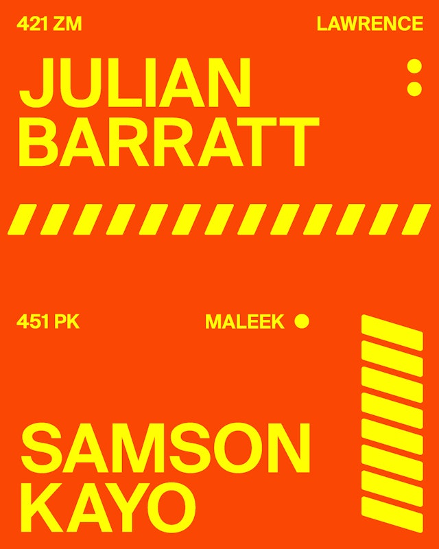
Working with type, chevron patterns, numerals, colour and motion, the team developed a library of design elements. These were used alongside clips of the characters in a punchy title sequence that introduces the viewer to the core cast.

Swiss Typefaces’ impactful sans serif was used throughout, echoing the type found on emergency vehicles. The familiar colours found on these vehicles and also on the paramedics’ uniforms inspired the colour palette used across the titles.

Producers Ash Atalla and Alex Smith at Roughcut TV approached Pentagram with the brief to create a title sequence for the ensemble show, which features the unlikely pairing of paramedics Maleek (Samson Kayo) and Wendy (Jane Horrocks) and follows their comedy-filled antics with colleagues and patients alike.
An important part of Roughcut’s brief was to create a sophisticated visual language (something not typically seen in UK sitcoms), combined with an approach that was still appropriate for a comedy programme.
Pentagram’s design team created the title sequences and on-screen graphics. These take a bold approach that channels the distinctive emergency services visual vernacular found on ambulances and paramedic uniforms.
Working with type, chevron patterns, numerals, colour and motion, the team developed a library of design elements. These were used alongside clips of the characters in a punchy, modern title sequence that introduces the viewer to the core cast.
Swiss Typefaces’ impactful sans serif Suisse International Semi Bold was used throughout, echoing the type found on emergency vehicles. The familiar colours found on these vehicles and also on the paramedics’ uniforms inspired the maroon, yellow and green colour palette used across the titles.
These graphic elements appear on screen throughout the show, and are used for the transitions between scenes, showing viewers when an ambulance team is attending a call out. Each paramedic team has its own call sign. This graphic device proved a useful visual cue in the balancing sequences that involved two ambulance crews talking to each other, ensuring the viewer could easily follow each team. Bumpers are designed to be used when cutting to commercial break. The BLOODS logo is flipped when going to the commercial, referencing the way AMBULANCE is spelled backwards on the front of the vehicle so drivers can read it in their rear view mirror. When the show comes back from commercial break, the logo is the right way around.
The design team extended the identity to flow into the end credits, and delivered a style and art direction guide to Sky Comedy for its campaign designs and implementation of the ‘Bloods’ graphic identity across the Sky Go and TV apps.
Pentagram’s sophisticated titles and graphics offer a refreshing approach, and reflect the much-anticipated comedy show’s winning combination of high-quality writing, production and performances.
Client
Roughcut TVSector
- Entertainment
- Arts & Culture
Discipline
- Brand Identity
- Motion Graphics & Film
Office
- London
Partners
Project team
- Amy Joycey
- Luis Gutiérrez
- Margherita Papini
- Ceri Stock
Collaborators
- Sholto Crow


