
The identity raises the profile of the Conservancy and reminds New Yorkers that stewardship of the Park is guided by a nonprofit that depends on their support.


The identity pairs a rectangular ‘park mark,’ with the distinct proportions and vertical orientation of Central Park, and the name set in Gotham Condensed.


Central Park is one of the most cherished landscapes in New York, but it hasn’t always looked like it. The 843-acre oasis in the middle of Manhattan suffered through decades of decline and neglect in the 1960s and 70s before a revitalization spearheaded by the Central Park Conservancy returned it to its former glory. Founded in 1980 by the environmentalist Elizabeth Barlow Rogers and other civic leaders, the Conservancy is a private, nonprofit organization that oversees management of the Park in a contract with the City of New York and NYC Parks. Its efforts have helped make the sanctuary the most visited urban park in the US, welcoming over 42 million people per year.
Despite this success, many New Yorkers have been unfamiliar with the Central Park Conservancy (CPC) and the important work it does. Pentagram has designed a visual identity and signage program that raises the profile of the CPC and reminds the public that stewardship of the Park is guided by a nonprofit that depends on their support. The branding also helps give Central Park its own distinct presence within the NYC Parks system of 1,700 parks.
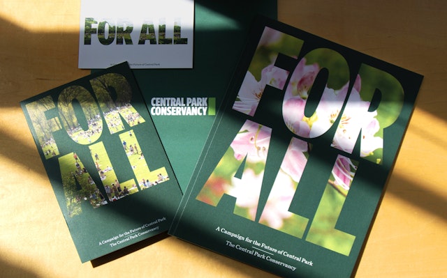
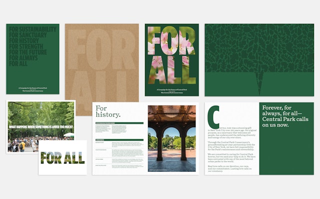
Pentagram collaborated closely on the project with CPC President and CEO Elizabeth “Betsy” Smith and other members of the organization’s leadership. Originally opened in 1858 for a rapidly growing city, Central Park was designed by Frederick Law Olmsted and Calbert Vaux as a place for New Yorkers from all walks of life to come together. Olmsted, in particular, believed open spaces are fundamental to democracy. This spirit of inclusivity inspired the theme of the CPC’s fundraising campaign, “For All,” with materials designed by Pentagram. The refreshed visual identity pairs a rectangular “park mark,” with the distinct proportions and vertical orientation of Central Park, and the name set in Gotham Condensed. The color palette is vibrant shades of emerald green, and the clean simplicity of the logo carries through to a series of custom icons, including a taxonomy of leaves from the range of trees found in the park.
These leaves are used in a brand typeface that arranges them into the letters of Gotham Condensed (optimized by Hoefler Type Foundry for the identity). A special web app was developed to generate the type. (Try the tester here!) The letters can appear in different shades and seasonal colors, and the leafy motif extends to graphic patterns on new staff apparel designed by the legendary uniform designer Stan Herman, as well as park communications and merchandise.
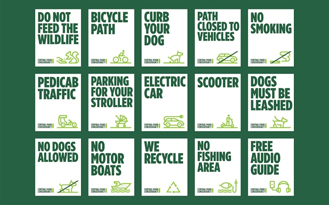
The strong typography of the identity is the focus of a new, more consistent system of signage that heightens the Conservancy’s presence within the landscape. The signs, including a new map by Pentagram, are designed to function in tandem with mandatory NYC Parks signage and help create a better, more cohesive experience for visitors. During the depths of the pandemic, banners appeared along park paths inviting visitors to “Share Your Story” with the hashtag #myCentral Park (part of a campaign developed with Pereira O’Dell), and select quotes are displayed to show what this big, beautiful backyard means to all New Yorkers.
Client
Central Park ConservancySector
- Civic & Public
Discipline
- Brand Identity
- Signage & Environmental Graphics
- Digital Experiences
- Brand Strategy
Office
- New York
Partner
Project team
- Katie Rominger
- Elyssa Yim
- Melanie Martinez
- Sakinah Bell
- Abby Matousek
- Chantal Jahchan
- Talia Cotton
- Tess McCann
- Gabe Smoller
