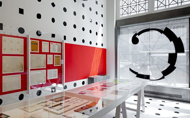


The idea of multiplicity is highlighted in an environment that communicates the endless diversity of typographic form: the walls and floor are covered in a pattern of 1,058 different periods, drawing from 630 typefaces.
Type surrounds us everyday in countless forms—on screens and publications, on signs and buildings, on products and packaging—and in just as many varieties. Created by Pentagram and produced and curated by Monotype, Century: 100 Years of Type and Design is a new exhibition at the AIGA National Design Center in New York that celebrates the incredible diversity of typefaces and their integral role in design over the past 100 years. Organized as part of AIGA's centennial year, the show served as the hub for two months of presentations, lectures, workshops and receptions.
Pentagram's exhibition design for Century transforms the AIGA gallery into an immersive environment of typography. The walls and ceilings have been dotted with hundreds of typographic periods drawn from the Monotype library, and a pair of dynamic animations further express the variations of different typefaces. The design sets the stage for the remarkable host of artifacts on display, including rare works from the archives of leading design organizations including Monotype, AIGA, Pentagram, Mohawk Paper, the Type Directors Club, Condé Nast, Hamilton Wood Type and Printing Museum, the Type Archive, the Herb Lubalin Study Center at Cooper Union, Alan Kitching and the Museum of Printing.
Monotype is one of the oldest and largest providers of type in the world, and in addition to its own library of typefaces, its holdings include the libraries of the other major type companies it has acquired over the years, including Linotype, ITC, Ascender and Bitstream, and many of the world’s most widely used typefaces, such as Helvetica, Frutiger, Univers, Optima and Times New Roman. To develop a unique experience for the AIGA centennial, the company turned to Pentagram. The designers worked closely with the exhibition's co-curators, Monotype creative director James Fooks-Bale and type director Dan Rhatigan, on the project.
Monotype made the entirety of its libraries available to Pentagram for the project. The idea of multiplicity is highlighted in an environment that communicates the endless diversity of typographic form: the walls and floor are covered in a pattern of 1,058 different periods, drawing from 630 typefaces. Displayed in the gallery window, the identity for the exhibition is a letter "C" rendered in segments of different Monotype fonts.
The idea is extended to two animations featured in the gallery. The first one, called “Fractured Century,” cycles through hundreds of typefaces that move like the minute hand on a clock. Each rotation has 12 font fragments, and in the five-minute animation approximately 600 different font fragments are shown. The second animation, “Full Stop,” identifies all of the periods displayed on the walls and floor. Set to the pulsing sound of a heartbeat, the animation hints at the notion of type as the heart of graphic design. During its five-minute running time, the animation goes through approximately 250 fonts, but pulls randomly from 1,232 fonts every time it plays.
Exhibition artifacts are presented in cases and on the walls and represent the evolution from typeface conception to demonstrations of fonts in use. Typeface production drawings by leading designers of the last 100 years, proofs, type posters and announcement broadsides are supplemented by publications, advertising, ephemera and packaging.
Office
- New York
