

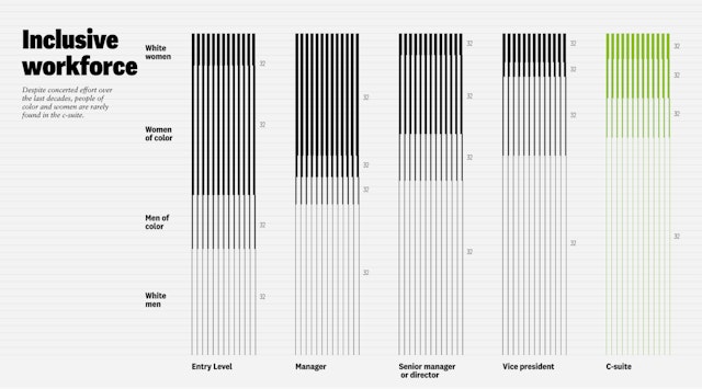
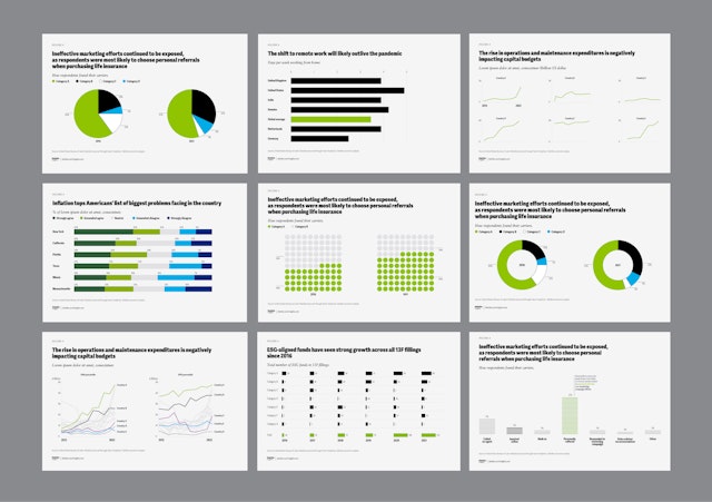
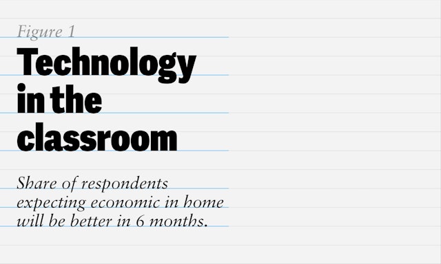
The new visualizations feature bold typography and a visible grid system (inspired by tax ledgers), evoking rigor, order, and confidence.

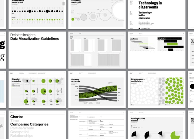
Pentagram designed more than 20 chart and infographic templates, ranging from highly custom dataviz models to more standard chart templates


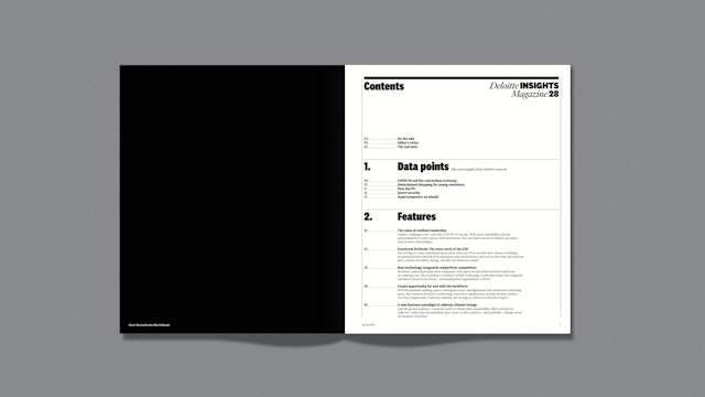
Deloitte Insights explores top-of-mind issues that lie at the heart of today's business challenges. Delivering thought leadership from Deloitte, one of the world’s largest professional services firms, the magazine publishes hundreds of data-driven articles and data visualizations every year. Pentagram has overhauled Deloitte Insights’ data visualization strategy, helping to reposition the outlet as a contemporary but still rigorous resource for the most important business analysis.
Designed by Pentagram partner Giorgia Lupi and team, the new data visualization language builds on the publication’s editorial framework previously designed by Pentagram partner Matt Willey. As a competitor to more well-known publications such as Harvard Business Review or Bloomberg Businessweek, it was critical for Deloitte Insights to carve out a unique look for itself that could effectively differentiate its data reporting. The publication’s graphs and charts needed to look less academic and more modern without losing their sense of authority and precision.
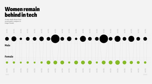
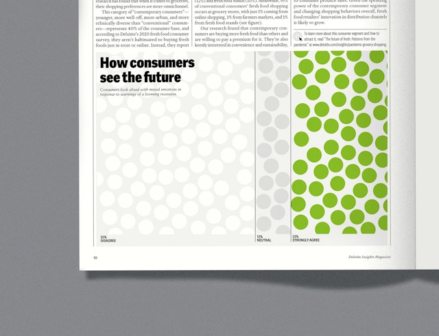
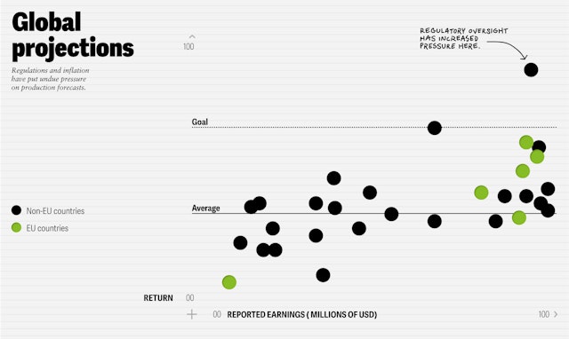
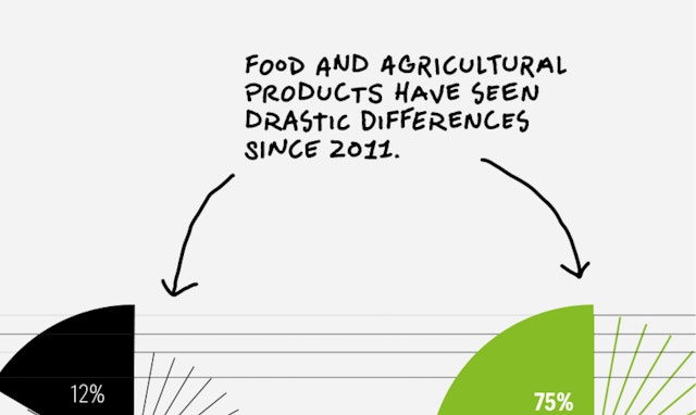
Recognizing that data visualization was an essential brand element for Deloitte Insights, just like its logo or color palette, the Pentagram team took a systems approach to the project to produce an overall graphic language inspired by both the existing editorial design as well as Deloitte’s company heritage. The new visualizations feature bold typography and a visible grid system (inspired by tax ledgers), evoking rigor, order, and confidence. Deloitte’s iconic green dot logo—a well-known mark with considerable equity—is invoked in various places, sometimes as a starting point for pie charts, bubble charts, and area maps, or simply as a highlight telling the reader to “look here.” A restrained color palette allows the green to stand out and ensures the reader is never overwhelmed with multiple insights.
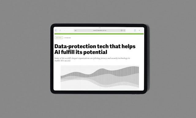
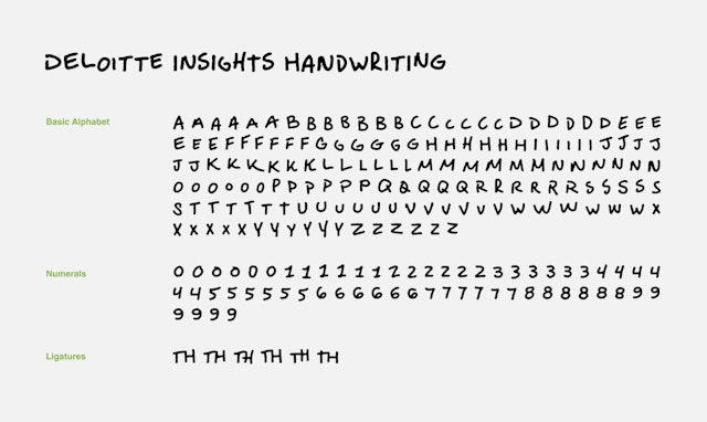
Following an audit of the many data types Deloitte Insights often publishes, Pentagram designed more than 20 chart and infographic templates, ranging from highly custom data viz models to more standard chart templates. Pentagram also created a bespoke handwriting typeface to be used for annotations or small labels, mimicking how a Deloitte consultant might note an insight on a graph for a client. Finally, extensive guidelines were also produced to help Deloitte Insights staff—both designers and consultants—to create new data visualization in line with the design language.
Office
- New York
Partner
Project team
- Phillip Cox
- Ed Ryan
- Ting Fang Cheng
- Gabrielle Merite
- Sarah Kay Miller
Collaborators
- Blast Foundry, typeface design
