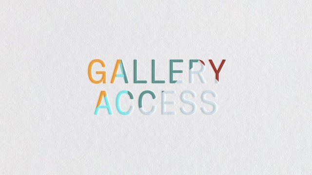
The unique features of the frieze magazine masthead were used to create a modern and ownable typeface to be used across the whole brand.

The custom typeface forms the essence of the brand itself, and unifies Frieze’s sub-brands under one coherent brand architecture.


Although the Frieze typeface performs well at small sizes, it has been paired with Sina Nova, a supporting serif typeface that has a high legibility and lends a warmth and intelligence to the designs.
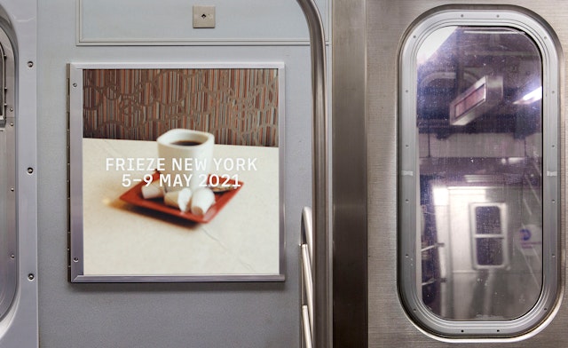
With the new brand design system in place, Frieze’s Creative Director David Lane embraced the brand design system’s capabilities to hero art and envisioned a series of campaigns, starting with the 30th Anniversary and Frieze New York 2021.

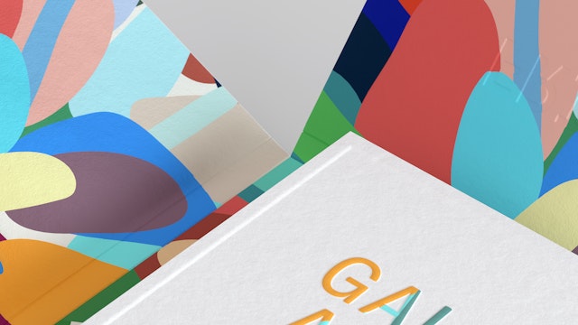
It was essential the design system provided the art itself space to breathe. The typeface is characterful & distinctive but does not dictate the layout.
Founded in 1991, Frieze comprises three publications—frieze, Frieze Week and Frieze Masters Magazine—and four leading international art fairs in London, New York and Los Angeles. In recent years, the organisation’s scope has expanded to include the digital platform, Frieze Viewing Room, alongside a host of editorial initiatives such as podcasts and talks.
Over time, with expansion of the organisation and the creation of a variety of sub-brands, a number of different identities and wordmarks emerged, without a clear brand architecture or relationship. With this in mind, Frieze’s Creative Director David Lane and their wider team established a brief for the rebrand, derived from the need to reconcile the creative and visual approach to form a consistent visual identity.
The Pentagram team began with an analysis of the existing brand architecture to understand how each facet of the business was represented, the relationship between sub brands, and how these identities could be grouped together. The rebrand required a strong and recognisable mother-brand but this had to be balanced with a level of differentiation between each of the sub brands. However, after this initial evaluation it was clear that the differentiation was in fact a legacy of the existing brand, and that a unified brand identity was the right solution. In addition, a key part of the brief was to create an identity that maintained flexibility so new brand products or sub brands could easily be incorporated into the brand family. It was this process that identified the best approach for the new brand would a typographic solution.
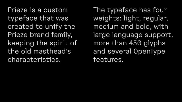
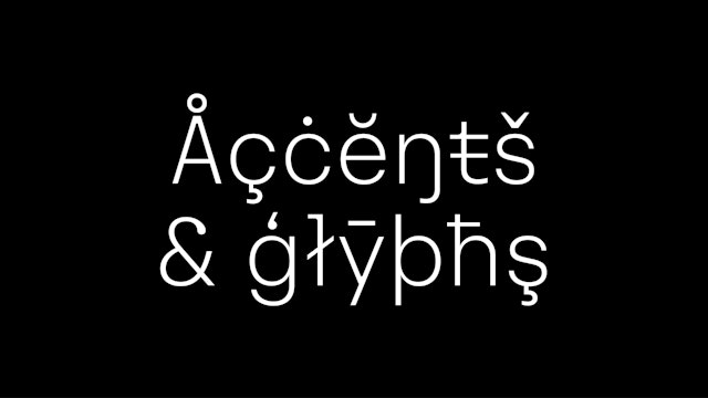
With Frieze’s visually astute audience of collectors, gallerists and art enthusiasts in mind, the Pentagram team knew an elevated and highly crafted design solution was essential. With a sensitivity to its heritage, the unique features of the frieze magazine masthead (created by Tom Gidley and later redesigned by Paul Barnes) were used to create a modern, sophisticated and ownable typeface which could be used across the whole brand.
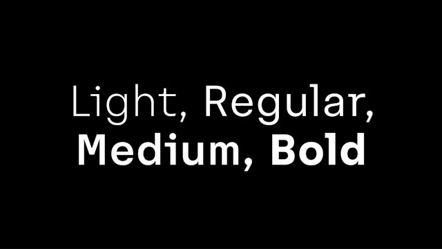
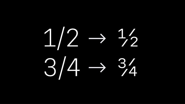
Additional features needed to be introduced in order to expand the masthead design into a typeface. The new Frieze typeface retains the original qualities of the masthead such as curved brackets and ‘occasional’ slab serifs, but in order to create an uppercase and full character set, the typeface needed to further expand on the masthead’s original design language. By developing uniquely narrow uppercase characters, the team were able to create a natural continuation of the typewriter/monospace features found in the masthead. This enabled a degree of graphic separation between the newly adapted masthead and the mother brand wordmark. The new custom typeface forms the essence of the brand itself. By using the typographic system, any configuration of a wordmark can be created, giving the new identity flexibility to combine sub brands or create new wordmarks. The typeface comprises four weights and was designed with typographer Luke Prowse.
It was essential that the new brand design system provided the art with space to breathe. Therefore, the typeface is characterful and distinctive but does not dictate the layout. The colour palette is black and white, this allows the colours and textures of the visual content to play a prominent role in the way the brand is expressed. These design decisions allow the art to be placed at centre stage, while the new brand identity retains its presence.
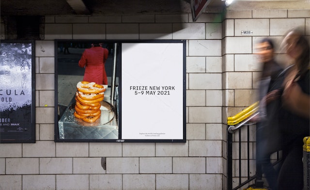
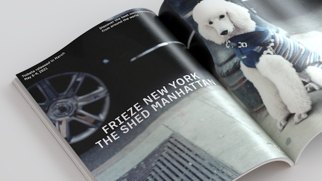
With the new brand design system in place, Frieze’s Creative Director David Lane embraced the brand design system’s capabilities to hero art and envisioned a series of campaigns that would mark key milestones in Frieze’s calendar throughout 2021. Each campaign is created in collaboration with an artist and the visual content at the heart of the campaign serves to create a visually intelligent identity around that particular event. Known for creating artwork with code, New York artist Zach Lieberman created a series of animations to represent the 30th Anniversary of Frieze. Photographer Chris Rhodes, devised a campaign shoot for Frieze New York, observing and capturing the essence of the city.
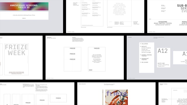
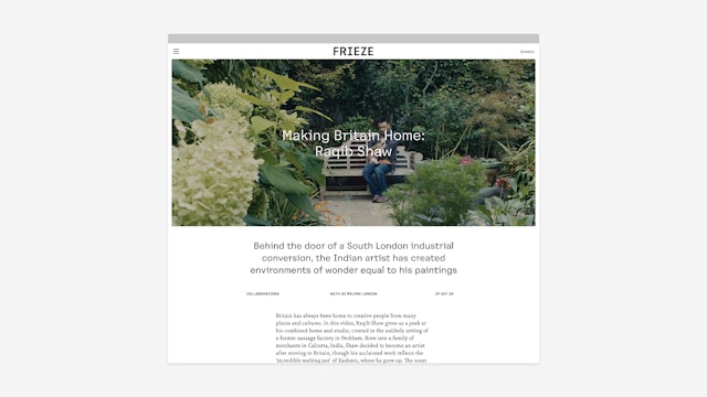
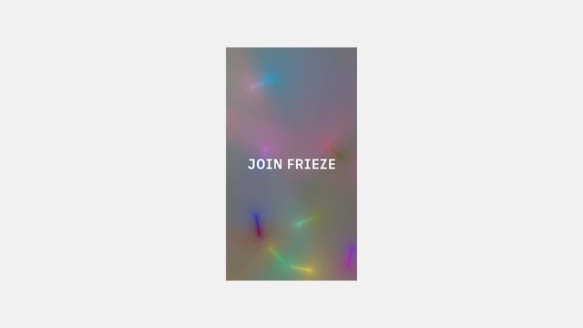
The Frieze brand appears across a variety of physical and digital spaces and mediums—to cater for this requirement the team developed a system which is open, unrestrictive and can be aligned in many configurations. Although the Frieze typeface performs well at small sizes, it has been paired with Sina Nova, a supporting serif typeface that has a high legibility and lends a warmth and intelligence to the designs. The team delivered a comprehensive set of design guidelines to equip the Frieze design department in the roll out of the new brand. It includes a number of examples to demonstrate the system’s capabilities; art fair signage and programmes, magazine covers, advertising in print, digital and out of home, website navigation UX design and social media.
Office
- London
Partners
Project team
- Margherita Papini
- Ceri Stock
Collaborators
- NaN.xyz Foundry
- David Lane