Modern, friendly and accessible, the identity is part of a comprehensive program of graphics we created for GEE that helps educate consumers about energy and design their own solutions to save energy.


Great Eastern Energy is one of the largest alternative suppliers of natural gas and electricity in New York, New Jersey and Massachusetts. Founded at the start of energy deregulation in 1996, GEE is an Energy Service Company (ESCO), or third-party energy retailer, that offers consumers the opportunity to choose who supplies their energy and helps them create more cost-efficient plans, then coordinates with local utility companies like Con Edison or National Grid for delivery of the energy to homes and businesses.
Pentagram has designed a new identity for GEE that positions the company as a unique and innovative energy provider. Modern, friendly and accessible, the identity is part of a comprehensive program of graphics we created for GEE that helps educate consumers about energy and design their own solutions to save energy. Since the launch of the identity in winter of 2014, the number of consumers who have made the switch to GEE has increased by an extraordinary 500 percent.
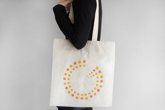
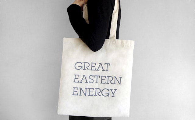
The designers worked closely with GEE to develop the identity system, which includes print collateral, marketing materials and the company website. Composed of dots in bright shades of orange and yellow, the new logo combines the shape of the letter “G” with the circular form of an energy meter. The dots are arranged in a pattern of alternating colors, visually activating the logo to convey the idea of energy production. An animated version of the logo on the website rotates the two circles like the turbines in a power generator. The symbol is accompanied by a wordmark set in ITC Lubalin Graph.
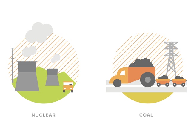
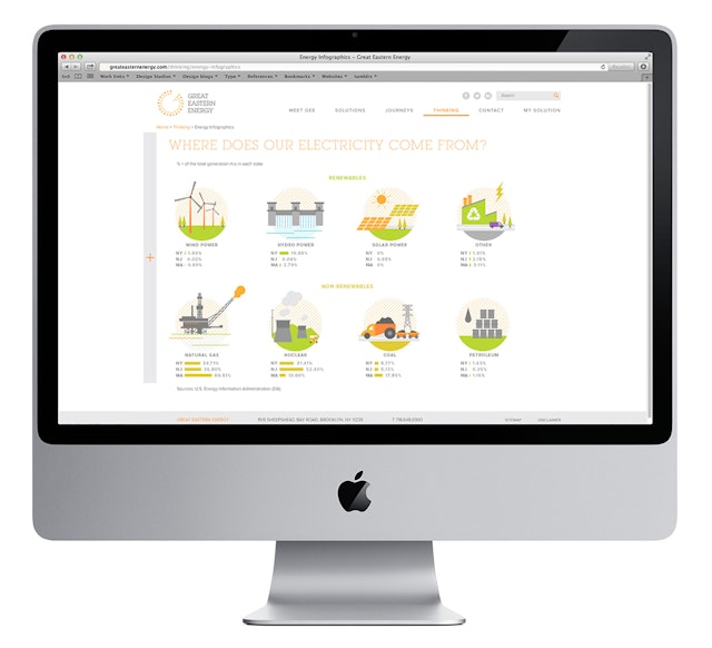
As a progressive company GEE values transparency about how the energy industry works and makes consumer education an important part of its mission. Pentagram was initially commissioned to design the company’s identity, but the scope of the project quickly expanded to include a full range of graphic content that explains what GEE does and how its services can benefit consumers. We suggested using infographics to describe the principles of energy production and distribution. The dots of the logo are used to form icons for electricity, natural gas, usage and efficiency, as well as motion graphics that playfully illustrate what energy does and the aims of GEE.
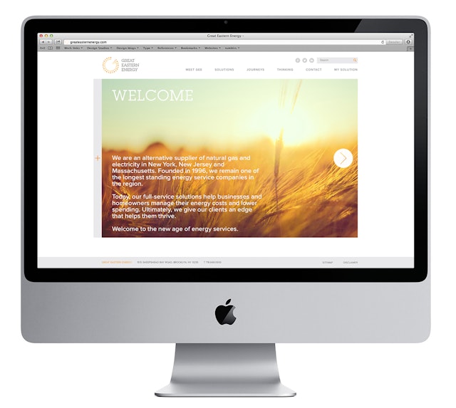
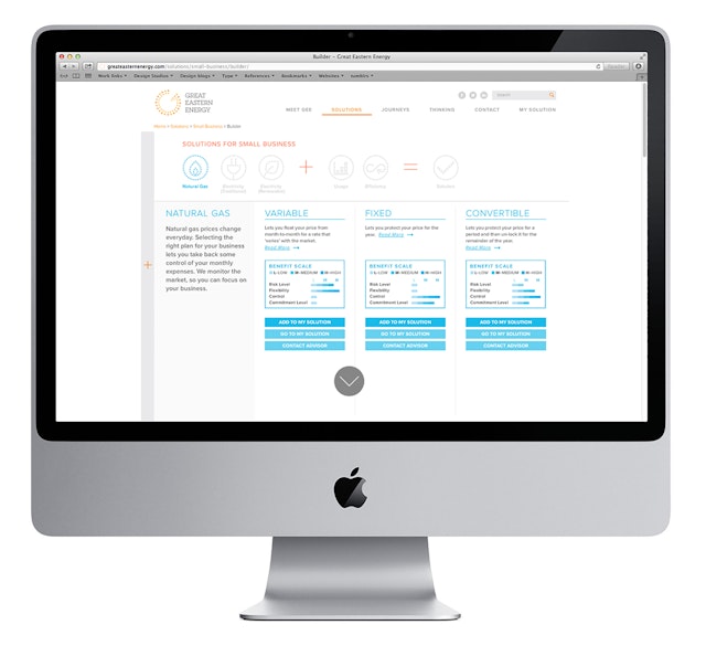
The website redesign focuses on building a direct and engaging relationship with the consumer. This is accomplished with a clean, simple design, friendly infographics and an easy-to-use interface. The centerpiece of the site is a “Solution Builder” that guides users through the process of assessing their needs and makes recommendations for developing their own customized energy plan. Potential customers can select from the different types of energy—natural gas, traditional electricity, and electricity from renewable sources—factor in their usage and efficiency, and arrive at a solution that meets their needs. Energy is billed according to the unit fee of energy usage, and the Solution Builder helps consumers use their energy more intelligently to reduce costs.
GEE introduces itself in “Meet GEE,” a written history of the evolution of the company in the context of milestones of the energy industry. Third party suppliers like GEE were able to start as a result of energy deregulation that broke up the monopolies of companies that controlled both power generation and distribution, and GEE’s story is told through a series of illustrations on a “Monopoly”-style game board. The “Journeys” section features interviews with existing customers and shares their energy solutions to show the benefits of using GEE.
Client
Great Eastern EnergySector
- Manufacturing & Industrials
Discipline
- Brand Identity
- Digital Experiences