
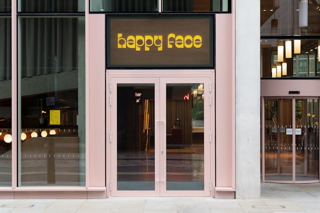
The identity uses a vivid colour palette of green and yellow to play on a 1970s pop theme.


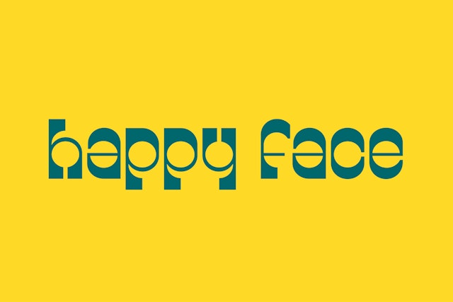
Collaborating with Bobby Tannam, Pentagram created The Happy Face Pizza and Supermax wordmarks and resulting Happy Face Display font.


The result is a familiar, but unique identity that references classic 1970s Italian design, in all its playful and organic forms.


Happy Face Pizza is a new pizzeria offering all-day dining and takeaway in London’s King’s Cross. Located underneath the Everyman Cinema, the restaurant's menu of authentic Italian pizza, antipasti, gelato and dolci is designed to build up that feeling of excitement before a night at the movies.
HFP is a new venture from the team behind the music-focussed space Spiritland and marks the second time the group have commissioned Pentagram to deliver an identity for one of their projects.
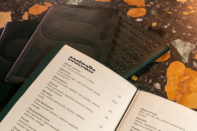
Like Spiritland, Happy Face Pizza is music-orientated. Its basement is home to the late-night, vermouth-led cocktail bar Supermax, which pays homage to Italian discotheques through a soundtrack of 1970s Europop and slow tempo funk.
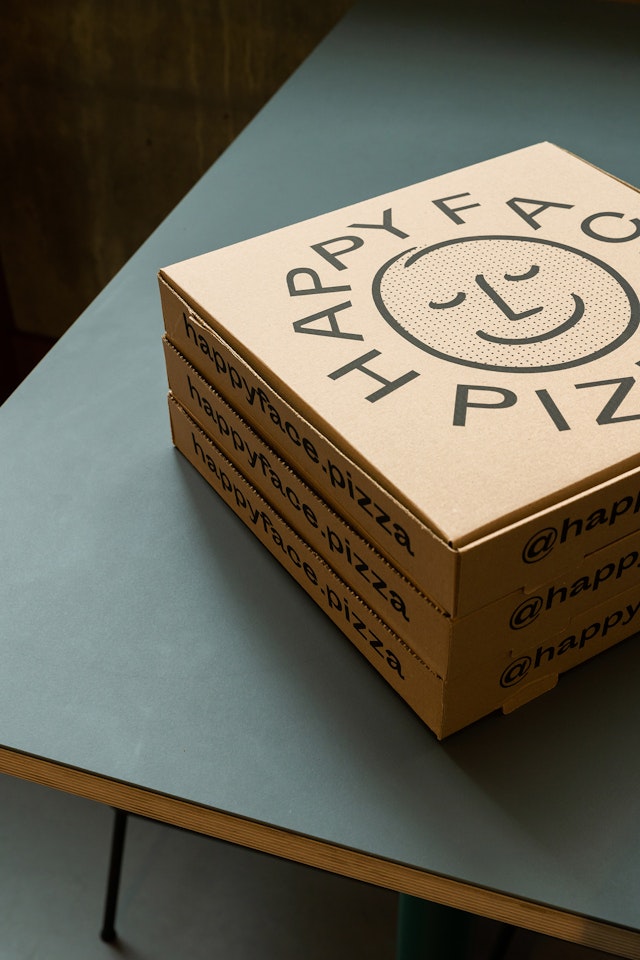
Pentagram's identity has been designed to embody the idea that a single illustration, the ‘Happy Face,’ could convey the contentment felt after the enjoyment of a good meal.
Signage and fixtures throughout the restaurant use a vivid colour palette of green and yellow to play on a 1970s pop theme. Light blocks suspended from the ceiling spell ‘pizza,’ a smiley mascot hangs over the door, and bright, retro speakers painted in the HFP theme play a mix of classic hits and old disco.
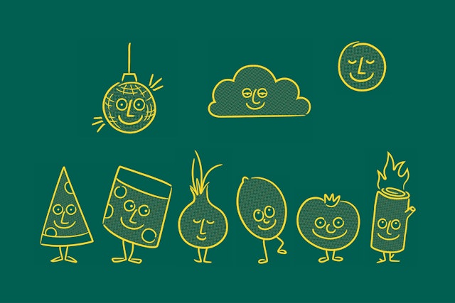
The team also created ‘hand-drawn’ characters to represent different elements of the Happy Face story, from pizza slices and ice-cream to lemons and disco balls. The illustrations conjure up layers of narrative in the restaurant and lend themselves to fun, quick animations that live online.
Collaborating with Bobby Tannam, Pentagram created The Happy Face Pizza and Supermax wordmarks and resulting Happy Face Display font. The initial drawings stemmed from a logo Bobby found in an old school book by Daniele Baroni for the Galleria D'Arte L'Incontro. The result is a familiar, but unique font that references classic 1970s Italian design, in all its playful and organic forms.
As a pizzeria, the team also created a Happy Face roundel to complement the wordmark, typeface, and characters. This additional element functions as a stamp or seal, which, when featured on t-shirts, badges and coasters emphasise the identity’s informality and playfulness.
Client
Happy Face PizzaSector
- Food & Drink
Discipline
- Brand Identity
- Signage & Environmental Graphics
- Digital Experiences
Office
- London
Partners
Project team
- Margherita Papini
- Amy Joycey
- Ben Leonard


