


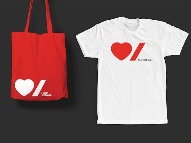
The identity centers on a bold, modern logo that uses the simple icons of international symbols to create a friendly, accessible and democratic visual personality.


The Heart & Stroke Foundation of Canada is a national charity with the mission to prevent heart disease and stroke, leading causes of death and hospitalization for Canadians. Pentagram has designed a new identity that establishes an iconic and instantly recognizable brand for the organization as it seeks to connect more deeply with Canadians and reignite passion for the cause.
The identity centers on a bold, modern logo that uses the simple icons of international symbols to create a friendly, accessible and democratic visual personality. The logo pairs the graphic icons of a heart and a stroke, which also reflects the new focus on the organization’s more commonly used name, Heart & Stroke. One of the challenges of the identity was fulfilling the official bilingualism requirements of the country. The symbols transcend language, and while the stroke symbol does not translate as directly to the French word for stroke as per English, it represents a feeling anyone who has been impacted by a heart attack or stroke has felt—an abrupt punctuation, exactly how stroke interrupts life suddenly. The new system also easily accommodates both English and French by stacking the words in a lockup with the logo.
Another challenge for the designers was creating a mark that conveys seriousness and urgency, while still being inspiring and approachable. Logos for many health charities tend to either look overtly medical, or in an effort to appear warm and friendly, overreach and become too playful, downplaying the gravity of what’s at stake. The heart and brain are the body’s two most vital organs, and Heart & Stroke needed a brand identity that would accurately communicate the importance of its mission—which is literally life and death—yet still offer hope and encourage people to act.
Heart & Stroke plays an important role in the lives of Canadians. Since it was established in 1952, the powerful healthcare advocate has raised and spent more than $1.45 billion on heart and stroke research. During this time, the death rate from heart disease and stroke in the country has declined by more than 75 percent, a testament to the group’s success. Previously a federation of 10 provincial foundations, in 2011 Heart & Stroke unified to become a national organization and is supported by a force of more than 125,000 volunteers and one million donors across the country. It needed a cohesive visual system that would help organize and explain its many initiatives and programs to an audience that includes everyone from schoolchildren to senior citizens.
The redesign is the first major change to Heart & Stroke’s identity in over 60 years, and the brand relaunch is about more than just a new look. The organization found that its existing identity reinforced its position as a benevolent, trusted authority but did little to activate or inspire fundraising, especially from younger generations. The charity needed a system that was more dynamic, modern and relevant, to help engage people so they would view support for Heart & Stroke as an investment in their own future.
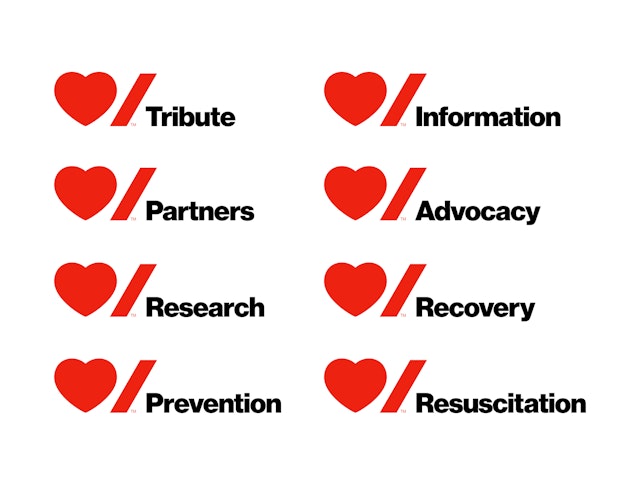
Heart & Stroke presents many different mission and fundraising programs, from research and prevention initiatives to its popular Big Bike and Jump Rope for Heart events. However, the organization found that inconsistent branding meant they weren't always getting credit as the force behind these programs. In the new system, the elements of the logo are used as a consistent framework that can anchor various divisions such as community events, corporate sponsorships, gifts and the lottery, and more. These sub-brands can be represented with graphic icons or a type signature.
Comprehensive graphic guidelines have been established for the implementation of the identity across publications, campaigns and other collateral. Custom icons can be created for individual initiatives, and the color palette of red, black and white may expand to incorporate additional colors. Typography is set in Neue Haas Grotesk, with different weights used to communicate urgency or empathy.
