Designed to create a fairer, more sustainable ecosystem for hotels, customers and guests, Impala wanted to engage with its audience (which includes start-ups and tour operators) on a much more emotional and personal level.


It was vital that the new identity should be bold and ownable, had a direct connection to travel, and have the ability to translate seamlessly into their product.


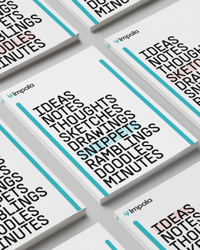
Pentagram’s new identity for Impala is inspired by the everyday graphic language of travel, including airport arrival boards, railway tickets, luggage labels and signage.


The travel vernacular-inspired graphic language appears across all the various applications, both on and off-line

Evoking all the anticipation and excitement of travelling, Pentagram has designed a striking identity for Impala, which, combined with the seamless online environment created for its customers, will ensure that it stands out in the competitive world of B2B travel.


Pentagram has created a new brand identity for Impala, a tech-driven business-to-business travel platform that specialises in connecting hotels with customers who are looking to buy rooms.
Impala approached Pentagram to help it transition from a tech-dominated travel brand in the travel space to a travel brand empowered by tech. Designed to create a fairer, more sustainable ecosystem for hotels, customers and guests, Impala wanted to engage with its audience (which includes start-ups and tour operators) on a much more emotional and personal level. Although they may specialise in the business-to-business side, Impala recognised that everyone who is part of the industry is a traveller first and foremost, and it was important to show that Impala had the same love of travel as their audience.
Impala’s new approach centres around Pentagram’s clear strategic framework, friendly tone of voice and colourful visual identity. It was vital that the new identity should be bold and ownable, had a direct connection to travel, and have the ability to translate seamlessly into their product.
Pentagram’s new identity for Impala is inspired by the everyday graphic language of travel, including airport arrival boards, railway tickets, luggage labels and signage. These instantly evoke the excitement of travelling and help paint a picture for customers and clients.
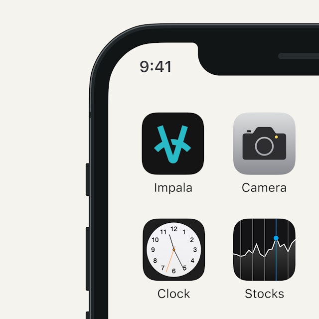
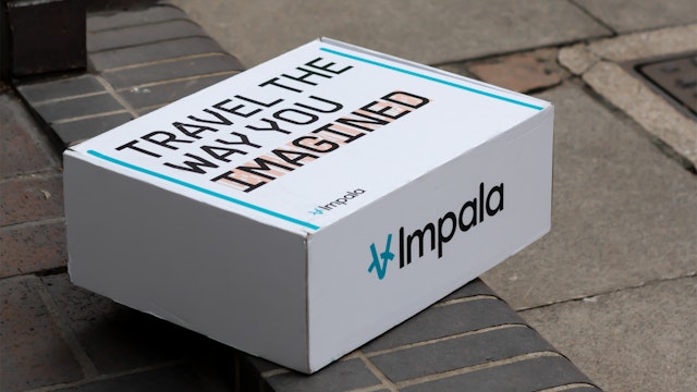
Pentagram’s bold new graphic language embraces both the joy of travel and the feeling of adventure that travel brings. It includes a stylised logo that combines a compass (used to guide us when we explore new territories) and the impala (the sleek antelope which embodies speed, ease and efficiency). The strapline ‘Travel the way you imagined’ emphasises the sense of anticipation we feel when planning and setting off on a journey.
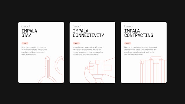
The design team created an inviting colour palette based on the colours of sand, sunset and sea—three desirable things that we travel across the globe to experience. The primary typeface is Impala Supply, an adaptation by PangramPangram of its original Supply typeface. With precise curves and sharp angles inspired by industrial design and architecture, its bold forms channel air ticket and tag typography, making it instantly recognisable to travellers.
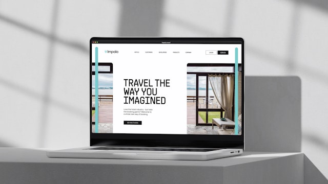
The travel vernacular-inspired graphic language appears across all the various applications, both on and off-line. It includes pairs of coloured vertical bars taken from the language of tickets which neatly bracket Impala’s content and serve as a graphic device to reveal what’s next. In addition to this, a coloured barcode device is used to emphasise specific words on posters and other marketing collateral.
The design team also created a system of colourful travel-inspired typographic tags and buttons, well as three different sets of icons. These icons take the form of functional (one colour and geometric), illustrative (multi-coloured and with more detail) and technical (precisely drawn line art) and appear throughout the Impala assets.
Evoking all the anticipation and excitement of travelling, Pentagram has designed a striking identity for Impala, which, combined with the seamless online environment created for its customers, will ensure that it stands out in the competitive world of B2B travel.
Office
- London
Partners
Project team
- Nav Bhatia
- Helena Postigo Matey
- Ry Coleman
- Yurii Khomovskyi
- Jonathan Quaade
- Anjela Freyja
- Michela Zoppi
Collaborators
- Uri Baruchin
- Rebecca Lynch
