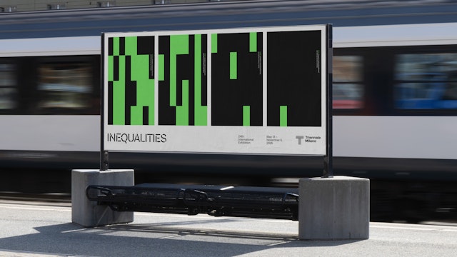
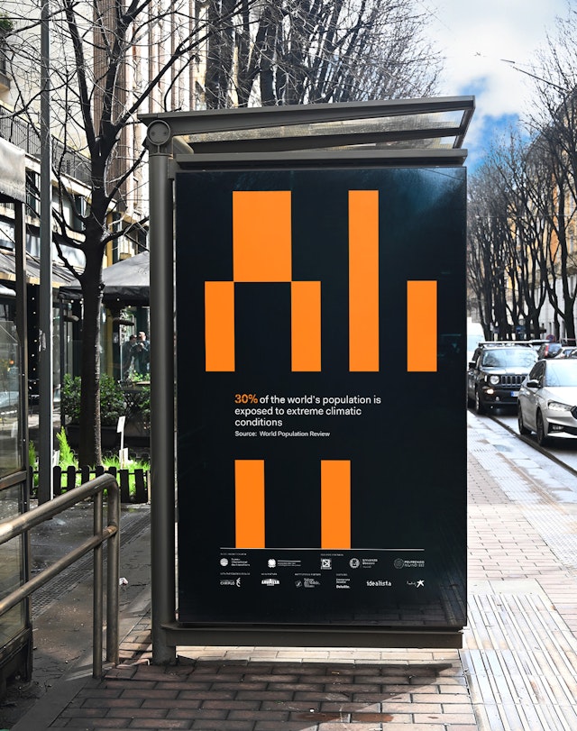
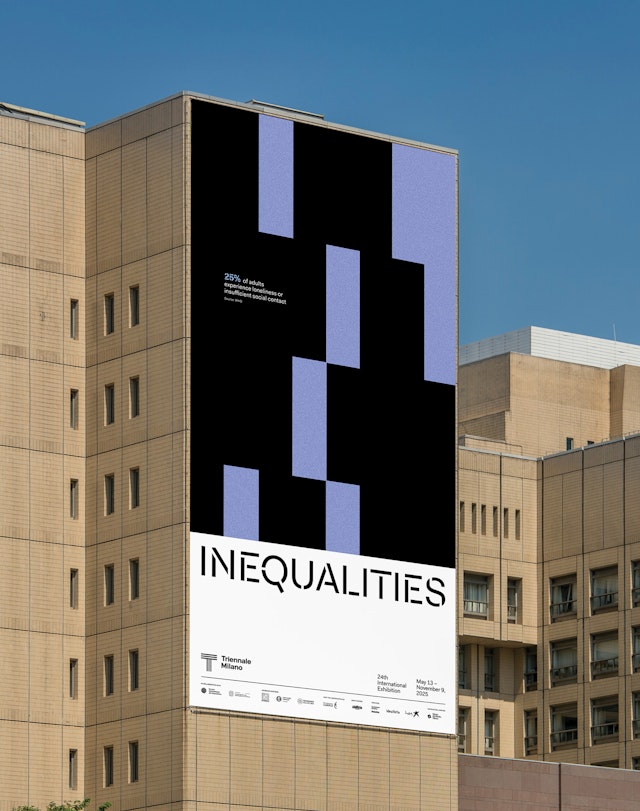
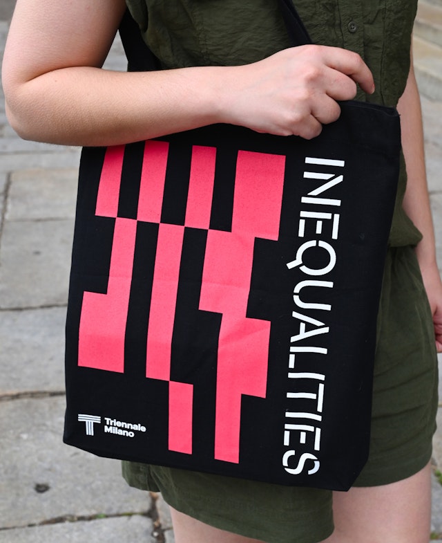
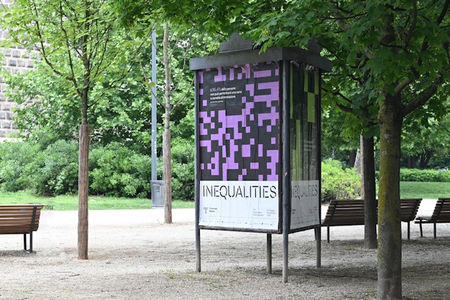
Based on block-like pixels, the dynamic generative system is endlessly flexible and can express different statistics while providing a cohesive visual framework for the wide-ranging content.
The patterns are graphically straightforward, but can yield conceptually profound results depending on the data employed.
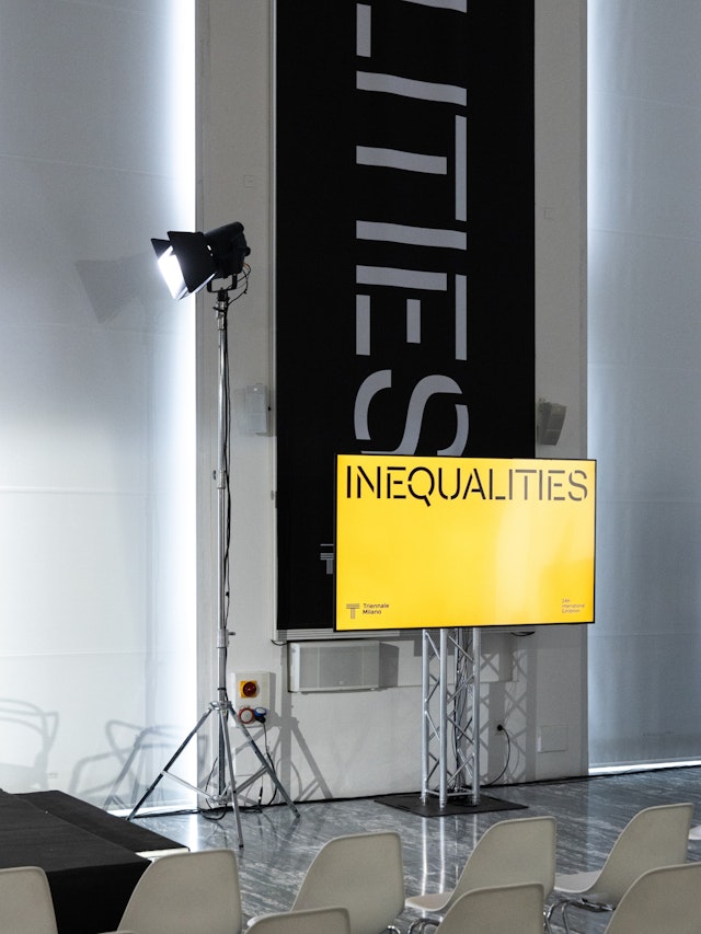
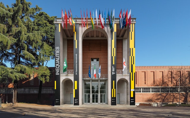
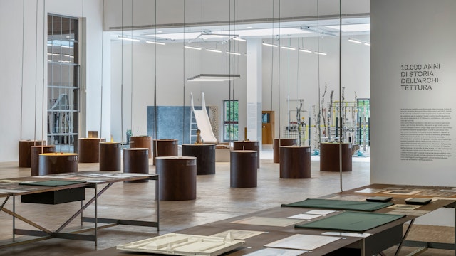
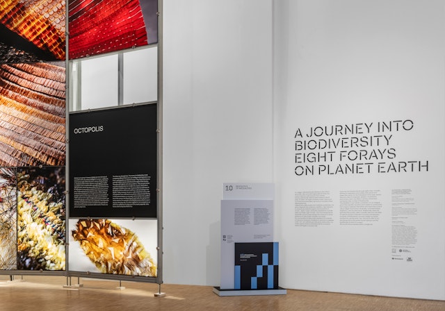
Arriving at a time of extreme societal instability, Inequalities, the 24th Triennale Milano International Exhibition, explores the global challenges arising from the powerful yet often unseen differences across various dimensions of human existence and the growing disparities that characterize them. These issues include socioeconomic injustice, geopolitical conflict, large-scale migration, environmental breakdown and the climate crisis. Presented at the Triennale di Milano museum of art and design in the historic Palazzo dell’Arte, the Triennale opened on May 13 and will remain on view through November 9, 2025.
Pentagram’s Giorgia Lupi and team have designed a brand identity framework for the Triennale that uses the shifting patterns of data visualizations to embody these themes of imbalance. Based on block-like pixels, the dynamic generative system is endlessly flexible and can express different statistics while providing a cohesive visual framework for the wide-ranging content. The program encompasses the exhibition graphics and promotional campaign, as well as the book design for the accompanying catalogue.
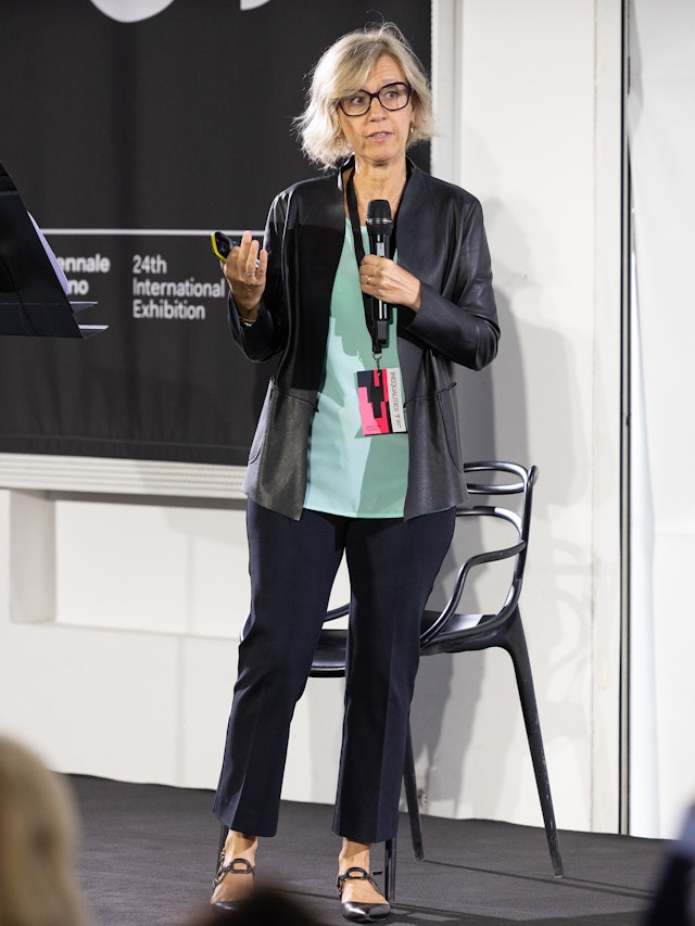
Giorgia and the Pentagram team collaborated closely with the Triennale’s own in-house design team to achieve Triennale President Stefano Boeri’s vision for the exhibition. The brief asked the designers to articulate the theme in a compelling way; appeal to a broad audience of local and international visitors; and create something that could easily adapt to multiple touchpoints. The Triennale has an impressive design legacy, with past identities and graphic systems created by Max Huber, Massimo Vignelli and Bob Noorda, among many others.
The 2025 edition is the final installment in a trilogy that began with 2019’s Broken Nature: Design Takes on Human Survival (for which Giorgia created an immersive installation that opened the show) and continued with 2022’s Unknown Unknowns: An Introduction to Mysteries. As with its predecessors, this year’s theme of inequality was timely and expansive––but its relevance posed a key conceptual challenge.
The visual identity had to walk a fine line, welcoming visitors with a vibrant, inviting look that could cohesively encompass a wide variety of issues, and yet still convey a sense of moral urgency. The challenge for Pentagram was visualizing the mass of interlocking conditions that affect real people and places along an ever-shifting continuum of social, political, and environmental contexts. How might an identity system capture a topic of such complexity and make it legible to everyone without losing any of its gravity?
The team wanted visitors to ask themselves questions about inequalities even before entering the exhibition, and saw data as the key to unlocking a more narrative, human-centered approach, carefully depicting big and small inequalities with a graphic clarity that they felt the topic demanded. To start, the team researched datasets that could describe inequality along multiple vectors, including life expectancy, economic prosperity, education attainment, ecological change, war and violence, and democratic participation. These datasets became the narrative input for the design system, eventually feeding directly into a custom-built visualizer that translated the numbers into distinctive gridded patterns.
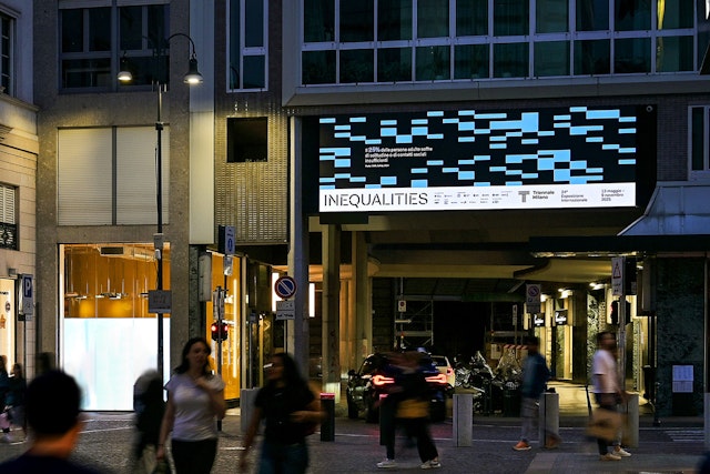
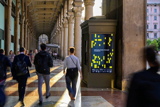
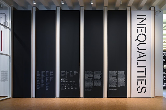
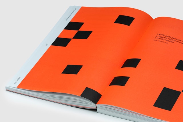
The block-like Triennial graphics are “tree maps,” a type of data visualization that represents numerical value through the proportional division of space. The use of tree maps allowed for a consistent logic that could support the entire system: a black field represents a whole value, and the overlaid colored blocks represent the data’s relative share of that whole. Without immediate didactic meaning, the patterns invite their own form of curiosity, discovery, and reflection. Legend text explaining what each pattern visualizes is kept relatively small and out of the way, functioning like a gallery wall label that identifies the larger work.
The patterns are graphically straightforward, but can yield conceptually profound results depending on the data employed. A nearly filled canvas of green squares might denote global progress by visualizing data about the growing amount of green space afforded to citizens in a certain country. But a very similar composition can just as easily visualize increased pollution, flooding, or climate migration. The team also discovered how varied levels of pixelation, from superfine to chunky, played with existing assumptions about each topic and drew out surprising revelations. What does equality look like? How do we measure it? Where is progress visible?
“This is ugly data,” Giorgia says, pointing to disparities around gender equality and climate justice. “It’s about people, but also about situations that are dire and, one could say, arbitrary. We didn’t want to shy away from that reality—without forgetting the human element.”
For the past two decades, Giorgia and her team have embraced the philosophy of “data humanism,” a way of working with quantitative and qualitative information that emphasizes individuality, emotion, and a hand-made intricacy that counteracts the stereotype of data as “cold,” technological and machine-made. Guided by this philosophy, the designers have pioneered a distinctive approach to data visualization that puts human stories at their center.
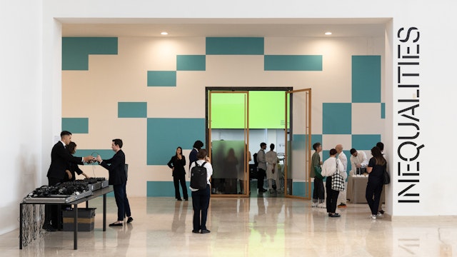
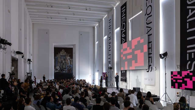
The distinctive look of the identity helped create a highly recognizable presence for the Triennale across the landscape of international cultural events, print and digital media, and Milan itself. Used around the city at transit hubs and train stations, the visual identity functions both as a static pattern and an animated masthead teasing the themes explored in the exhibition. At large scales, the pixel-based graphic language takes on an architectural gravitas. The colorful data visualizations contrast sharply with Milan’s umber textures and vernacular, helping to draw attention to both the exhibition and its theme.
In addition to the out-of-home campaign and in-situ exhibition graphics, the museum adapted the pixelated system for banners, temporary wall graphics, and other promotional materials leading up to the launch, beginning in September 2024 with the Inequities Forum.
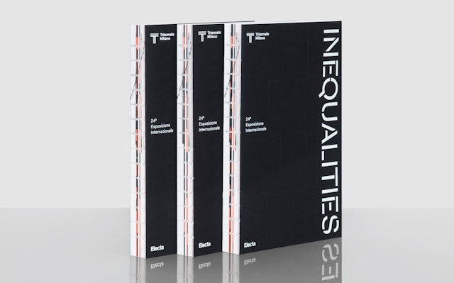
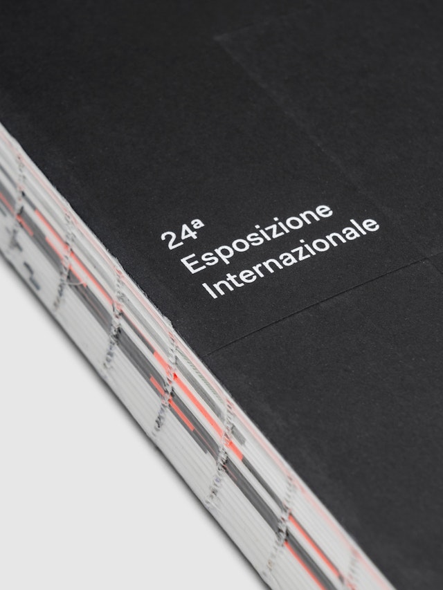
The Pentagram team also designed the Inequalities catalogue, published by Triennale Milano and Electa. Conceived as a tool to explore the themes addressed in the exhibition, the book is divided into two sections, Geopolitics and Biopolitics. Data visualizations extend across double-page spreads between the essays and projects to further illustrate the issues at hand. In keeping with the elemental look of the identity, the catalogue has an exposed smyth-sewn binding, and the covers are debossed with data blocks from two studies.
Client
Triennale MilanoSector
- Arts & Culture
Discipline
- Brand Identity
- Signage & Environmental Graphics
- Data Driven Experiences
Office
- New York
Partner
Project team
- Zach Scheinfeld
- Ed Ryan
- Phillip Cox
- Rachel Crawford
- Julia Saimo
- Yoshi Torralva
Collaborators
- Giorgia Roscini, animation
- Triennale Design Team
- DSL Studio, book photography