
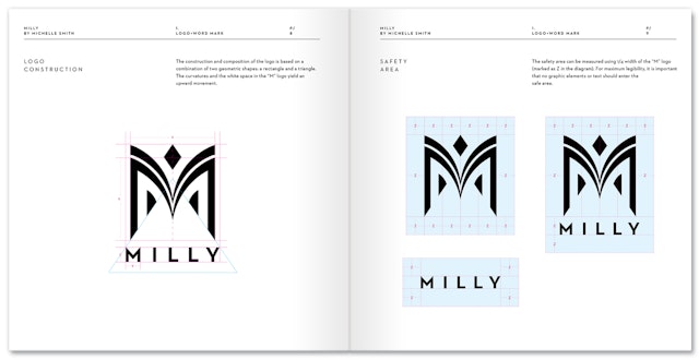

The mark is built around the symmetrical architectural forms of the letter M, balancing the strong bones and geometry of the letter with a series of fluid, organic curves and shapes.
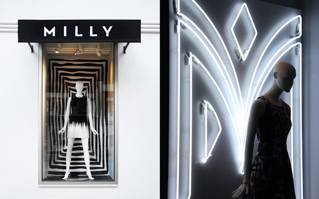

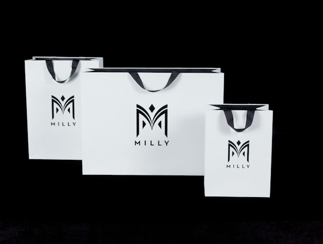


The liquid curves of the logo are juxtaposed by the logotype, which is set in Neutraface, a geometric sans serif typeface that is closely associated with mid-century Modernism, one of Smith’s historical influences.


As the design sensibility of a fashion designer evolves over time, the brand they established at the start of their career may no longer reflect their work. This was the challenge faced by the designer Michelle Smith, whose logo for the 2001 launch of her label Milly bore little relation to the clothes she was designing today. To create a new identity that would better reflect her point of view, Smith enlisted the expertise of Pentagram. The designers created an iconic identity for Milly that captures the label’s contemporary attitude and helps position it for future growth.
Smith’s designs juxtapose clean, classic silhouettes with bold colors, vibrant patterns and luxurious textures and fabrics. Milly has a devoted following of style icons like Gwyneth Paltrow, Victoria Beckham and Beyoncé, and has expanded on several fronts in recent years. The line is carried in stores around the world and sold in stand-alone Milly boutiques in New York, East Hampton and Tokyo, as well as through a thriving online presence.
Designed in 2001, the previous Milly logo was retro and almost exaggeratedly feminine, appearing in a script typeface and a color palette of pink and gold. The identity was limiting and no longer embodied the DNA of the collections.
The new identity keeps the femininity but adds strength. The mark is built around the symmetrical architectural forms of the letter M, balancing the strong bones and geometry of the letter with a series of fluid, organic curves and shapes. Unique and easily recognized, the mark is joyful and expressive but also has gravity and captures the idiosyncratic charms of Smith’s work.
The liquid curves of the logo are juxtaposed by the logotype, which is set in Neutraface, a geometric sans serif typeface that is closely associated with mid-century Modernism, one of Smith’s historical influences. The font has many of the formal qualities—structure, symmetry and elegance—that Smith explores in her designs. The color palette is a cool, modern black and white, with all further decoration and embellishment stripped away, to better set off the vibrancy of the clothes.
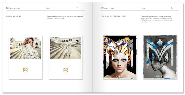
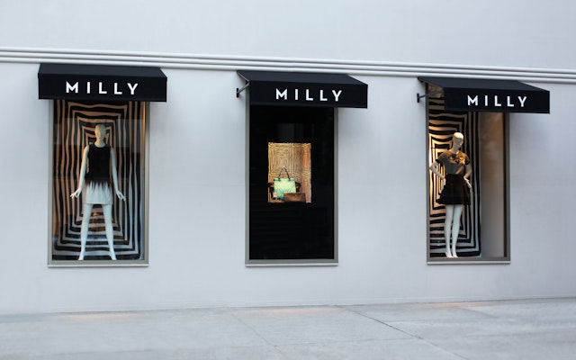
The identity officially launched in the Summer of 2013. To help roll out the new look, the designers created an extensive style guide and designs for applications including packaging, look-books, store environments, signage and displays, invitations for shows, and other related collateral. A neon version of the logo provided the backdrop for Smith’s runway show at New York Fashion Week.
