To design the fictional Minx magazine, the Pentagram designers method-acted the part by immersing themselves in the visual culture of the era.
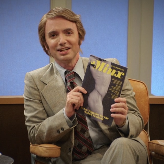


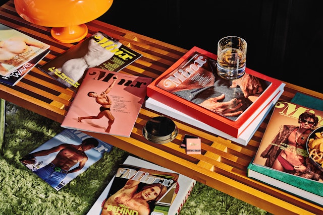
The show follows the birth and success of Minx the magazine over a series of issues, and the designers evolved the look of the publication as well.
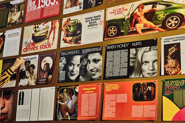


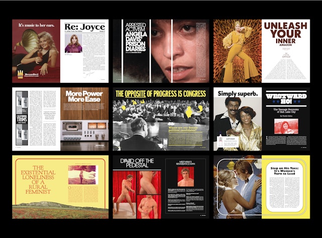
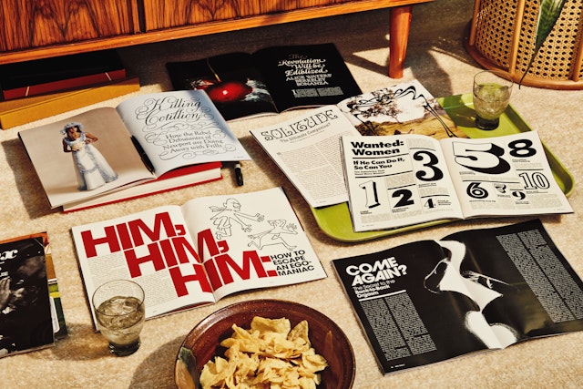
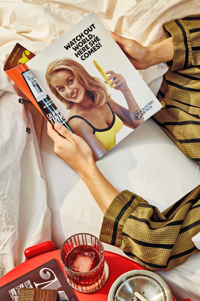
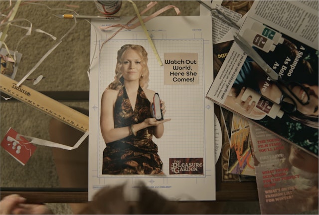

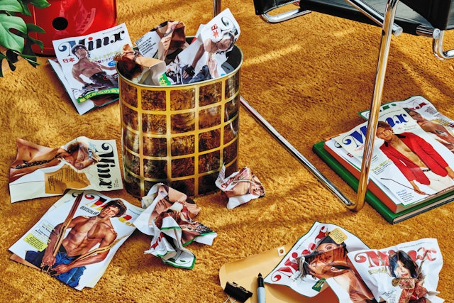

Along with the magazine, Pentagram consulted on other graphic elements seen in the show, contributing to a cohesive visual personality that is cheeky and fun.

In the title sequence, the Minx logo glides off the screen in trippy layers of 70s-inspired colors that change with each episode.
In the comedy series “Minx,” an earnest young feminist joins forces with a low-rent publisher to create one of the world’s first erotic magazines for women, also called Minx. Produced by Lionsgate Television, the series debuted on HBO Max before moving to Starz for its second season. Pentagram designed the namesake fictional magazine seen throughout the show—method-acting the part by immersing themselves in the world of the 70s feminist movement, publishing, LA and vintage erotica—and also evolved and refined the logo and created the title sequences.
Pentagram worked closely on the project with “Minx” creator and executive producer Ellen Rapoport, executive producers Paul Feig and Ben Karlin, and the show’s in-house creative department. The setting may be unusual, but the series offers a funny behind-the-scenes look at everything that goes into the making of a magazine, with the feminist editor-in-chief Joyce Prigger (played by Ophelia Lovibond) struggling alongside publisher Doug Renetti (Jake Johnson) and the rest of his crew from the aptly named Bottom Dollar Publications.
To develop the look of the magazine, Pentagram approached the project like any other editorial design, establishing a grid, selecting typefaces, and mocking up covers and issues. The team welcomed the opportunity to research ephemera from the era, including groundbreaking feminist publications like Ms., Spare Rib and Off Our Backs, and landmark titles such as Eros, Playgirl and Nova (designed by Pentagram’s own David Hillman). The designers also sourced additional retro 1970s imagery online.
Pentagram worked in tandem with the show’s producers and in-house team, receiving briefs for individual episodes and designing under tight deadlines—not unlike the magazine creators in the show, making last minute changes just in time for a shoot.
The design was meant to look like it stepped right out of the 70s, with graphic devices like justified body text, ornamental frames and borders, and saturated colors. The designers developed copy including headlines, deks, pull quotes and taglines, and created the comps and in-process galleys seen as the Minx editorial team reviews layouts. Pentagram also created specific spreads and print advertising that are highlighted as plot points, like the “Re: Joyce” editor’s letter, an infographic on birth control and the magazine’s first ad for a vibrator (“Watch out world, here she comes!”)
The show follows the birth and eventual success of Minx, and the designers thoughtfully evolved the look of the magazine as well, starting with relatively basic layouts for the first issue, then becoming more graphically sophisticated when the publication takes off—with detours into an overwrought holiday issue and Minx International edition that Joyce rejects.
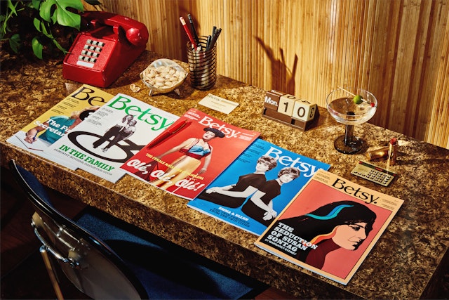
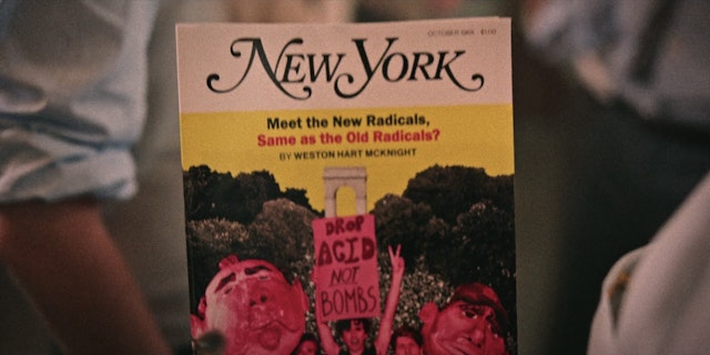
Along with the magazine, the Pentagram team worked on many of the other graphic elements seen in the show, contributing a cohesive visual personality that is comical and just a little over the top, in keeping with the cheeky tone of the series. These include the logo and covers for Minx’s rival Betsy, a faux Ms. magazine featuring famous feminists like Susan Sontag and Gloria Steinem; a bawdy fetish magazine from the Bottom Dollar portfolio called Feet Feet Feet; and the in-world ad campaigns. The team had the opportunity to pay tribute to the pinnacle of 1970s publication design, New York Magazine, with a fake cover that incorporated characters from the show.
Many of the period design cues are based in the show’s typography, which utilizes over 30 different fonts from the influential ITC library (now part of Monotype/Adobe) that evoke the funky, freewheeling late 1960s and early 1970s, including ITC Benguiat, Cooper Black and ITC American Typewriter.
The Minx logo is first seen being worked up by Joyce on a drawing board in the final moments of the pilot episode. For the title sequence, Pentagram refined this wordmark to make it more bold and powerful, and had it glide off the screen in trippy layers of 70s-inspired colors. Title cards for each episode are bespoke with a different color and one of the fonts used in the magazine design; end credits are set in classic ITC Avant Garde Gothic.
Office
- New York
Partner
Project team
- Laura Berglund
- Elizabeth McMann
- Renee Freiha
- Jase Hueser
- Elizabeth Goodspeed
- Beatriz Congar
- Dianne Kim
Collaborators
- Cody Guilfoyle, documentation photography
