

The exhibition design conveys the innovative spirit of the competition and creates an engaging and exciting environment for the featured works.


Presented by the New Practices Committee of the AIA New York Chapter, New Practices New York is a biennial competition that serves as New York City’s preeminent platform to recognize and promote new and innovative architecture and design firms. Pentagram has designed the competition graphics and exhibition for New Practices New York 2014 at the Center for Architecture.
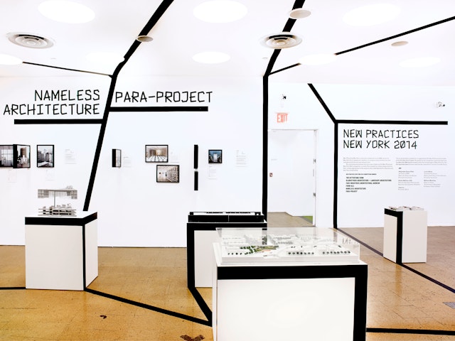
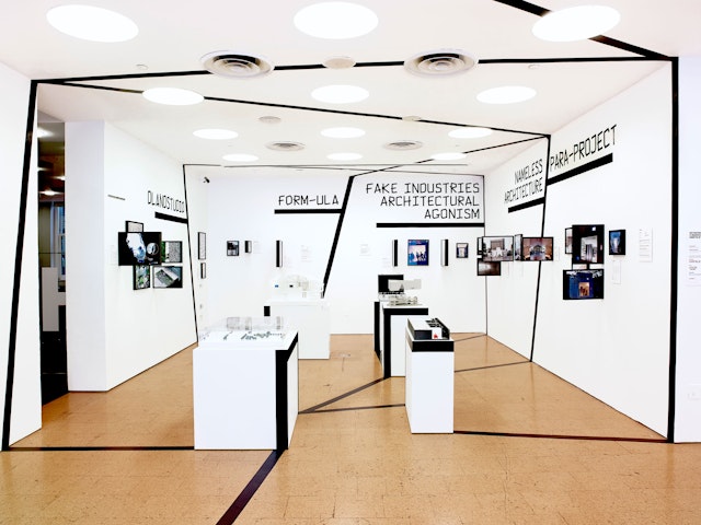
The graphics for the competition build on the identity Pentagram previously designed for the New Practices Committee in 2011. The logo presents a convergence of three lines: two come together to form a directional arrow, while the addition of a third creates a corner or symbol of dimensional space. This year’s New Practices New York competition has been organized around the theme “Action!,” and the design for the exhibition extends the strong black line of the logo into graphics that run across the walls and floor of the gallery to activate the space.
The New Practices New York 2014 exhibition design conveys the innovative spirit of the competition and creates an engaging and exciting environment for the featured works. The Center had a limited budget for the installation, so the designers had to find an inexpensive, easy-to-produce solution that was still impactful.
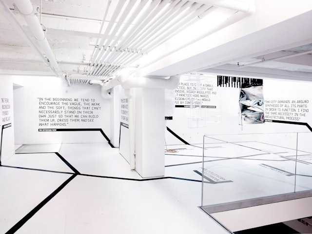
The lines running throughout the space have been created using black vinyl tape affixed to the walls and floor. Drawings and photographs are mounted in simple black frames (RIBBA from IKEA); some have been mounted perpendicular to the wall to create a dimensional effect. The fabrication may be the most cost-effective we've ever produced for an exhibition: the total cost of the frames was $382 (for 46 frames); the total cost of the tape was $253 (for 35 rolls).
The names of the six honored firms are linked with the images and models of their featured projects and quotes about their work. The mesh of lines resembles a network or the streets on a map, suggesting themes of connection.
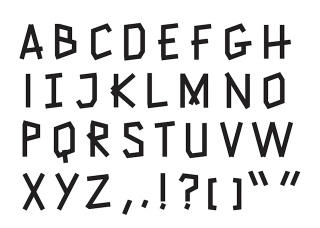
Vinyl-cut lettering was not feasible with the budget, so the designers developed a custom typeface based on tape lettering. Display typography for names, titles and quotes were directly affixed to the wall with black tape, with the letters formed according to the design of the font. The weight and size of the letters complements the original New Practices New York logotype, which is set in Gothic 13.
The competition announcement, invitations, exhibition catalogue and other collateral also utilize the lines of the logo. The three lines are used as dividers for triptych images of action that suggest graphic cubes or panels of comic books. Call-for-entries materials feature images of pop explosions, photos of people in action, and urban textures, while collages in the newsprint catalogue are formed of images of winning projects.
Office
- New York
