
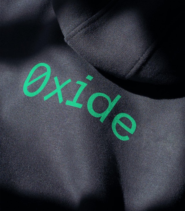
The Oxide logo appears in bright green on black. It features a slashed zero in place of the letter ‘O’ and a multiplication symbol in place of the letter ‘X’, both of which together reference hexadecimal.


The design team’s approach takes inspiration from TUI (Text-based user interfaces), CLI (Command line interfaces), and ASCII art, and has a subtle DIY gaming and retro computing vibe.
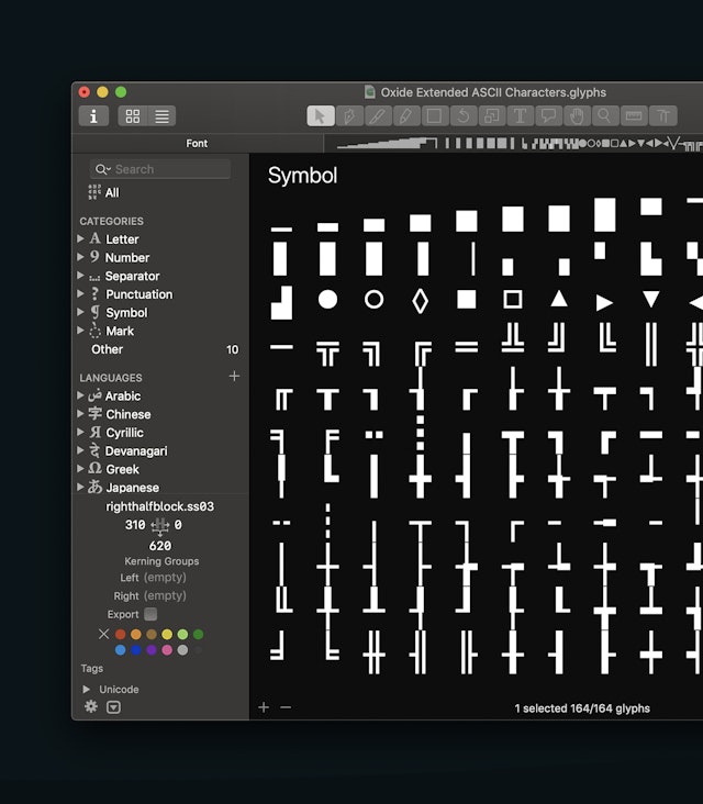
Working with Grilli Type, the design team created an extended set of characters, which were incorporated into a custom cut of GT America Mono, allowing Oxide to use the font for both typography and to create realtime illustrations on the website.
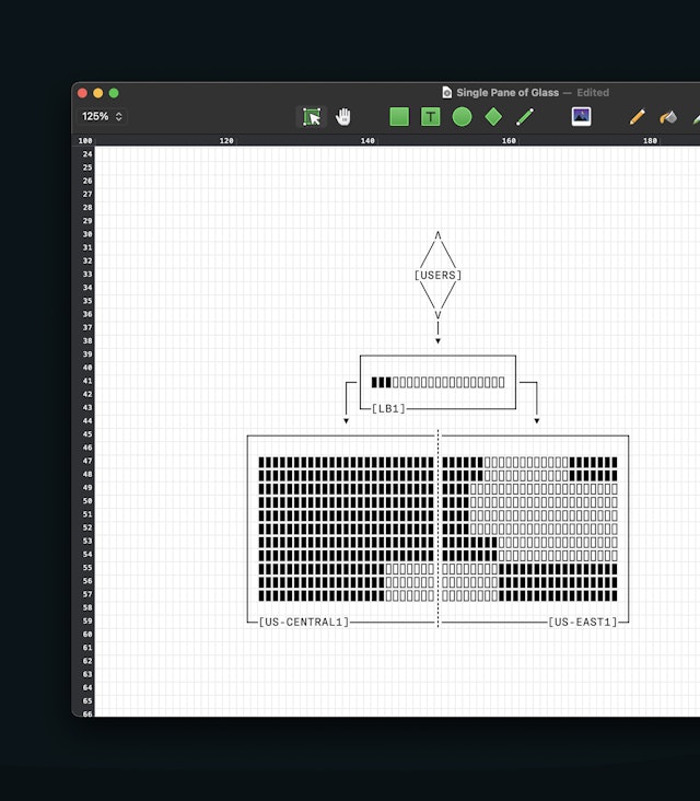


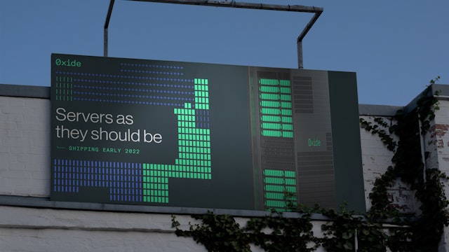
The ASCII-inspired visual language was also used by the design team to create a series of intricate grid-based patterns. These can be applied across many different applications, and also appear on Oxide’s hardware.

Pentagram has designed an identity that perfectly encapsulates Oxide’s holistic and very human approach to providing ‘servers as they should be’.


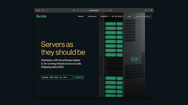
Founded in San Francisco by Bryan Cantrill, Jessie Frazelle and Steve Tuck, Oxide is a new, technology-driven company with a mission to provide businesses with servers that have the capacity and convenience of the cloud but come with the control and security of hosting on premises.
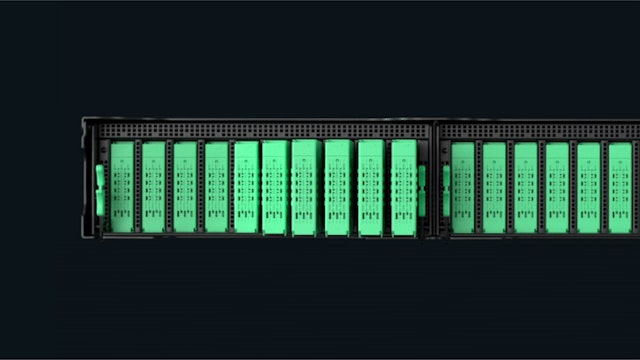
Many tech-heavy companies (including the fast-growing food delivery and ride-hailing apps) are now reaching a size where running in the cloud is becoming prohibitively expensive, and it makes more business sense to invest in their own infrastructure. Using a combination of existing open-source and bespoke components, Oxide aims to deliver a new type of rack-based server system where the hardware and the software are designed together, making it ideal for running infrastructure at scale.
Oxide approached Pentagram to create a brand identity and website which reflected its human and often irreverent approach and which would single it (and its offer) out from the established tech companies.
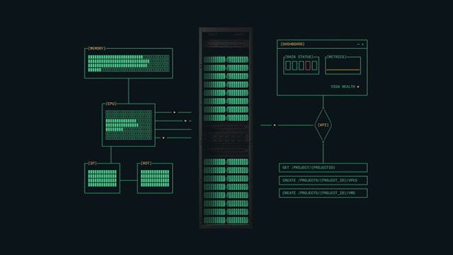
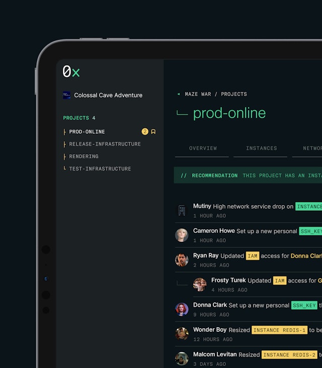
The design team’s approach takes inspiration from TUI (Text-based user interfaces), CLI (Command line interfaces), and ASCII art, and has a subtle DIY gaming and retro computing vibe. The identity features the Oxide logo, a saturated colour palette on black backgrounds, a set of bespoke icons, a series of animated network architecture diagrams and additional playful animations.
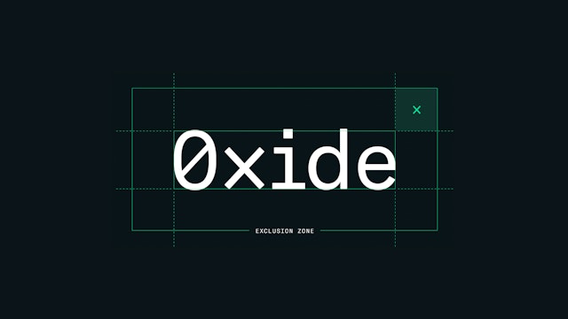
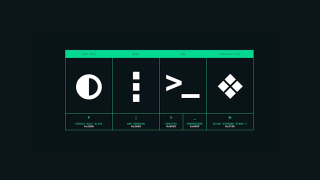
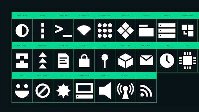
The Oxide logo appears in bright green on black. It features a slashed zero in place of the letter ‘O’ and a multiplication symbol in place of the letter ‘X’, both of which together reference hexadecimal. The logo also appears in a shortened version as ‘OX’ . The classic Swiss typeface Neue Haas Grotesk is used as the primary typeface throughout, with Grilli Type’s monospaced GT America Mono used for the more information-led features (such as the diagrams and the product user interface).
As GT America Mono lacks the necessary ASCII characters to be used in the Monodraw art editor, working with Grilli Type, the design team created an extended set of characters, which Grilli Type incorporated into a custom cut of GT America Mono, allowing Oxide to use the font for both typography and to create realtime illustrations on the website.
The colour palette comprises of oxide green alongside red, blue and yellow and appears on black backgrounds throughout. Colour is also used to improve functionality.
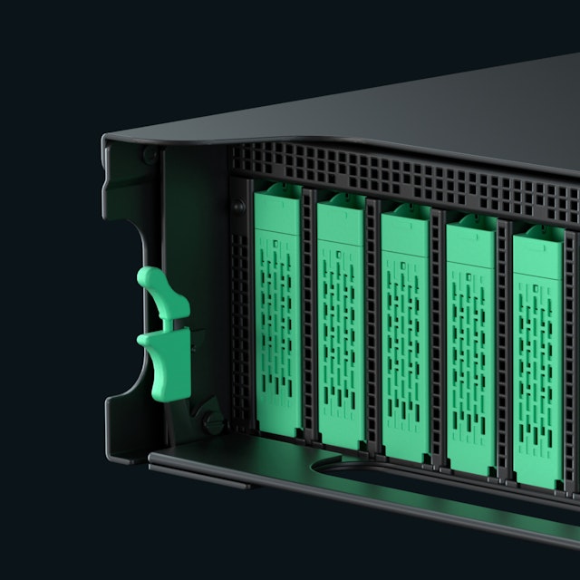
The identity has been applied to everything from the hardware to the software interface, across the website, social accounts and on all on- and offline marketing materials. The TUI, CLI and ASCII-inspired visual language is the standout feature of the identity, and appears everywhere from the Oxide marketing site to its product UI. The ASCII-inspired visual language was also used by the design team to create a series of intricate grid-based patterns. These can be applied across many different applications, and also appear on Oxide’s hardware, laser cut into the metal panels of each server rack unit.
As well as showcasing the company’s products, the website also hosts sections on Oxide’s mission statement and principles, a blog and its ongoing series of Podcasts ‘On the Metal’. Unlike many tech companies which feel anonymous and corporate, Oxide’s founders are keen for their people-centred ethos to be a key part of its offer, with a section dedicated to its Mission, Principles and Values which are loosely based on Scott McNealy's coda for Sun Microsystems, where Oxide co-founder Bryan Cantrill established his career.
Oxide provides a smart alternative to the established tech providers—its confident approach and attention to small details inspires trust in its customers. Using a design language that will appeal to its core audience of forward thinking tech-savvy users, Pentagram has designed an identity that perfectly encapsulates Oxide’s holistic and very human approach to providing ‘servers as they should be’.
Client
Oxide Computer CompanySector
- Technology
Discipline
- Brand Identity
- Digital Experiences
- Typefaces
Office
- London
Partners
Project team
- Ben Leonard
- Nav Bhatia
- Albert Sanjuán
- Luis Gutiérrez
- Serafim Mendes
- Amy Joycey
- Katee Hui
