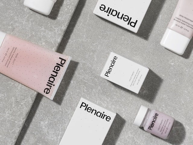
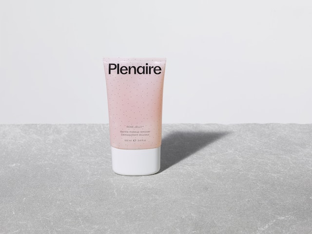
Plenaire was created as a direct-to-consumer brand for young people who seek out accessible luxury and a more modern, curated approach to skincare.



This sense of lightness and air is expressed throughout the identity, from the custom typeface and the graphic language employed.
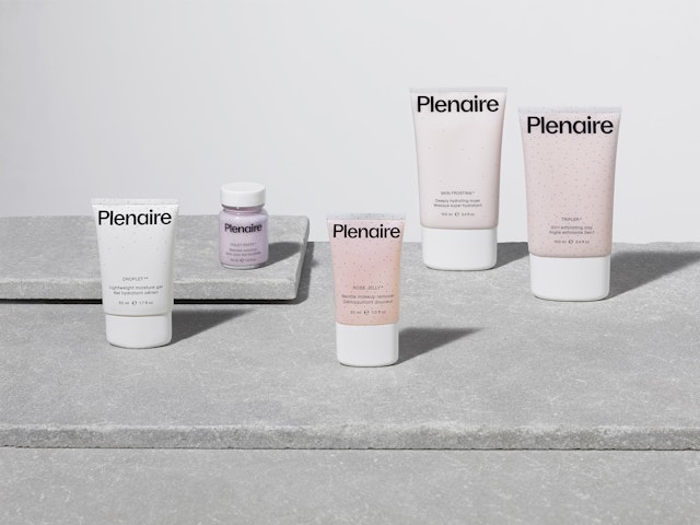
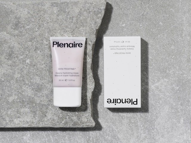
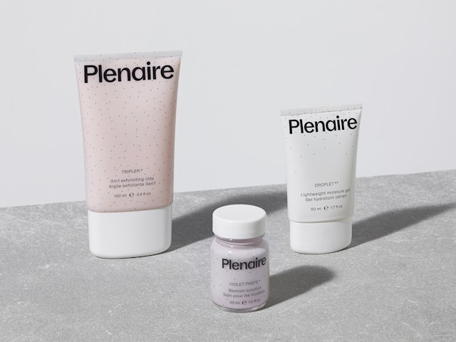
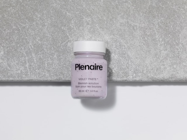
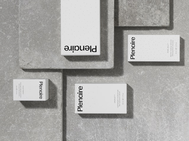
Plenaire is a new ethical skincare brand with a mission to create a range of inclusive, aspirational products for young consumers at the start of their skincare journey. Unlike many existing skincare brands which focus mainly on science, Plenaire actively promotes emotional wellbeing and self-care. Designed to appeal to Generation Z but sure to have a universal appeal, Plenaire was created as a direct-to-consumer brand for young people who seek out accessible luxury and a more modern, curated approach to skincare.
The brand aims to recreate the classic coming-of-age skincare rituals with a launch collection of eight unique products. These celebrate natural beauty and only use ingredients that are kind to sensitive skin and free from raw materials that are widely considered to be harmful or toxic. Plenaire’s products and packaging are all sustainably made and sourced in the UK.
The visual identity created by Pentagram takes its cue from the brand’s name, which derives from the French expression plein air, meaning ‘in the open air’. Painting ’en plein air’ was an approach adopted by the expressionist painters of the nineteenth century, where scenic landscapes were captured outdoors, using natural light.
This sense of lightness and air is expressed throughout the identity, from the custom typeface and the graphic language employed, to the colour palette, photography and materials chosen for the packaging.
Plenaire’s typeface is a custom version of La Nord. The sans serif was named after a beach on the coast of southern France, which is known, ‘both for its relentless surge as well as its fragile nature,’ and the typeface captures this through the contrasting weight of its strokes.
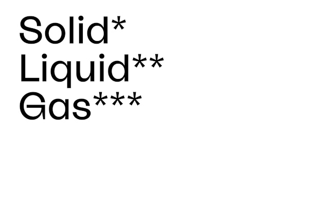
Each product is associated with one of three essential skincare routines; that cleanse, relax and energise. These three functions are represented by a pattern of particle densities. In addition to the patterns, a system of asterisks is used to differentiate the state of matter of each product. The three elements; solid (*), liquid (**) and gas (***) are then stacked in a triangle formation to create the distinctive Plenaire brand symbol – this is designed to complement the wordmark, and is used as a social media icon and within the system to divide content.
The Plenaire brand colour is a light violet, named ‘Cresyl’ after the purple histological stain cresyl violet, which is used by scientists to identify cells under the microscope. It is used as an accent throughout the identity; on its packaging, on social channels, and on the Plenaire website. Photography also plays a large part in the brand identity, and models are shown in a relaxed pose, captured in the moment and radiating a free-spirited and very natural beauty. As well as the art direction, Pentagram worked closely with the client to produce Plenaire’s packaging, including the box, cartons, and bottles which were all produced to strict environmental standards (a prerequisite for its young and engaged consumers).
The packaging comprises of six different formats and is minimal without feeling clinical, with the text stripped back to include only the mandatory information and printed with black print applied directly to the transparent bottles. Tiny ‘particles’ appear throughout the packaging and over photographs, adding a delicate, organic feel and tying the elements of the identity together.
Office
- London
Partners
Project team
- Margherita Papini
- Laura Chan
- Jack Llewellyn
Collaborators
- Raoul Gottschling, Typeface
- Zero Studios, Web Design
- Beate Sonnenberg, photographer
