Ro Derm wants to bring clarity and control to the world of dermatology by shifting the focus to each person’s individual skincare goals.
The look and feel of the brand is clear, simple and direct, to reinforce the idea of ‘clean beauty’ and transparency around ingredients and treatments.
The brand strategy presents Ro Derm as approachable, empowering and accessible, offering patients a simplified experience that meets their needs and fits their lifestyle.
Ro Derm is the prescription dermatology platform from the healthcare technology company Ro. With a mission to make dermatologic expertise accessible to all, the direct-to-consumer skincare line offers products and services that are tailored for each person’s needs, dermatologist designed, and backed by science. Pentagram has developed brand identity, brand strategy and messaging for Ro Derm that reflects this customized approach with a flexible system that can be applied across promotional campaigns, packaging and social media.
The fast-growing Ro has revolutionized virtual healthcare with a series of digital clinics that offer patients individualized care through the convenience of telehealth sessions with licensed medical providers. Its best known brand is Roman, its original platform for male sexual health. This has been joined by Ro Mind, for mental health, and Zero, to quit smoking. As Ro Derm became part of this growing family, it needed a brand identity that would fit in with Ro while also setting the skincare line apart in its product category.
The Strategy
With all of the recent advances in skincare, Ro Derm wants to bring control and clarity to the world of dermatology by shifting the focus to each individual person’s goals. Everyone’s skin––and skin journey––is different, and the brand positions itself as patient-centric. At the same time, it seeks to democratize dermatology and appeal to as wide an audience as possible, from skincare specialists, or “skintellectuals,” who are up on every new ingredient and treatment, to more pragmatic individuals who just want to look after their skin as part of their personal self-care routines.
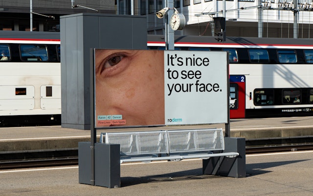
The brand strategy by Pentagram presents Ro Derm as approachable, empowering and accessible, offering patients a simplified experience that meets their needs and fits their lifestyle. The verbal identity is witty and irreverent, but grounded in medical care and honesty. This is reflected in a playful tagline––“We love all types”––and messaging that coaches patients with a sense of humor that helps make uncomfortable topics easier to discuss.
The Solution
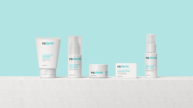
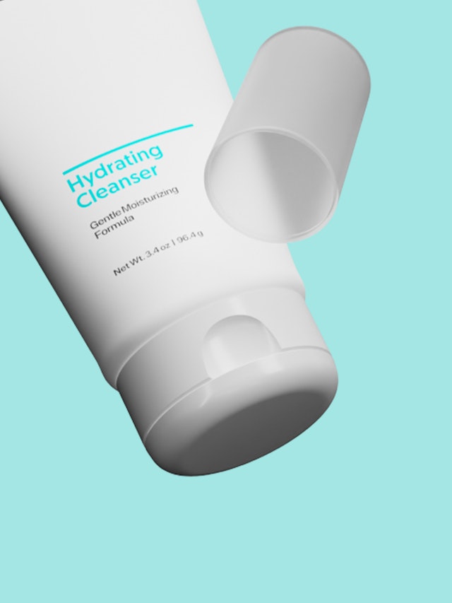
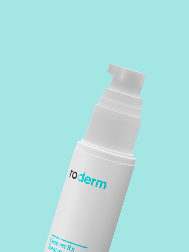
The look and feel of the brand is clear, simple and straightforward, to reinforce the idea of “clean beauty” and transparency around ingredients and treatments. The wordmark builds on the existing Ro logo by using it as an anchor for the dermatology vertical, which is highlighted in a different color. Like the skincare system, the identity is composed of various elements that are at their strongest when used in combination. Ro Derm is built around the idea that each patient’s recommended routine should be individually customized, and the branding can be modulated across various applications.
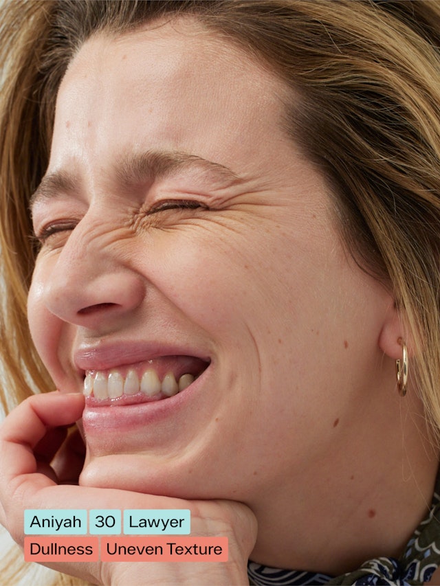
These elements include color-coded textual tags that describe various conditions and ingredients––a way to hint at the technology behind the product, as well as the transparency. A series of custom graphic icons use a cross-section of skin to illustrate micro-level interactions and treatments, and bands of images appear in copy to visually describe actual skin conditions. Photo direction emphasizes the natural and unabashedly authentic, with portraits of real patients and documentary-style photography of ingredients.
Office
- New York
Partner
Project team
- Veronica Hoglund
- AJ Kim
- Daniel Koppich
- Lynn Sohn
Collaborators
- Corey Lewis, strategist
