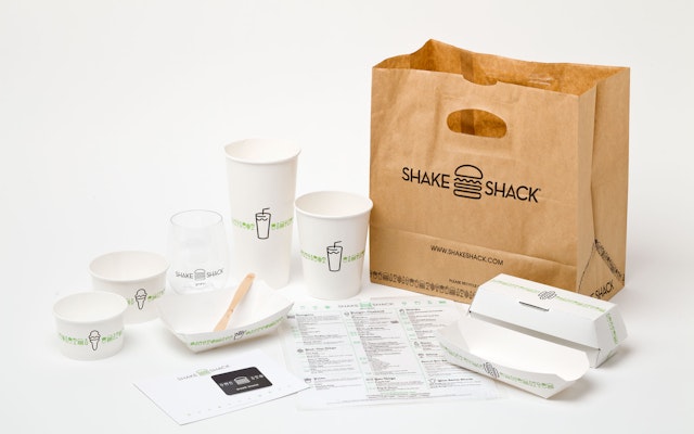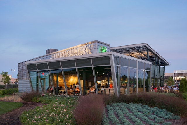


The graphics have responded to the chain's growth with a flexible system that can be adapted to different sites around the world, from stand-alone restaurants to locations at airports and stadiums.


As every Shackburger fan knows, Shake Shack serves some of the best burgers in the world. And now, with a recent IPO that has valued the company at a staggering $1.6 billion, more of the world will get to know the Shack: from its roots as a hot dog stand in New York’s Madison Square Park, the company has grown into a chain of 63 restaurants from Chicago to Dubai, and plans to use the additional funds to expand to over 400 locations in the next decade.
Tastiness of its burgers aside, no small part of Shake Shack’s success is due to its sophisticated sense of design, expressed in an iconic brand identity and environmental graphics by Pentagram and original restaurant architecture by James Wines and his firm SITE. (Shake Shack even noted its fantastic brand awareness as an asset in IPO prospectus.)
Founded by New York restaurateur Danny Meyer and his Union Square Hospitality Group, Shake Shack is inspired by roadside stands that offer simple food like hamburgers, hot dogs, shakes and fries, but made with premium ingredients. The concept has resonated with consumers: as traditional fast food chains like McDonald’s have stumbled, Shake Shack has notably thrived. Pentagram's branding has helped establish the inviting visual personality of the Shack. Originally conceived for a single location, the graphics have responded to the chain's growth with a flexible system that can be adapted to different sites around the world, from stand-alone restaurants to locations at airports and stadiums.
Like the High Line—another project with an identity by Pentagram—Shake Shack started as a relatively small local initiative that blossomed into an globally recognized brand. The first Shack was conceived as an installation to help support the refurbishment of Madison Square Park. Beginning in 1999, the Madison Square Park Conservancy led a major effort, supported by local businesses and public funds, to restore the park to its 19th-century luster. The park is located across the street from Pentagram’s New York offices.
Meyer was a charter member of the conservancy, and in 2003 successfully staged the first Shake Shack trial run with a hot dog cart, leading to the permanent kiosk located at the southern end of the park, across from the Flatiron Building. Opened in 2004, the kiosk was designed by Wines and his team at SITE as a riff on the American hamburger stands of the 1950s and 60s, but in one of Manhattan’s most famous 19th-century parks. Structurally the kiosk combined the triangular forms of the Flatiron Building with the open-aired efficiency of the roadside food stand, topped off with a garnish of foliage: the cantilevered trellis over the service windows, the inclined roof, and the structure’s back wall were all covered with English ivy.
“The iconic ‘edginess’ of the kiosk was a result of juxtaposing 1950’s and 60’s roadway imagery with a pastoral urban park,” says Wines.
Pentagram's graphics for the original kiosk displayed a visual sophistication appropriate to the area, which unofficially might be called New York’s design district, given its concentration of studios and firms. The signage combined the aesthetics of the area’s art deco “23 Skidoo” heyday with the direct appeal of the typical fast food stand. The signage typography was designed to look playfully heroic in terms of scale: “Shake Shack” was rendered in Coney Island-sized letters across the roof, but in elegant and modern stainless steel. Set in Neutraface, this initial logo still appears as exterior signage on all the Shacks around the world.
A smaller typographic relief running around the rim of the trellis listed menu mainstays like shakes and burgers; the letters were pin-mounted for the illusion of depth. “The food items list cantilevered over the park space in the form of an I-beam sculpture—or more specifically, the ‘menu as the building,’” says Wines. “The perforated zinc façade material was intended to reflect the color and rib-like surfaces of the Flatiron Building.” These elements have been carried over to all the Shacks.
The kiosk proved an instant success, drawing Shackburger fans into the park for lunch and for dinner, on weekends and even on rainy days. Describing its fare, one reviewer called Shake Shack “the Dom Perignon of hot dog stands.”
When Meyer decided to open a second Shack on Columbus Avenue in Manhattan’s Upper West Side in 2008, the challenge was translating a design originally intended as an architectural intervention in an urban park to a less distinctive venue. The environmental graphics became the key for creating a consistent experience.
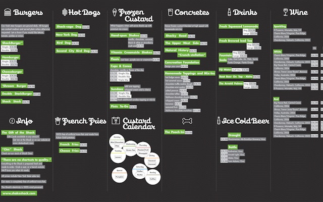
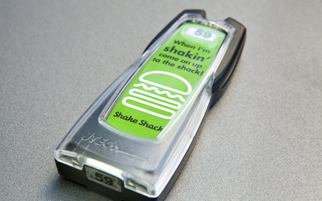
With future expansion in mind, Meyer asked Pentagram to design a new iteration of the Shack identity that looked more like “fast-food retail” but still maintained a clean, modern aesthetic. The designers developed a system of curvy, neon-like icons of menu items, accompanied by script type set in Galaxie Cassiopeia. The team also designed a format for the menu boards, which serve as the graphic focus in all of the restaurant interiors. Futura is used as the secondary typeface. Meyer’s in-house team has applied the identity to swag like t-shirts, hats and watches, helping to build the restaurant’s cult-like following.
Whether in Tokyo, Miami, London or Doha, the identity communicates the Shack spirit and helps tie together a brand that has become shorthand for the growing category of upscale, fast-casual dining.
Client
Shake ShackSector
- Food & Drink
Discipline
- Brand Identity
- Signage & Environmental Graphics
- Packaging
Office
- New York
