


The wordmark has been redrawn to appear stronger, friendlier and more modern, with softer curves and fuller letterforms.


The design plays with the sizes of images to create a dramatic sense of scale, while rules between columns keep everything feeling organized.

Stern ("Star") is Germany’s most widely read magazine and one of the world’s best newsweeklies, balancing in-depth journalism about current events with arts, entertainment and lifestyle reporting, all accompanied by extraordinary photography. Pentagram collaborated with Stern on a redesign that updates the look and feel of the magazine for a modern audience. The designers worked closely with the magazine’s editor-in-chief Dominik Wichmann and art director Johannes Erler to develop the format.
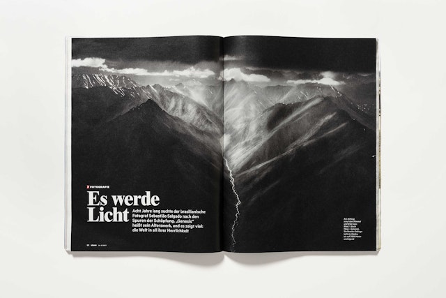
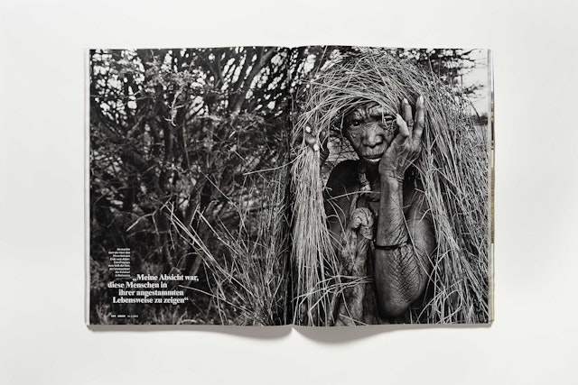
Founded in 1948, Stern is published by Gruner + Jahr and has a weekly circulation of 1 million and total readership of about 8 million. It mixes serious journalism about politics and social issues with softer features on celebrities, home life and travel. The publication is perhaps best known for its award-winning photojournalism—it's what Germans call “eine Illustrierte” (“an illustrated”)—and every issue is filled with striking images in photo essays, articles and a “pictures of the week” section.
The Stern refresh is rooted in the DNA of the magazine and its brand. The designers looked back at old issues for inspiration, particularly from the magazine’s “golden age” of design in the late 80s. The update builds on the existing format to create a design that is smart, lively and accessible.
The redesign includes an update of the iconic Stern masthead. The magazine’s famous white star logo remains unchanged, but the accompanying wordmark has been redrawn to appear stronger, friendlier and more modern, with softer curves and fuller letterforms. The logotype was revised by Ludwig Übele, who also designed the Tundra typeface.
The redesign employs a grid that is simultaneously more complex and more freeing. The existing layout has been replaced with a more detailed and flexible 10-column grid that opens up the pages to new possibilities. The narrow columns allow for more white space and a greater mix of elements like sidebars, infographics, and pull quotes that provide entry points for the reader. The design plays with the sizes of images to create a dramatic sense of scale, while rules between columns keep everything feeling organized.
The magazine's typography has also been freed up. Inspired by distinctive layouts from '80s Stern, headlines and decks wrap around each other in a way that is both sophisticated and playful. A mix of more readable fonts was selected for the update. The display fonts used for cover lines, section titles and headlines are Soft Press, Metric (originally inspired by street signage in West Berlin) and Nimbus Roman No. 9. Text is set in the Tundra family.
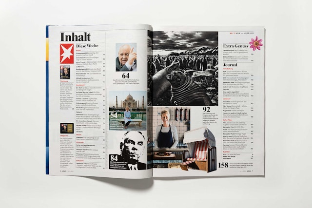
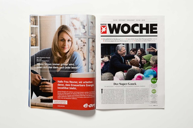
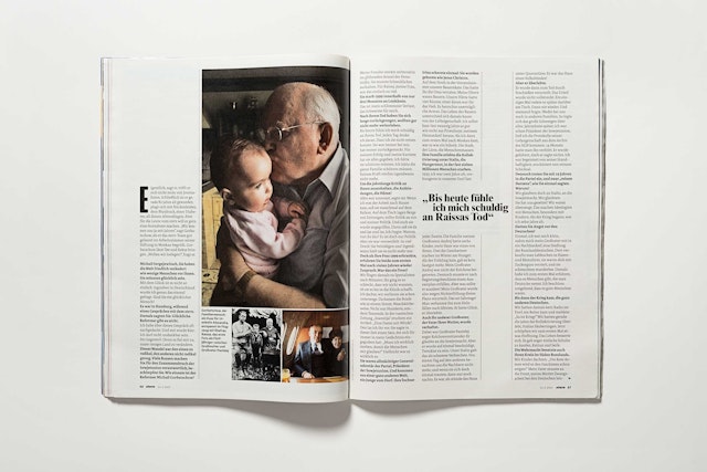
The designers worked with the editors to organize and refine existing departments and introduce new sections. The magazine continues to open with “Bilder der Woche” (“Pictures of the Week”), its signature photography section that presents images in cinematic double-page spreads. The photo portfolio leads into a revamped front-of-book section called “Diese Woche” (“This Week”) that features updates on current affairs, short columns and profiles.
The updated “Diese Woche” introduces strategies used throughout the redesign that help readers navigate the magazine. Sections are announced by opening pages with their own masthead typography; the type treatment is slightly different for each section, to reflect its individual sensibility. The opening pages function as anchor points in the sequence and flow of the magazine.
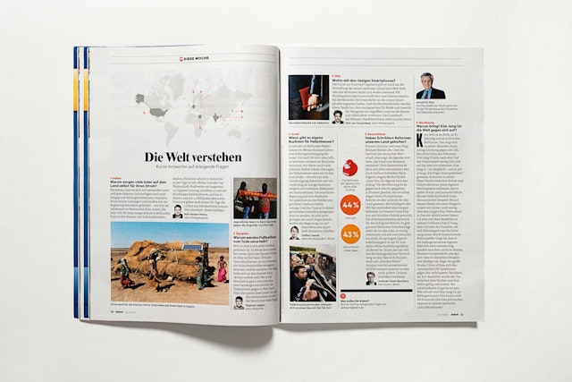
The weekly “Blick in die Welt” (“View of the World”) spread on news around the world has been retitled “Die Welt verstehen” (“Understanding the World”), and the slightly ballistic arrows indicating where news has taken place on the globe replaced with a more refined number key.
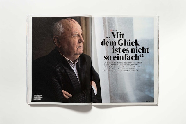
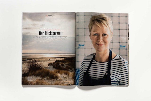
Following “Diese Woche,” the magazine opens up into its features well, where the magazine’s trademark in-depth reporting and high-quality photography are on full display. Here the new grid is used to create a different setting for each story; tightly designed columns of text for a political piece give way to open, elegant layouts for a photo essay.
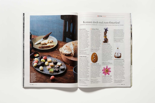
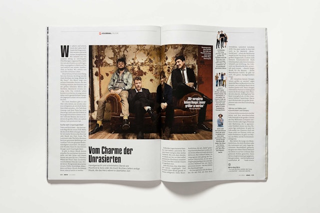
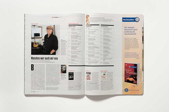
The “lean forward” news sections of the front-of-book are balanced by “lean back” sections at the back of the magazine that focus on home life and weekend leisure. The designers and editors developed a new service-themed section called “Extra” with a rotating focus on subjects like food, finance, fashion, and cars. The magazine closes with another new section, “Journal,” devoted to film, television, books, music, art and travel.
Office
- New York
