It was clear from the first conversations that SSG required a new brand language that would represent the knowledge and expertise they bring, and the truly visionary way they work.


SSG now radiates with boldness and depth—smart textures and patterns working together to reflect the intelligent identity of a true collective.


Highly regarded and well-known Sustainability Solutions Group (SSG) is not your typical climate consultancy. They don’t only create climate action plans and implement them—they shape the future of cities and communities through a radically collaborative, deeply values-driven way of working. As a worker-owned cooperative rooted in climate justice, SSG’s philosophy of sustainability isn’t just about lowering emissions—it’s about redesigning the systems we live within.
SSG came to Pentagram not just for brand expertise, but specifically for the studio's body of work in sustainability. Projects like Water Matters for New York's Department of Design and Construction, with the overall design and use of infographics that enabled it to be enshrined in city regulatory law; GeoThermal Heat Pump Manual, a guide that laid the groundwork for sustainable city policy; Toronto Tomorrow, a masterplan by Sidewalk Labs that would transform the city’s eastern waterfront into one of the most innovative districts in the world; and the book design for Terra Nova by Eric W. Sanderson that envisions and illustrates the United States without a dependence on oil, automobiles, and urban sprawl. This body of sustainable design work demonstrated a commitment to meaningful content as well as exceptional design—for SSG, this alignment of content and form was essential.
The Challenge
Despite leading the field across the Americas with more than 200 climate action projects—from municipalities to universities—SSG’s overall messaging and positioning didn’t match that of the established consultancies. The Big Four have pivoted aggressively into sustainability as an add-on service, which stands in stark contrast to SSG’s decades-long sole focus and expertise in sustainability.
SSG’s existing method of communication leaned heavily on standard corporate tropes: blue hues, unpolished, unconsidered typography, irregular and inconsistent method of representing vital data visualizations and infographics, a cacophony of layouts, positioning and messaging all leading to confusion and dilution of what should be a standout brand.
“Nothing is mandatory at SSG,” one member noted. “So people kind of do their own thing.”
Their overall design system lacked cohesion, energy, and distinction, it lacked the necessary personae to capture and express SSG’s singularity in the marketplace—a worker owned coop with deep and proven expertise entirely dedicated to sustainability. It did not reflect their radically collaborative approach.
It was clear from the first conversations that SSG required a new brand language that would represent the knowledge and expertise they bring, and the truly visionary way they work.
This understanding of the existing challenges included the one inherent in working with a collective: decision-making at SSG is cooperative and consensus-based. Everyone has a vote, meaning the new system would not be a top-down redesign with built-in, hierarchical decision-making structures. Every member was heard and represented. How could a complex design process accommodate this unconventional structure and still arrive at a focused, striking result?
The Strategy
Pentagram knew the brand identity would have to transcend aesthetics and typical methods. It needed to stand out and embody SSG’s distinctive collective approach. It had to be—deeply participatory.
Through key interviews with the team, a powerful theme emerged: “radically collaborative.” This wasn’t just a way of working. It became a strategic call that would echo across its wordmark, and flow from there to inspire typography, iconography, data visualization, photography, and color.
“You think of sustainability and calming, pastel shade colors and trees, and all that is fine,” explained SSG’s Principal and Senior Modeller, Marcus Williams during key interviews. “Well, what we’re actually trying to do in a lot of cases is shake stuff up…we’re trying to disrupt.”
Throughout the research Pentagram heard SSG members say that the current brand failed to capture who they are at their core: We’re not really representing ourselves effectively as a co-op, clients are confused about who we are as an organization.
“The co-op is a microcosm of our values,” explained Principal Rebecca Foon. What we want to show is how we work: collaboratively with energy and passion. We want people to feel the difference we bring, deep expertise in sustainability and a new way of working. SSG co-creates, it’s in our DNA, our structure, how we work also speaks to who we are.
And “the importance of not just being the experts, but thought leadership,” added Peter Hough, External Director and SSG Senior Associate.
The time was now with an urgent need as SSG and WhatIf Technologies merged, further deepening their expertise and offerings.
“Design is more than just how things look,” said SSG’s Engagement and Design Lead, Naomi Devine. “Design is understanding. SSG has always brought a unique, innovative, and bold vision to the table….we want people to see right away that we are serious about solving the most significant problems of our generation.”
The team also emphasized the need for clarity and accessibility to a broader audience. SSG’s work speaks to city leaders, public institutions, communities, and individual citizens. Sustainability, after all, belongs to everyone—and so another strategic lens emerged.
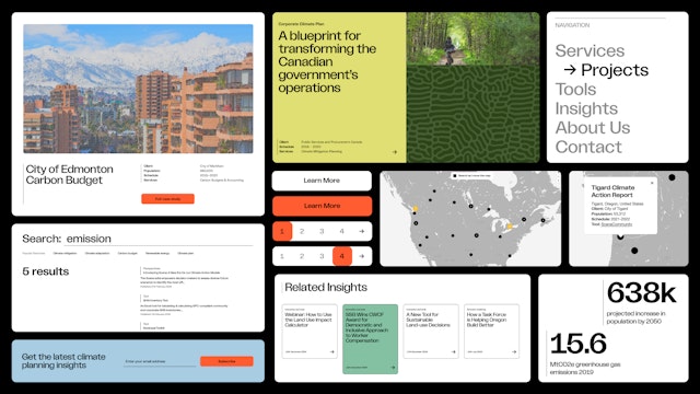
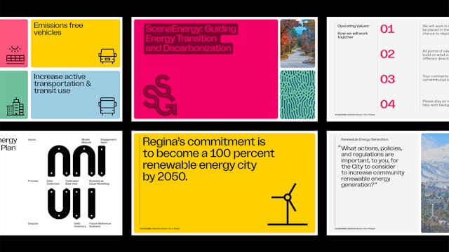
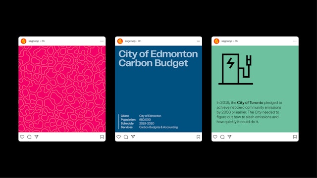
With that, a new vision came into focus. The design framework needed to be: edgy and energized, editorial in tone with striking use of type, color, form and imagery. Delivering complex information with clarity, applying texture, and layers drawing from illustrative charts and expressive data visualizations and infographics, nothing stock or generic. All this and it had to encompass an improved workflow for content and documents for all report creation across a growing company.
Pentagram set out to build not just a brand identity, but a cohesive and expansive visual language. A system of storytelling tools that could unify SSG’s diverse outputs—from detailed reports to web pages to public presentations—under one powerful, recognizable voice and visual set of narrative tools.
The Solution
A transformational leap for SSG: a vibrant, ownable aesthetic that shatters the visual norms of the sector and expresses an internal set of differentiated values. SSG now radiates with boldness and depth—smart textures and patterns working together to reflect the intelligent identity of a true collective.
More than a new brand identity, the visual system and its language captures that SSG is “...working on transformational projects that have impacts,” says Naomi Devine.
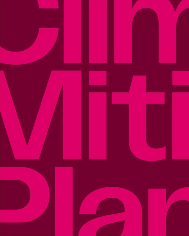
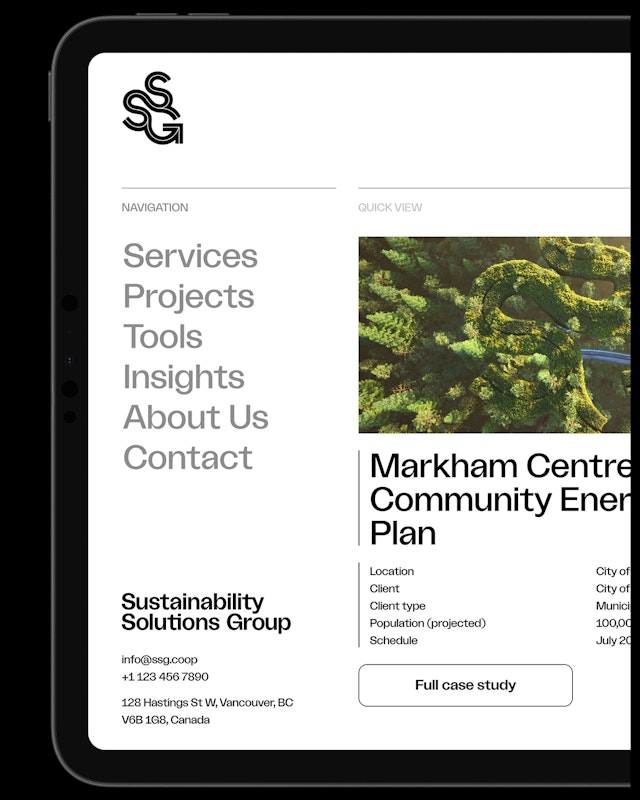
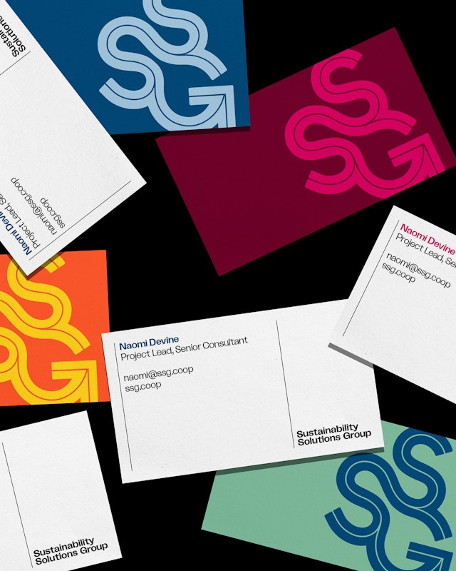
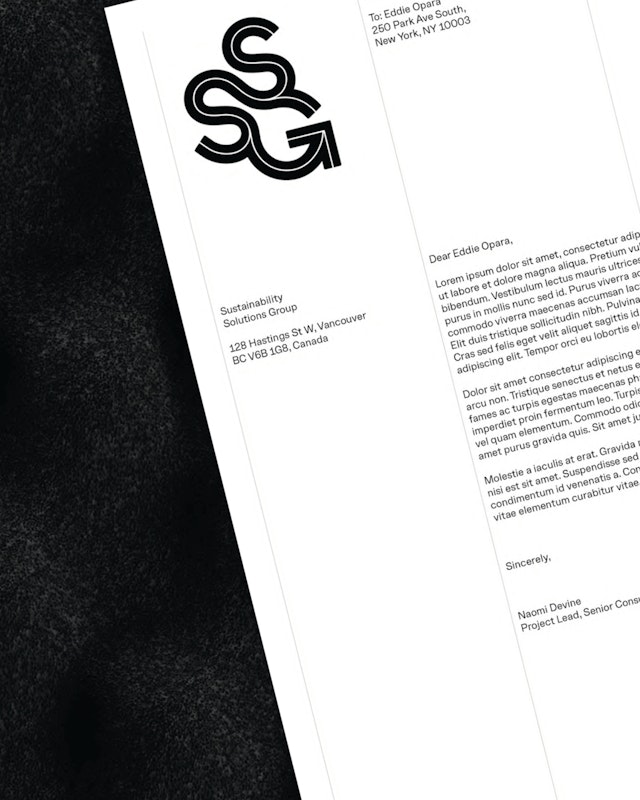
At the core of SSG’s new brand system is Ciron—a contemporary grotesque, variable typeface designed by Pentagram alumnus Raoul Gottschling. Ciron is smart, confident, and versatile— offered in a range of weights. Ciron Classic, Regular to Extra Bold, this typography aligns with the refreshed feel: striking, editorial, and intentionally built. It loads efficiently, drawing less energy, and reinforcing SSG’s core values and purpose: impact through sustainability.
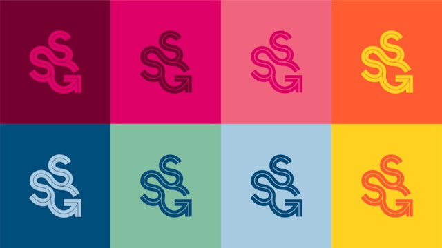
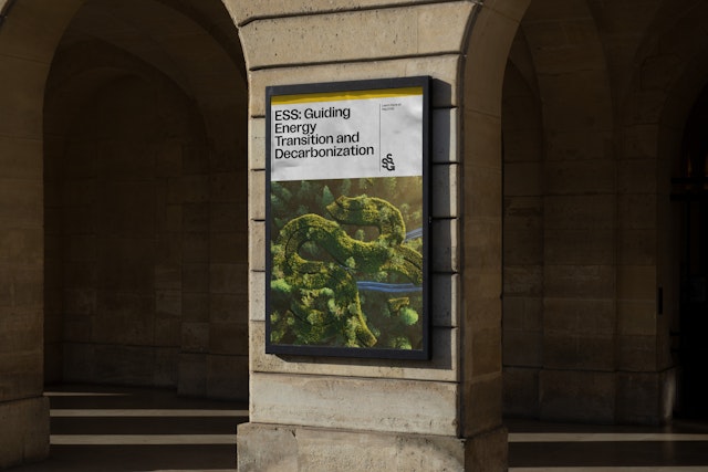
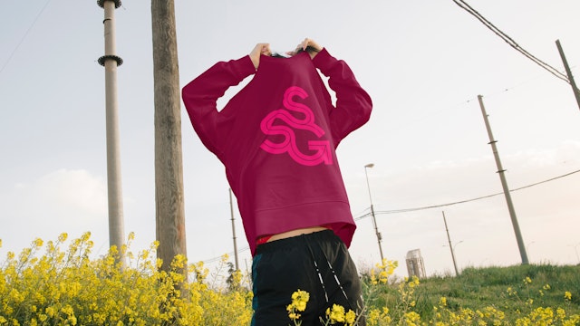
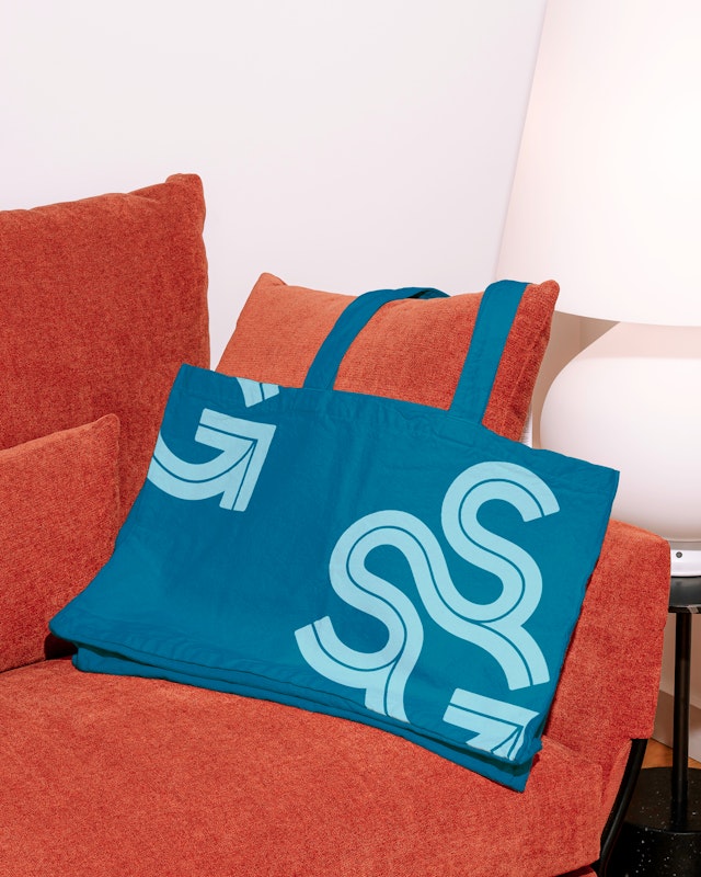
From here Pentagram turned its focus to the logomark. Inspired by the interconnected systems of the natural world, letters S-S-G intertwine. Through it, a visual pathway emerges, leading upwards towards a new and revolutionary way forward. The mark acts as both image and message with generative elements like a 3D logo animation with a purpose of introducing the brand to those who don’t yet know it. This brings flexibility to the system, and the brand to life. These dynamic design elements evolve as the work evolves—mirroring the adaptive nature of climate action itself.
“It’s easy to get lost in the data of climate change,” Devine reminds us “but inspiring action necessitates that the story of opportunity is communicated with every point of data we share. Our brand has recentered experiences and feelings back to the climate action conversation.”
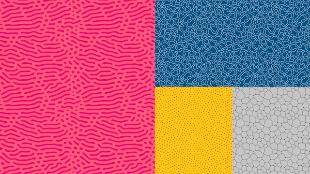
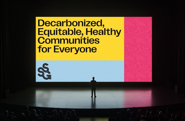
Feelings provoked through movement like the mark’s animation, use of color, patterns, and textures inspired by nature. The colorful palette draws from a spectrum of energetic, optimistic, and unconventional tones that reflect the spirit of change. This color system, which includes multiple color pairings, pulses with immediacy—just like the need for climate action. A library of graphic shapes, iconography that plays with line weight on an extensible unit grid, and a flexible pattern library that lends dimensionality and tone across all collateral, provides for individual expression within a defined feel.
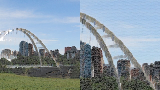
Using a scalable technique combining photography with computational effect derived from the information graphic assets, a reflection of topographic mapping and landscapes emerge—impressionistic illustrations with artistic warmth and depth.
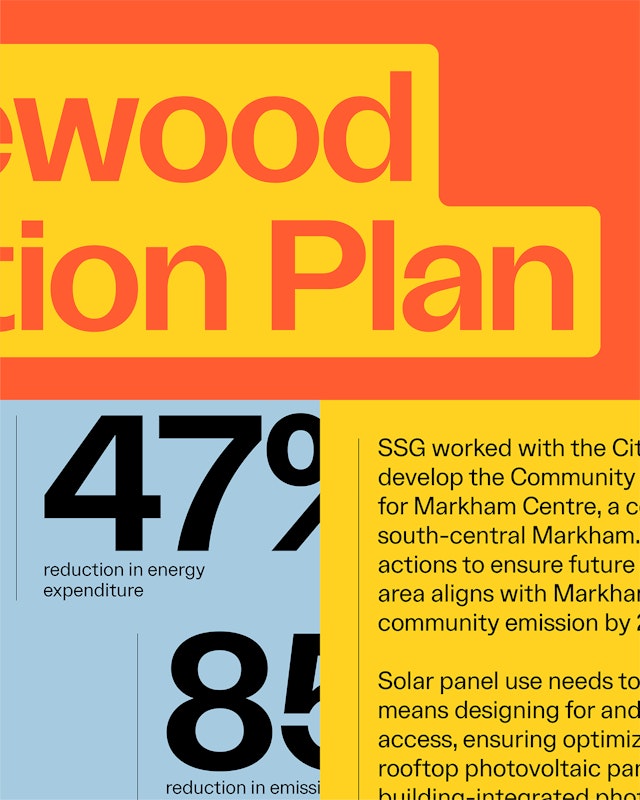
Charts aren’t just data—they’re clear, impactful statements. Infographics are rendered with a distinctive aesthetic designed as a smart, modular system composed of a large library of assets.
Central to the system is a unified storytelling method that shapes every expression of the brand identity: logomark, typography, iconography, data visualizations, 3D animations, photography, pattern and graphic libraries, and the colors. Whether it’s a municipal roadmap or a campus climate plan, a billboard, brand merchandise, letterhead, social media—SSG’s materials now feel like editorial pieces: structured, impactful, and emotionally rendered. They’re designed to move both the mind and the heart—because, as SSG sustainability researcher Ann Dale reminds us, “beauty is really important… if you can engage both the mind and the heart, you move to action.”
The new system gives people a way to do their thing—together. It offers consistency without conformity. Expression within a cohesive visual structure. “It’s helping us stand out from other companies in our space and reflects our bold vision and goals,” says Alia Dharssi, Director of Marketing and Communications.
A Mark of Distinction
The new SSG identity doesn’t just look different—it feels different. It articulates who they are: a transformative, energetic collective reshaping how we think about climate, how we can work collaboratively in community, for the future of our cities.
“Our rebrand had three goals,” explains Devine. “First, to signal to the marketplace that SSG and whatIf? Technologies had merged under the SSG name, creating a stronger organization focused on climate action planning and implementation. Second, to create a new identity inclusive of our newly formed team. And third, to update our brand to better reflect our leadership, innovation, and ambition in the climate action space.”
In a field crowded by lookalikes, SSG stands out as bold, ownable, and unmistakably itself. An organization that doesn’t just make plans, but co-creates change.
Dharssi agrees, “It’s bold, fresh, vibrant, and hopeful—that represents who we are and our hopes to improve the world.”
The identity doesn’t just reflect SSG’s history; it brings forward the spirit of collaboration that defines their work. It translates collective values into a cohesive presence, capturing how SSG works with communities, not just for them, but together.
Sector
- Manufacturing & Industrials
- Civic & Public
Discipline
- Brand Identity
Office
- New York
Partner
Project team
- Jun Park
- Ruairi Walsh
- Brankica Harvey
- Issabella Hindley-Cupper
- Dana Reginiano
- Sami Duskis
Collaborators
- Hannes Weikert, animator
- Chris LaVigne, web development
