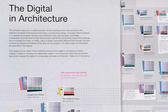
The timeline maps out the key developments that were pivotal for the trajectory of digital thinking and technology in architectural design.


The visualization has been conceived for print, taking advantage of the large scale of the tabloid-sized report to unfold into an immersive, poster-sized design.


“The Digital in Architecture: Then, Now and in the Future” is a special report produced by SPACE10, IKEA’s research and design lab, that looks at the ways in which innovations in digital tools for design and fabrication in architecture have contributed to the built environment today. Pentagram’s Giorgia Lupi and team have created a data visualization for the report that explores the history of buildings, movements and tools that influenced this shift towards the digital. Presented as a five-panel gatefold inserted into the document, the timeline maps out the key developments that were pivotal for the trajectory of digital thinking and technology in architectural design.
The timeline uses buildings as the lens to visualize data, situating them in a network of complex interplay with architects, tools, technologies and design movements from the late 19th century to the present day, with continuous emphasis on parametric design. The visualization has been conceived for print, taking advantage of the large scale of the tabloid-sized report to unfold into an immersive, poster-sized design (measuring nearly five feet wide when completely open) that rewards close examination by readers.
Lupi and her team collaborated closely with SPACE10 on the project. The visualization acts as a counterpart to the text of the 16-page report, which functions as both a broad overview and in-depth exploration of the subject. The text was written by the architecture historian and theorist Mollie Claypool and is intended for a mainstream audience, with clear, accessible language.
The Pentagram designers wanted to take a similar approach with the timeline. The team utilized the principles of “data humanism”—focusing on data that people can actually relate to—to move away from the idea of the “starchitect” and instead concentrate on the actual experience of the built environments themselves. The team curated their own dataset, conducting original research to build a database that included the projects referenced in the report and others that are key to the various movements. Ultimately, 160 projects are featured in the timeline.
Designing the structure of the timeline, Lupi was inspired by the expansive “evolutionary tree” maps of the architectural theorist Charles Jencks to create an encyclopedic view of the subject. The timeline touches on digital architecture’s roots in the modernism of projects like Frank Lloyd Wright’s Robie House and Walter Gropius’s Bauhaus, the organicism of Antoni Gaudí’s Sagrada Familia and high-tech of Buckminster Fuller’s Montreal Biosphere. Landmark projects like Frank Gehry’s Guggenheim Bilbao, Greg Lynn’s Embryological House, and UNStudio’s Mercedes-Benz Museum are spotlighted with more extensive captions. It also includes speculative and as yet unbuilt projects, like Sidewalk Labs’ plan for the Toronto waterfront.
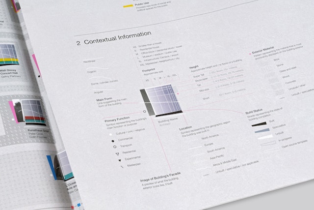
In analyzing each project, the team looked at primary information like the building’s relevance and innovation––why is it part of the canon now, and why was it revolutionary?––including the design, technology, sustainability and materials. Contextual information includes the building’s height, footprint, exterior material, location and build status. The data are represented by a system of colors, lines, patterns and shapes that are used in a micro-illustration for each building and situated on the timeline. The abstract graphic form pays homage to the early sketches of Zaha Hadid, and also evokes an architectural blueprint. On the built projects, an element of the façade shows through.
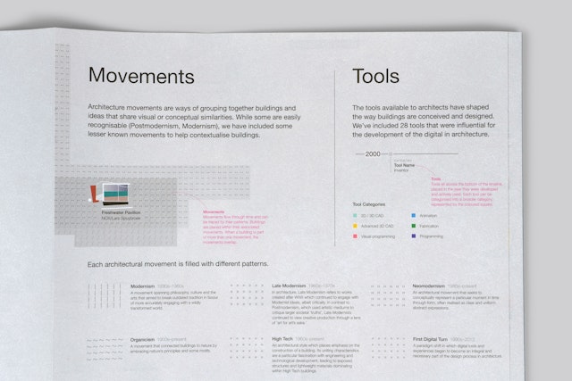
The visualization represents movements like modernism, organicism, biomorphism and postmodernism as graphic patterns on the background of the timeline. The development of digital tools, programs and technologies like computer-aided design (CAD) software, augmented reality for construction and 3D printing of architectural models are mapped along the bottom.
The timeline is stretched and condensed in order to maximize space, and a guide notes the true distribution of all the buildings placed chronologically. The visualization’s legend appears on the reverse of the panels and can be folded over the timeline for easy reference.
Office
- New York
Partner
Project team
- Ting Fang Cheng
- Phillip Cox
- Sarah Kay Miller
Collaborators
- Mollie Claypool
