



TNR is incisive, progressive and authoritative, and the new identity restores these qualities to the visual brand.
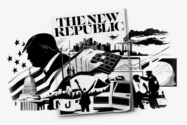

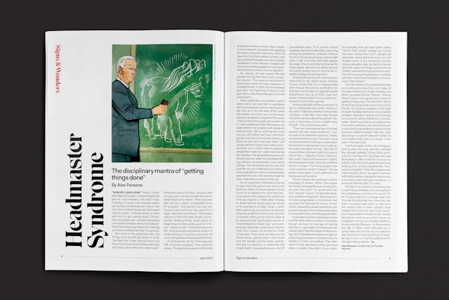


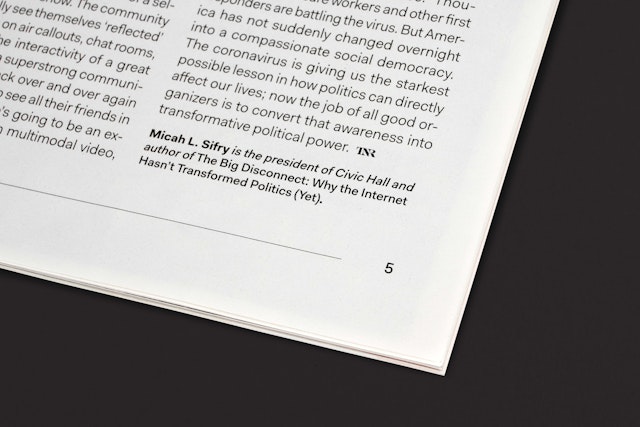

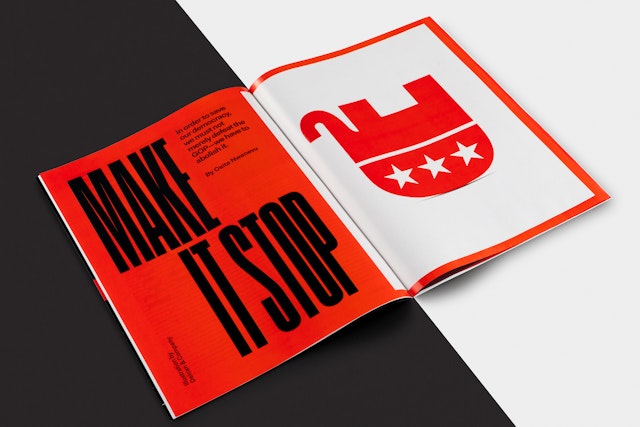
Contemporary display typefaces were chosen for the myriad of voices and viewpoints they can lend to different stories.






The visual language of the identity extends to a brand architecture for sub-brands and new editorial channels on the relaunched website.





The New Republic is the premier US journal of liberal opinion, dedicated to addressing today’s most critical issues with commentary on politics, culture and the arts. Founded in 1914 as an intellectual call to arms for reform, the magazine has evolved over the past century into a modern media organization with the mission to respond to the current political moment as changing conditions demand.
Pentagram has created a new brand identity framework for TNR that reinvigorates the magazine with a bold look that matches its forward-thinking content. The program carries through a new editorial design for the print publication and digital design for the website. The update pays homage to the magazine's roots in the Progressive Era but adds a larger sense of the contemporary.
TNR is incisive, progressive and authoritative, and the new identity restores these qualities to the visual brand. Pentagram worked closely on the project with Editor-in-Chief Win McCormack, Editor Chris Lehmann, Design Director Siung Tjia, Digital Director Mindy Kay Bricker, and Editorial Director Emily Cooke, along with other chief editorial, digital, marketing and publishing staff. Lindsay Ballant later joined as Design Director and has continued implementing the design. (Pentagram previously collaborated with McCormack, Lehmann and Ballant on a redesign of the iconoclastic literary journal The Baffler before the team moved to TNR.)
The Pentagram team consulted with TNR on the brand strategy, looking at the history of the magazine and other publications in its category and helping to define the values important to TNR as an institution. The designers considered TNR’s singular place in political, societal and cultural debate and its tradition of strong opinions, critiques and polemics.
The magazine wanted a visual personality that would reflect its robust brand of liberal inquiry and engage new audiences. A new liberal movement is growing in response to challenges like racial and gender equity and climate change. TNR sought to connect with these potential readers and reinforce its position as a media platform as it continues to expand further into digital journalism, podcasts and live events.
“Since its founding in 1914 at the height of the Progressive Era, The New Republic through all its various mutations, has been the principal standard bearer for the best of the liberal tradition in America,” says McCormack. “Graphically as well as editorially, we have tried to design a contemporary TNR suitable for the unparalleled and fraught period of political history in which we find ourselves now.”
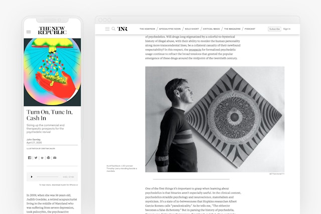
The identity framework conveys the passion, determination and experimental outlook of TNR, establishing a cohesive visual and reading experience both in print and online. The system embraces the magazine’s journalistic and political heritage in a graphic language that is sharp, refined and open.
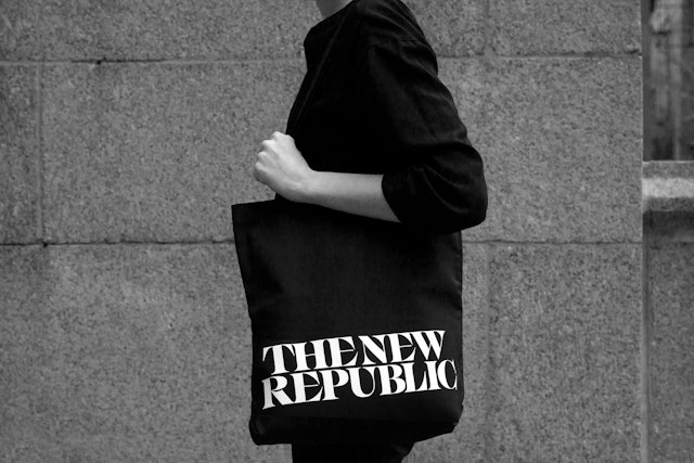
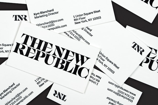
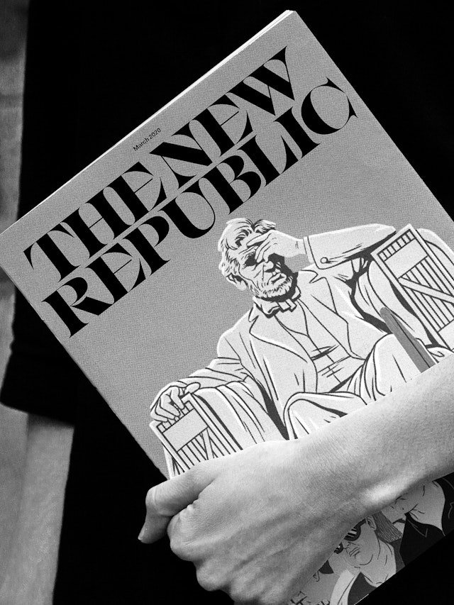
The new nameplate balances energy and restraint in striking typography. The wordmark is set in IKANSEEYOUALL, an experimental serif font (designed by Swiss Typefaces from its Lab portfolio) with flared serifs, strong contrast, and great craftsmanship. The type has been modified slightly with custom connection points to help uniformity in the lockup and an increased weight in the thinner strokes to enhance legibility at smaller sizes.
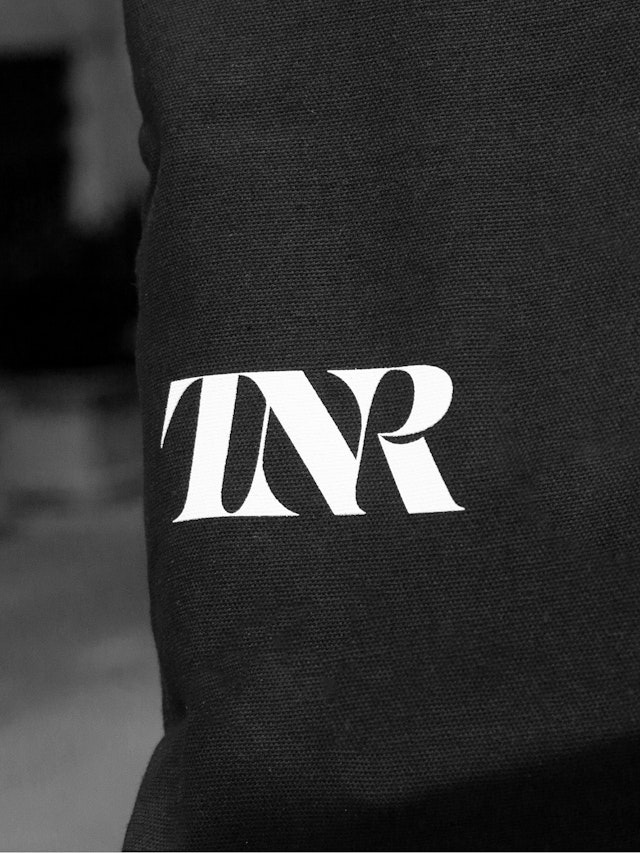
The designers also created a monogram that replaces the magazine’s founding logo of a colonial ship with a stylized rendering of the TNR acronym. The ship symbol was originally inspired by a passage in Walt Whitman’s Leaves of Grass ("In paths untrodden..") but its meaning was no longer clear and it was not inclusive. The new logo combines the initials in a custom connected form that creates a signature mark for the TNR brand.
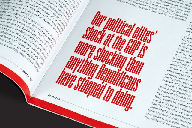
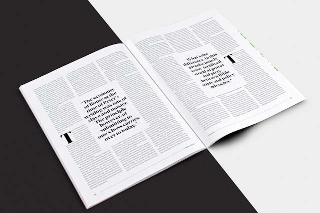
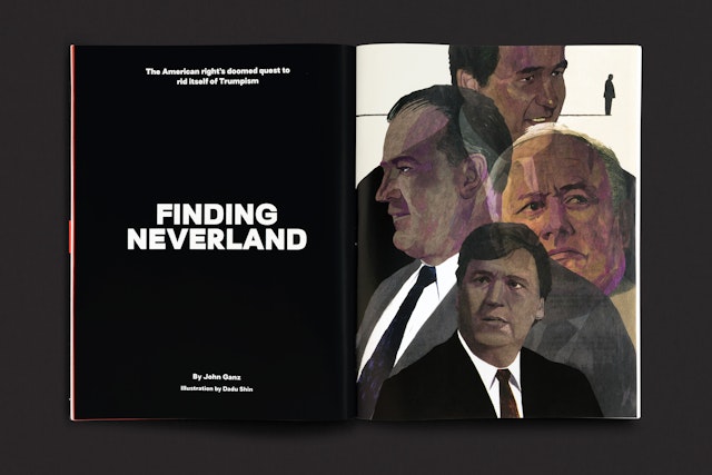
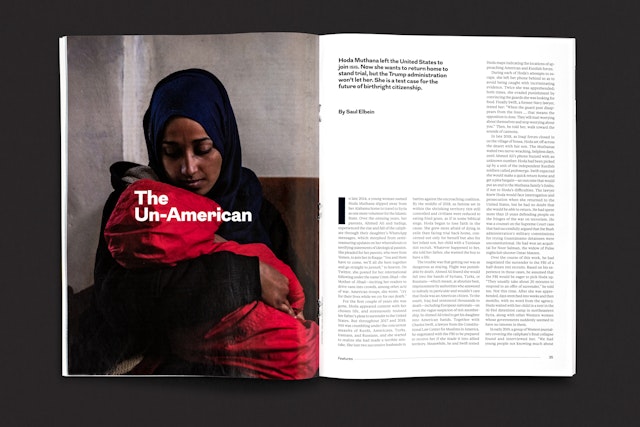
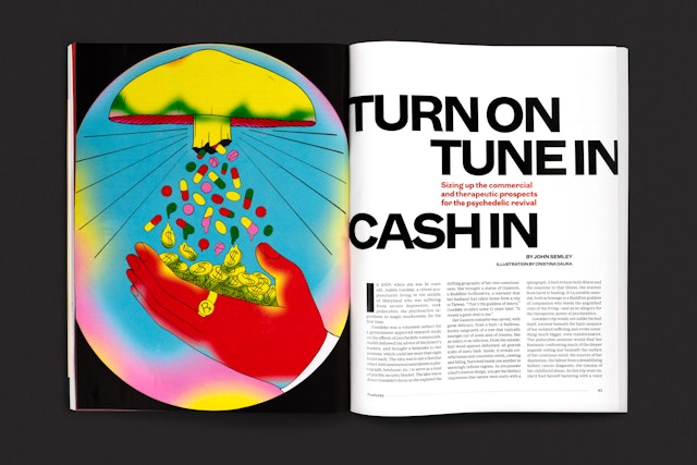
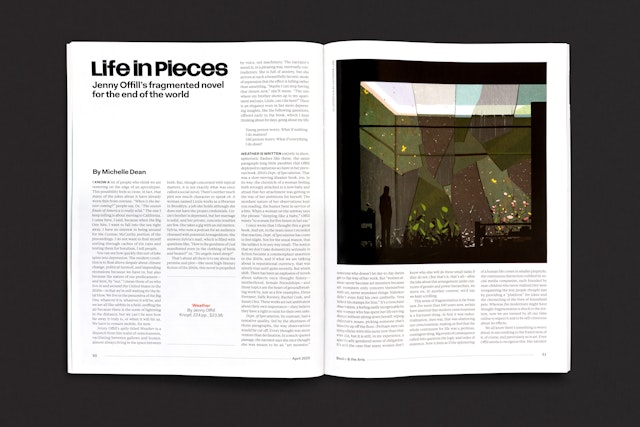
The powerful masthead is matched by cover art direction that uses type and image for maximum graphic impact. The overall look of the magazine is more visual, with a redesigned 12-column grid that improves readability and offers greater flexibility to utilize illustration and photography. Pull quotes and factual sidebars can be used to break up blocks of text.
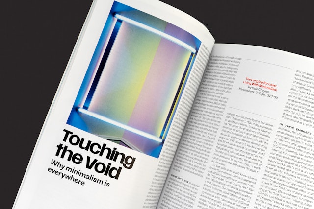
A group of four core typefaces—Eksell Display, Stadt, Fakt and Tiempos Text—are used in combination to set off the different departments and feature well. The front of book, called “Signs & Wonders,” contains essays on current events and utilizes the exuberant Eskell Display in headers that run vertically up the pages. The sans serif Fakt is used for text in pieces that are shorter in nature and usually deal with more contemporary political subjects. The back of book, called “Books & The Arts,” includes cultural criticism and poems, and uses the smart-looking Stadt for headers, with copy set in the serif Tiempos Text.
For the feature well, the designers specified a secondary family of 10 contemporary display typefaces, chosen for the myriad of voices and viewpoints they can lend to individual stories, as well as the fresh typographic direction they give to the magazine. These include: Coign, Ogg, Surt, Grot10, Wayfinder, Tiempos Fine, Reckless Neue, Brenner Slab, Breve Display and Breve Slab Title. Copy in the long-form pieces is set in Tiempos Text.
The Pentagram team created an imaginary typographic matrix that TNR designers can use to help decide which of the 10 fonts to use. The features and their subject matter can be plotted in the quadrants formed between two axes—from Serious to Light, and from Past to Present/Future—then the designer selects from the typefaces assigned there to choose one that is appropriate for the article.
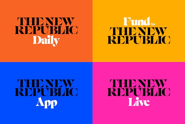
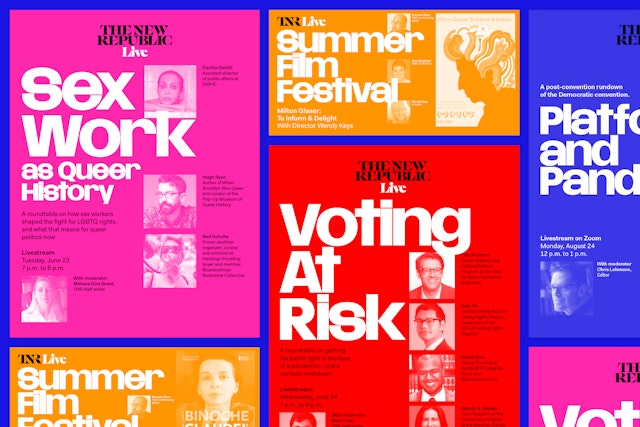
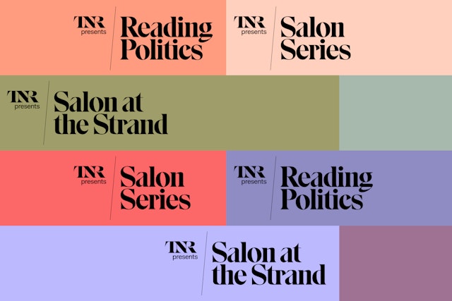
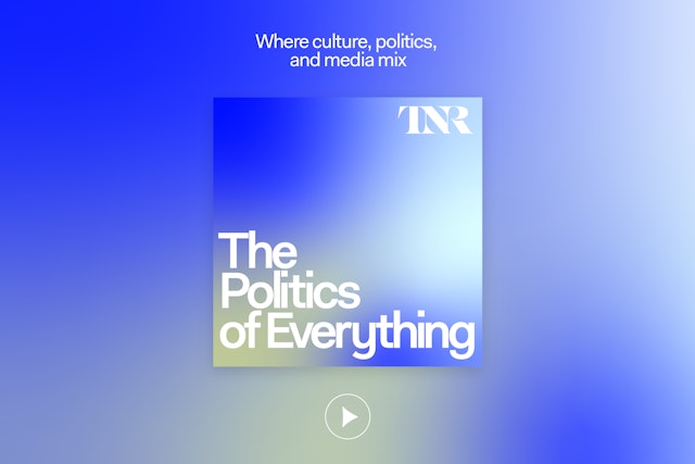
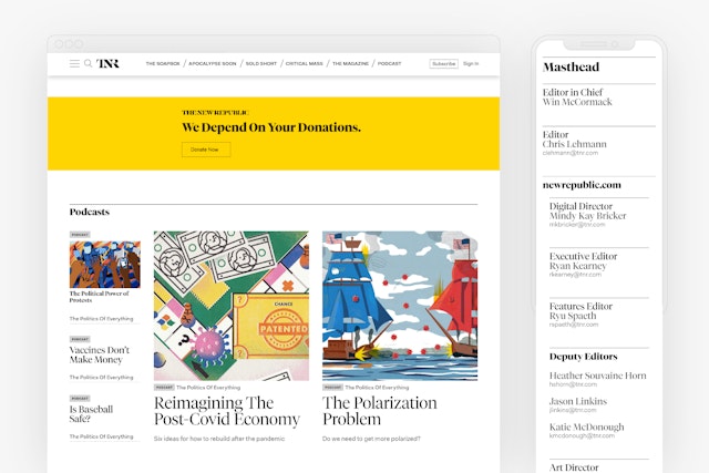
The visual language of the identity and magazine extends to a brand architecture for sub-brands like The New Republic Daily, the Fund for The New Republic and The New Republic Live. Diagonal lines and an expanded color palette establish a distinctive look for the live event series of salons and readings. The designers also created the identity for TNR’s first podcast, “The Politics of Everything,” using a color gradation to set it off from other offerings.
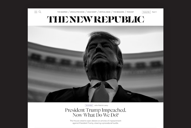
The relaunch of the TNR website followed the rollout of the magazine’s redesign, translating the look and feel of the print edition online while also establishing the site as a dynamic platform in its own right. The Pentagram team worked with Digital Director Mindy Kay Bricker to develop a design that would provide structure and organization for the wide-ranging content. Robert A. Di Ieso, Jr. later joined as Digital Art Director and has continued implementing the design.
As with the print magazine, the goal was to make the site feel distinctive in its category and signal that TNR has a different point of view. It wanted to compete with other publications that have a robust online presence, such as The Atlantic and New York Magazine’s Intelligencer, with an increased publishing schedule that brings readers back daily for new content.
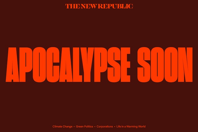
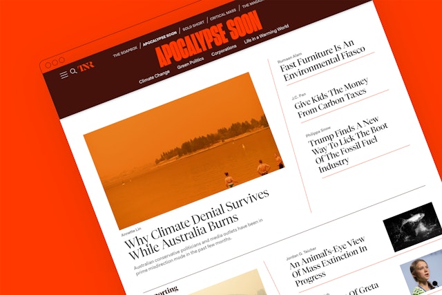
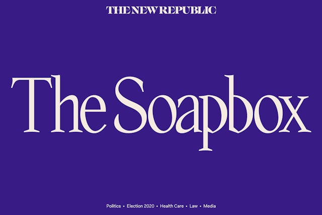
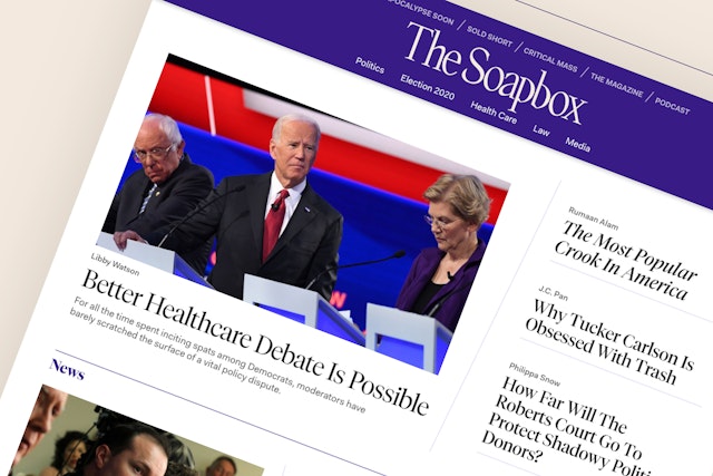
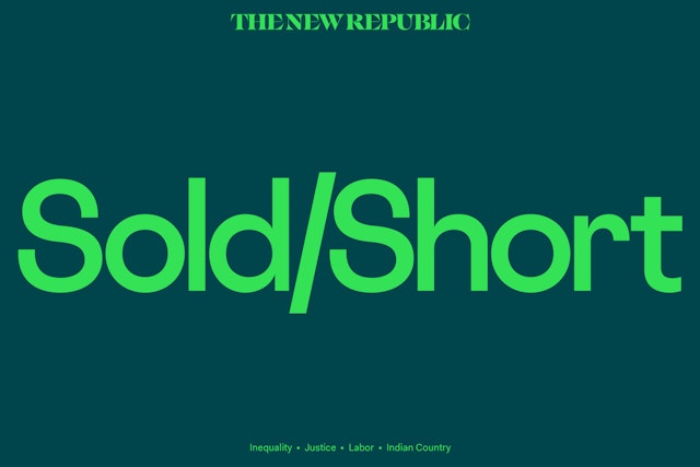
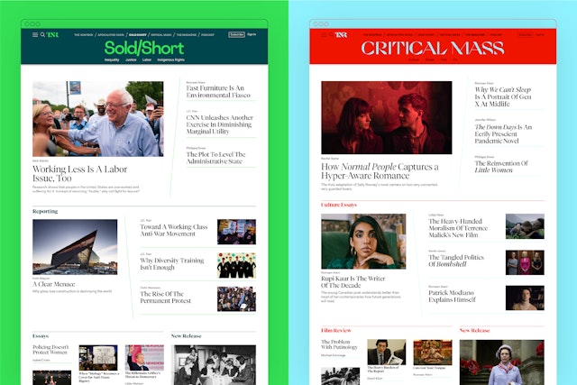
As part of the redesign, TNR launched four new editorial verticals that each feature a specialized focus and in-depth reporting: The Soapbox, on politics; Apocalypse Soon, on climate change; Sold Short, on inequality; and Critical Mass, on culture. Each vertical is accompanied by a weekly newsletter that is designed to reach and communicate directly with new and existing audiences. (Digital readership grew following the relaunch of the site in June 2020.)
The site’s visual profile is playful, appealing and direct. Type and color are used to differentiate the verticals and establish each as its own individual sub-brand. Each has its own distinct logo in a different typeface—taken from the contemporary display fonts of the magazine—that appears on its own vibrant color-coordinated masthead, giving the section its own character and voice as a channel in the TNR universe.
Client
The New RepublicSector
- Publishing
Discipline
- Brand Identity
- Digital Experiences
- Publications
Office
- New York
Partner
Project team
- Jack Collins
- Xinle Huang
- Steven Merenda
- Leo Field
Collaborators
- Daniel Stolle, case study illustrations