The new title-logo, animated reveal and bespoke typeface, all reference the fray of battle—large-scale, individually indistinguishable throngs of weapons, armour and organic matter clashing across a sea of armies.
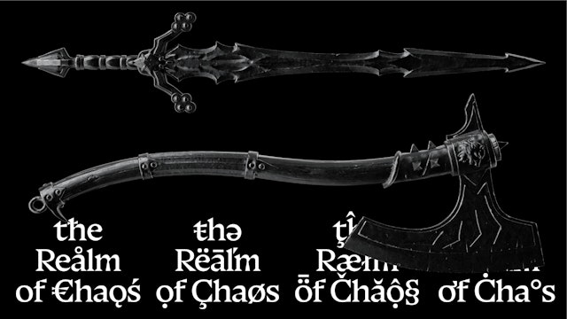

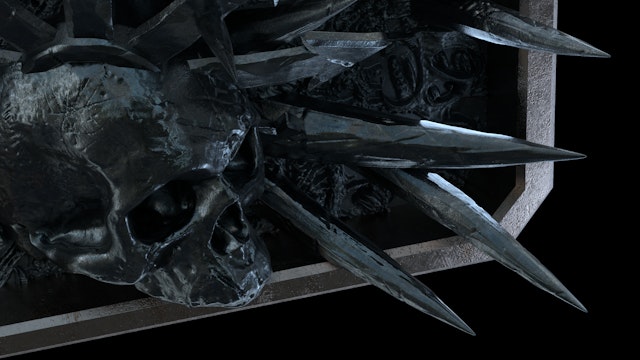
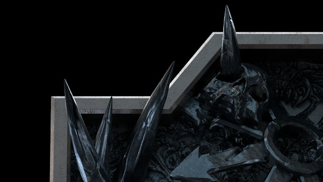
The 'Chaos Mass', a procedurally generated 3D texture that can be visually read as armies colliding in the fray of battle produces horizons or pattern-like backdrops to frame content.


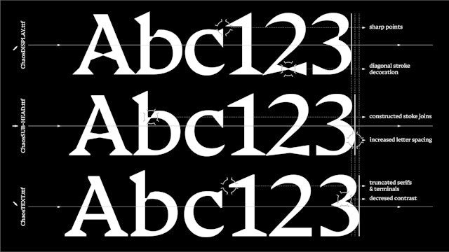
The glyphic style 'Chaos' typeface, with its blade-like serifs, tapered strokes and sharp decorative detailing, features three optical weights, optimising the style for use at all sizes.

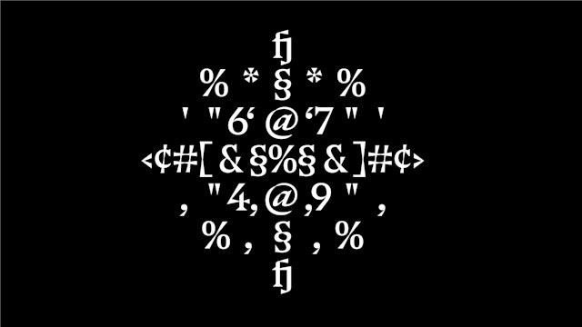
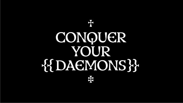
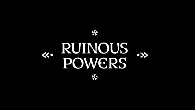

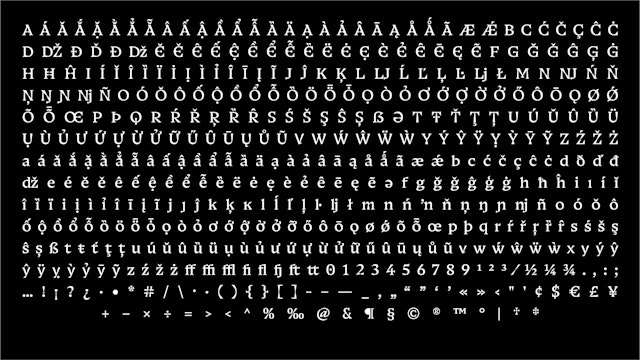
The Chaos typeface and Chaos Mass connect assets across the full spectrum of applications, from marketing campaigns, to web and social content and in-game.
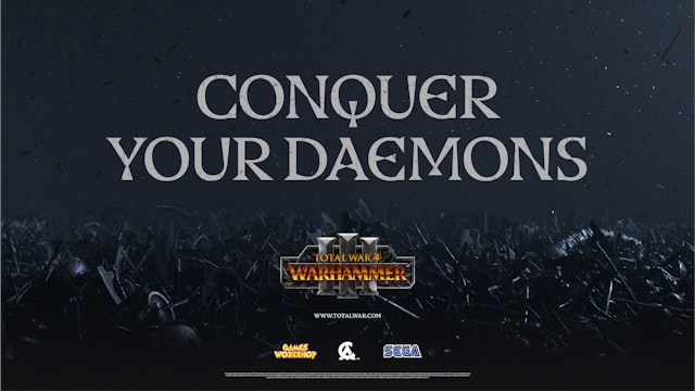


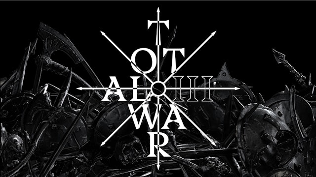
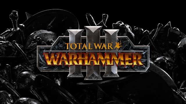
The title-logo, constructed in cold, war-worn steel featuring a framing shield and Roman numerals bevelled like axe blades, was modelled in 3D so that it could be animated in the title card, and dramatically lit with cinematic lighting.


Pentagram partners Jody Hudson-Powell and Luke Powell have revealed their typeface, logo and supporting visual elements for game developer Creative Assembly and Sega’s Total War: Warhammer III.
Total War: Warhammer III is a grimdark fantasy real-time-strategy video game, developed by Creative Assembly and Games Workshop and published by Sega. The conclusion of the Total War: Warhammer Trilogy, Warhammer III invites players to rally their forces and confront (or play as) the four Chaos Gods and their armies from the ‘Realms of Chaos’, a dimension of mind-bending horror.
Taking the backdrop of daemonic gods and the series’ move away from traditional fantasy towards the dystopian ‘grimdark’ sub-genre as inspiration, the visual assets were themed around the brutality of battle and the large-scale, individually indistinguishable throngs of weapons, armour and organic matter clashing across a sea of armies. Pentagram created the ‘Chaos Mass’, a procedurally generated 3D texture that can be visually read as the fray of battle, armies colliding, or even as a large Chaos entity engulfing the scene and stretching off into the distance. The pattern-like texture produces horizons and backdrops to frame content.
Chaos Mass ephemera adorns the new title-logo, constructed in cold, war-worn steel featuring a framing shield and Roman numerals bevelled like axe blades. The title-logo maintains a constructional consistency with previous series entries and houses the Total War and Warhammer brand logos, however tonally moves the aesthetic to a darker, almost monochrome colour palette. It was built as a 3D model so that the detail of the Chaos Mass inlaid into the shield container could be picked out with cinematic lighting. The 3D model also facilitated an animated title card, which was revealed as the conclusion of the highly anticipated announcement trailer, and will be used across all cinematic video assets. The logo triumphantly emerges from within a vast expanse of seething Chaos Mass.
Inspired by the vernacular of fantasy war, Pentagram created a bespoke font family titled ‘Chaos’ alongside Luke Prowse of NaN Foundry. The glyphic base style, with its blade-like serifs and tapered strokes, belies a more geometric and modern character proportion. The typeface has the visual hallmarks of engraving, which is exaggerated further through decorative diagonal compressions added to strokes and angled, constructed joins. The style feels solid and dominant whilst also creating a dynamic mass of diagonal rhythm mirroring the aggressive tone of the Chaos Mass.
The family consists of three optical weights optimised for display and text usage at either end by scaling the amount and presence of the sharp detailing. This allows the full extent of the characterful personality and unique flourishes to be seen at large-scale campaign level whilst maintaining the style’s ability to functionally work at smaller sizes and ensure it was possible for the typeface to be used in-game.
Pentagram’s identity elements for Total War: Warhammer III capture the ferocity of the Old World within dynamic graphic elements that seamlessly connect all parts of the title’s campaign, video, web presence and the product itself.
© Games Workshop Limited 2021. Published by SEGA
Client
Creative Assembly & SegaSector
- Entertainment
Discipline
- Brand Identity
- Motion Graphics & Film
- Typefaces
Office
- London
Partners
Project team
- Jack Llewellyn
- Luis Gutiérrez
- Albert Sanjuán
- Ceri Stock
Collaborators
- NaN.xyz Foundry
