


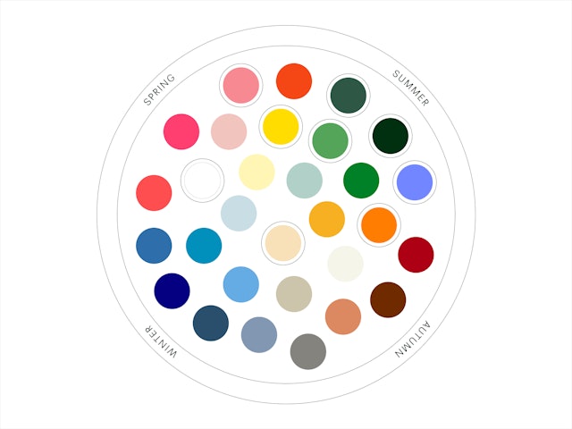
The pattern is built from a palette of deliberately imperfect and abstract shapes based on organic forms that give a feeling of a living garden.




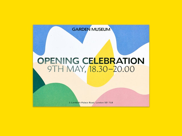

A focus while developing the identity was to create a system that could flex and scale based on the audience.

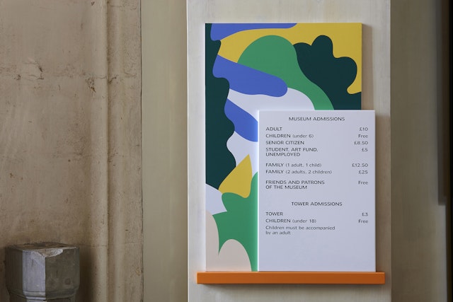
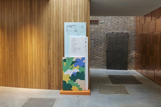

In addition to creating the Garden Museum's visual identity, a website and signage system was designed for the space.

As the only museum dedicated to gardening and the culture that surrounds it, two years ago the Garden Museum undertook the large task of renovating the beautiful space in which it is housed; an ancient church. With the reopening taking place in May 2017, the museum has much to offer outside of its temporary exhibitions and permanent galleries displaying Britain's love affair with gardening. It has also introduced a cafe, a learning space and studio, and finally, a garden designed by renowned garden designer Dan Pearson.
The renovation presented the museum with a unique opportunity to reposition itself as an open and inclusive tourist attraction, suitable for visitors of all ages and knowledge levels. Alongside its refreshed interiors, Pentagram devised a new visual identity for the museum that communicates its widespread appeal to new audiences; avoiding overtly floral themes and literal representations of cultivating plants, instead referencing growth, life and the organic nature of a living garden.
Inspired by the work of Brazilian landscape artist Roberto Burle Marx, Pentagram created a visual language out of different forms and colours to represent seasons and flora. This language can be both visually expressive and functional, used to create illustrations when brought together and individual icons when pulled apart.
The palette of shapes are interpretations of the organic forms native to different seasons. These shapes are deliberately imperfect and abstract, but when constructed into compositions give a feeling of a living garden. In addition to the illustrative applications of the shapes, Pentagram has designed a practical set of icons, including a garden fork, which is used as a symbol for the museum.
The museum’s wordmark is set in Humanist 970, a font that is based on Doric, a very early sans serif released by the Stephenson Blake Foundry in 1816. As with other fonts released during this time period, it is organic and imperfect in nature, creating a characterful letter set. The secondary font is Amira, a contemporary addition, that has a graphic, woodcut-feel closer to the traditional visual language of gardens.
A key focus while developing the identity was to create a system that could flex and scale based on the audience. The bold wordmark can live on its own strongly when required but also quickly become inviting and lively when the shapes and illustrations start to come into play. This is particularly useful for the museum's event series, which in certain instances needs to be a more subtle application of the identity while in others it needs to strongly demonstrate the culture and energy of the institution.
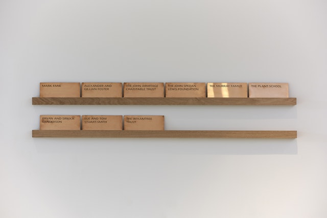
In addition to creating the Garden Museum's visual identity, Pentagram redesigned the website, signage and other collateral for the space. The website is both appealing and informative, marrying the decorative nature of the identity with a simple and functional user experience. With a similar mindset, a unique signage system combines straightforward wayfinding information with illustrations, creating a visually engaging and informative guide around the museum.
Client
Garden MuseumSector
- Arts & Culture
- Non-profits
Discipline
- Brand Identity
- Signage & Environmental Graphics
- Digital Experiences
