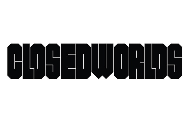

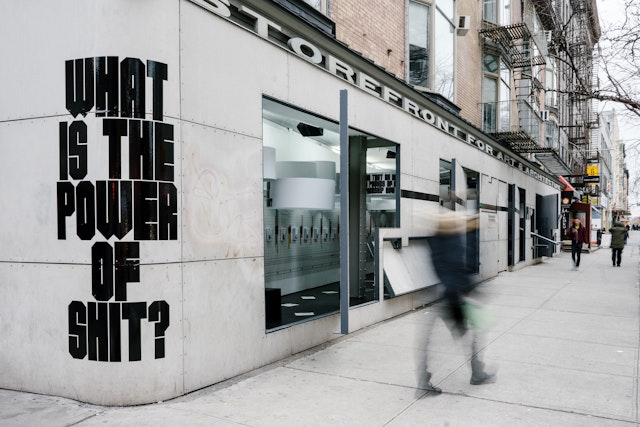
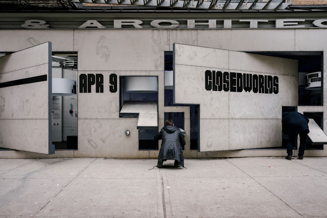
The font, appropriately called CLOSED, visually echoes the confined, self-sustaining physical environments in the show.
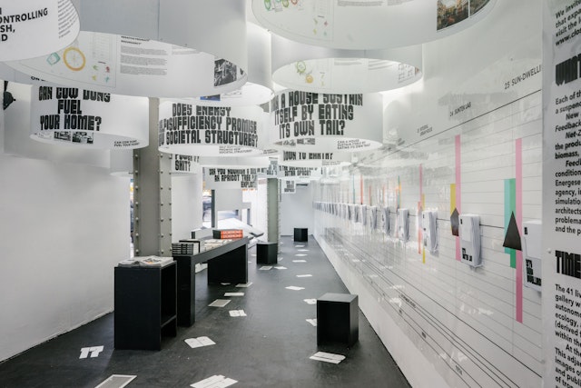
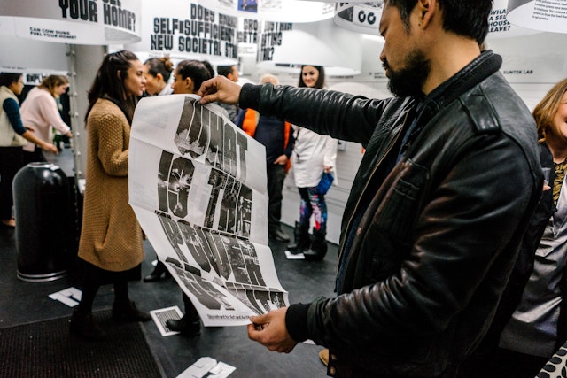
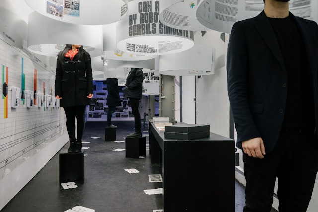
The exhibition presents each prototype as its own mini-world: Each of the 41 projects is displayed within a cylinder suspended from the ceiling, and visitors are invited to step inside as if inhabiting an egosphere.




What do outer space capsules, submarines, and office buildings have in common? Each was conceived as a closed system, a self-sustaining physical environment that is set apart from its surroundings and uses its own matter and energy to function. Closed Worlds is a new exhibition at the Storefront for Art and Architecture in New York that presents 41 living prototypes for these ecologically regenerative systems. Pentagram has created an innovative exhibition design for Closed Worlds that is a closed system in itself, complete with its own custom typeface, display methodology and organizational structure.
The designers worked in close collaboration with the exhibition curator, Lydia Kallipoliti, on the design of the show. Each of the 41 prototypes was extensively researched, and the challenge for the designers was to create an engaging context that would draw visitors into the idea of closed systems and at the same time organize the volumes of data and information. The subject is timely; contemporary discussions about global warming, recycling, sustainability and net-zero energy building all tie into the study and analysis of ecologically regenerative systems.
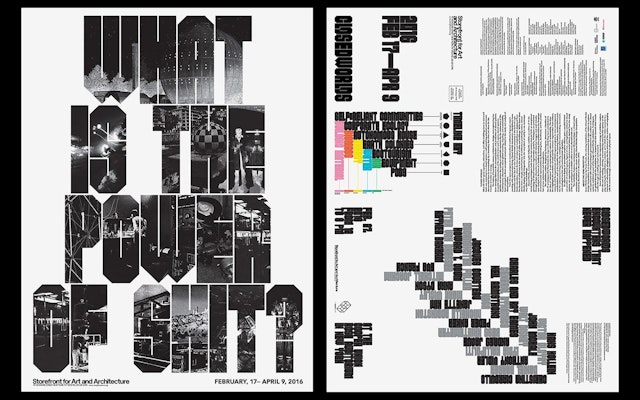
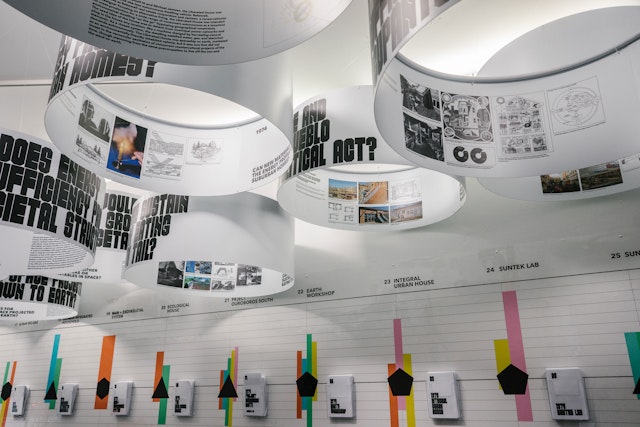
The exhibition presents each prototype as its own mini-world: Each of the 41 projects is displayed within a cylinder suspended from the ceiling, and visitors are invited to step inside as if inhabiting an “egosphere.” The exterior of the each styrene cylinder teases the prototype with an intriguing question: “Can man become amphibian?,” “What good is a toilet without a flush?,” “Can the body plug into the computer?,” and “What is the power of shit?,” to name a few. The interior presents a synopsis of the prototype and analysis in the form of net-zero diagrams that illustrate the ecological footprint and feedback drawings that visualize performance and energy flow. Beneath each cylinder is a corresponding number, used as a notational tool to locate the project within a timeline on the gallery wall.
The cylinders are accompanied by a 42nd prototype, Some World Games, a virtual reality installation by Farzin Farzin that invites visitors to explore and experiment with the archive of 41 closed systems in the larger exhibition. The installation was selected as the winning project in the Closed Worlds Design Competition hosted by Storefront in November 2015.
The designers approached the exhibition design as the 43rd closed system in Closed Worlds, and wanted to create their own custom typeface for the identity and graphics. The font, appropriately called CLOSED, visually echoes the confined, self-sustaining physical environments in the show. The typeface removes as much negative space as possible from within and between its letterforms. Drawn and cut with 45 and 90 angles, the letterforms interlock with each other into a continuous pattern. Lines are used as counters, and from a distance, the heavy type appears as a black bar—requiring a “close” reading.
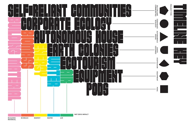
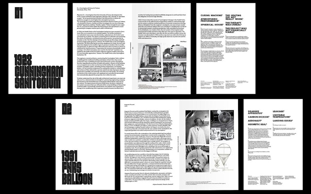
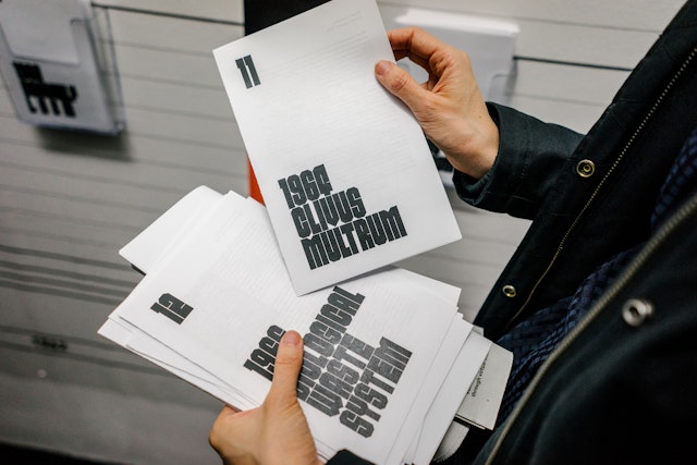
The numbers beneath the 41 prototype cylinders direct visitors to a linear timeline that runs the length of the gallery. The typology of each prototype on the timeline is represented by a symbol based on a simple shape, indicating one of seven categories: autonomous houses, pods, equipment, self-reliant communities, ecotourism, corporate ecology, and earth colonies. Each prototype in the timeline also contains a color-coded bar graph that depicts the cycles of the various resources within its closed system. More extensive information is presented in an accompanying leaflet for each project. Visitors are invited to take these home and read them at their leisure, and together the 41 leaflets are conceived of as a book for the exhibition.
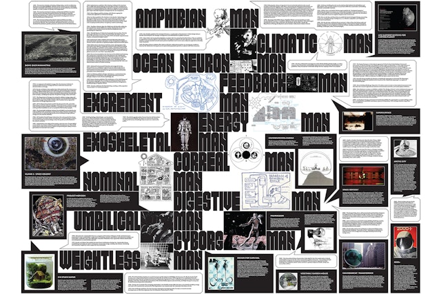
At the opposite end of the gallery, the timeline leads to “Speculative Histories,” a supergraphic that displays a parallel historical narrative of enclosed spaces. The wall features projects and publications more loosely associate with the timeline, including images of speculative design projects, as well as legislation throughout the respective periods.
Pentagram previously collaborated with Storefront on the design of OfficeUS, the U.S. Pavilion at the 2014 Venice Architecture Biennale.
Sector
- Arts & Culture
Discipline
- Motion Graphics & Film
- Exhibitions
Office
- New York
