
The new brand identity revolves around the ‘Covariant Flow’, an abstract visualisation that represents the process of learning through what’s known as the ‘decision boundary’.


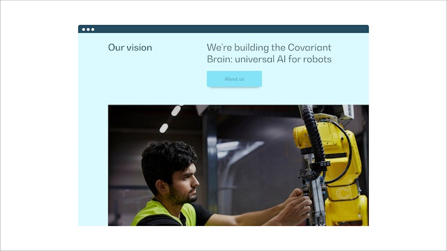
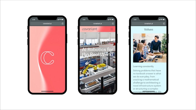
The identity’s look and feel extends to the new website, which features the Covariant Flow decision boundary as an intelligent layer that sits behind all content.
The Covariant wordmark, symbol and icons mimic the curves, twists and flow of the decision boundary.
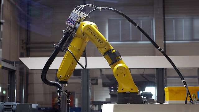



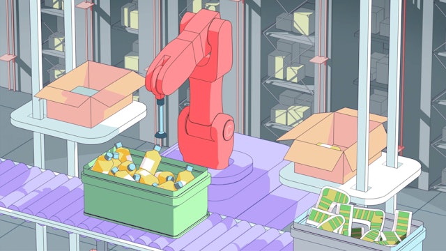
A wider, more playful extension of the colour palette was used in a set of looping animations that accurately represent the three Covariant use cases.
Pentagram has designed the brand identity for Covariant, a Berkeley-based AI company building the Covariant Brain, a universal piece of AI software that allows robots to see, reason and act on the world around them. Covariant is bringing this pioneering new technology to the industries that make, move and store things in the physical world.
Robots are still not a feature of most modern warehouses. They are used extensively in the automotive and in some other specialist manufacturing industries, but their function is limited to carrying out the repetitive movements that they’ve already been programmed to follow. A robotic arm can work in a very precise way, but cannot deal with any deviation or changes.
Covariant’s engineers saw an opportunity to change this. Initially, they carried out research into deep imitation learning, deep reinforcement learning and meta-learning; they then spent time testing and deploying the results from this research. The resulting Covariant Brian is a universal AI created specifically for robots, designed to work across many different customer environments and to be employed for multiple uses – a breakthrough that could have a significant impact on the future of industries such as logistics and online retail.
This groundbreaking technology is reflected in Covariant’s new brand identity. This revolves around the ‘Covariant Flow’, an abstract visualisation that represents the process of learning through what’s known as the ‘decision boundary’. A central component in the way neural networks learn, this intelligent layer always lives in the background, morphing and changing in response to external data.
The design team built an app for Covariant for creating unique static and moving image assets. The form, speed, complexity and colour of the decision boundary can be altered manually in the app, and then the graphic can be exported in whatever size, length and format is needed for each platform. This leads to an infinite number of possibilities for Covariant, all within the parameters of the new brand identity.
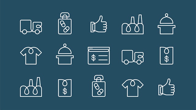
Both the Covariant wordmark and symbol mimic the curves, twists and flow of the decision boundary – this relationship is echoed in the animated version of the symbol and in the brand typeface, a high contrast geometric grotesque font family, which shares typographic similarities to the custom wordmark. A series of icons were also created, these feature a loop or overlapping lines, echoing the Covariant logos and the decision boundary curves.
The brand assets always appear in the friendly colour palette consisting of four core colours, which are a combination of human (red, pink, light blue), with a more serious and industrial feel conveyed by the petrol blue. A wider, more playful extension of the colour palette was used in a set of looping animations created by Geoffroy de Crécy, whose realistic illustration style was chosen to accurately represent the three Covariant use cases – order picking, induction and putwall.
The identity’s look and feel extends to the new website, which features the Covariant Flow decision boundary as an intelligent layer that sits behind all content. Together with the elements of the brand identity, this layer expresses the complexity of the work that Covariant does in a clean, clear, but expressive way – representing the intelligence that is sitting at the heart of Covariant technology.
Client
CovariantSector
- Manufacturing & Industrials
- Technology
Discipline
- Brand Identity
- Digital Experiences
- Data Driven Experiences
Office
- London
Partners
Project team
- Margherita Papini
- Laura Chan
- Luis Gutiérrez
- Albert Sanjuán
- Jack Llewellyn
- Ben Leonard
