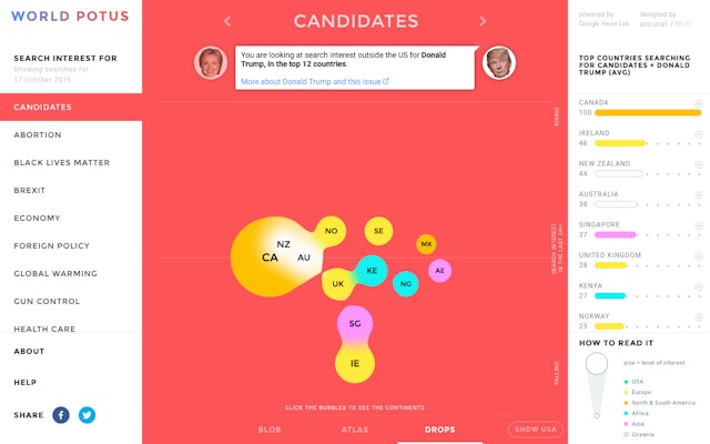

The app displayed how frequently people around the world searched for the critical issues of the election in association with each of the two candidates, Hillary Clinton and Donald Trump.


In search of new ways to use Google Trends Index data in newsrooms, Google News Labs and the department of Visual Journalism at the University of Miami reached out to Pentagram partner Giorgia Lupi, then at Accurat, in the summer of 2016.
At the time, international interest in the US presidential election was spiking. The president of the US is often described as the “leader of the free world,” but how widely or deeply this de facto leadership is perceived is seldom measured. Starting with this simple concept, Giorgia and her design team proposed to use Google Trends data to gauge interest outside the US in the 2016 candidates in relation to top political issues.
Over the course of the next several months, the design team conceptualized, designed, and developed WorldPOTUS, an interactive web and mobile application. The app displayed how frequently people around the world searched for the critical issues of the election in association with each of the two candidates, Hillary Clinton and Donald Trump.
The selection of issues—abortion, Black Lives Matter, Brexit, economy, foreign policy, global warming, gun control, healthcare, ISIS, oil, racism, refugees, same-sex marriage, Trans-Pacific Partnership—was based on their average ranking in Google searches that year to date. By illustrating searches for each candidate and how they differed in each country, WorldPOTUS showed real-time variations worldwide and revealed which region was interested in which issues.
The Google Trends Index offered a useful way to assess the general sense of a country’s interest in an issue over time, but it was not a perfect measure. People often change their opinions about complex political issues, and for this reason, the design team created a deliberately imperfect visual to express the irregularities inherent in a human dataset.
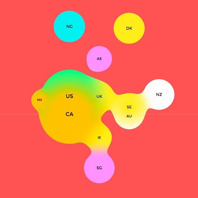
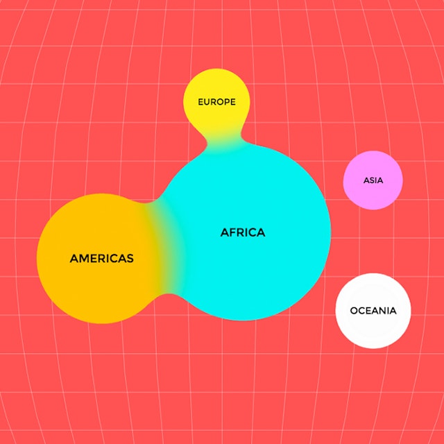
The design solution transformed countries into rounded blobs like speech bubbles. As fluid as conversations about politics and election issues, these bubbles moved around the screen when the app user switched from topic to topic. The animation reflected the changing nature of data on people’s interests as well as the general direction and magnitude of the trends.
The app presents three independent but complementary views--BLOB, ATLAS, and DROPS--that differ based on the arrangement of the bubbles in space. Though each view was available individually, they provided the best insights when seen together. All three shared the same primitive, amoeba-like form that melts and evolves into more complex structures during navigation.
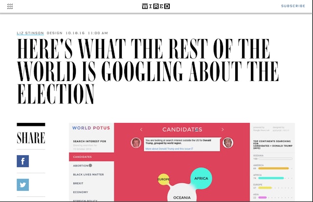
WorldPOTUS was featured prominently on the homepage for Google Trends as one of the tools journalists used most often to report on global perceptions of the election. The project was covered internationally by major news outlets such as WIRED and Fast Company, bringing the global perspective to a controversial American phenomenon.
Client
Google News LabsSector
- Publishing
- Technology
Discipline
- Digital Experiences
- Data Driven Experiences
