The designers developed a concept that uses data to address the urgent topic of voting rights and voting disenfranchisement.

In anticipation of election day on November 8th, Fast Company reached out to Pentagram partner Giorgia Lupi and her team with an exciting brief: redesign the iconic “I Voted” stickers that are distributed at polling places around the country on voting day. While “I Voted” stickers have been shown to indeed encourage voter turnout, Fast Company wondered if the sticker’s traditional design might be radically re-imagined to improve its success.
From the outset, Giorgia and her team knew they wanted to use data to help raise awareness for the importance of voting and drive change. For their concept, they chose to address the urgent topic of voting rights and voting disenfranchisement. In recent years, states such as Florida, Texas, and others have made headlines by enacting restrictive legislation to bar those with past felony convictions from voting. According to estimates from The Sentencing Project, a criminal justice advocacy non-profit, 5.2 million Americans are forbidden to vote because of felony disenfranchisement, or laws restricting voting rights for those convicted of felony-level crime. This translates to one out of 44 adults—2.27 percent of the total U.S. voting eligible population—unable to participate in the democratic process. (The problem is especially acute for voters of color; for instance, one in 16 African Americans of voting age is disenfranchised, a rate 3.7 times greater than that of non-African Americans.)
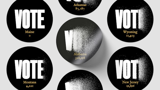
The resulting design process fused both visual exploration with data research, a hallmark of Giorgia’s work, to arrive at a custom solution. Using data from The Sentencing Project’s report, “Locked Out 2020: Estimates of People Denied Voting Rights Due to a Felony Conviction” the design team plotted how many individuals were denied the right to vote in each state. Immediately, it was clear that the data needed to be represented on a state-by-state basis, as rates of disenfranchisement vary dramatically by state due to broad variations in voting prohibitions. For instance, in three states— Alabama, Mississippi, and Tennessee—more than 8 percent of the adult population, one of every thirteen people, is disenfranchised.
Instead of representing these statistics with charts, pure typography was used—thereby merging both the message and the underlying quantitative evidence that supports it. The word “Vote” (set in A2’s LargePoint, designed by Henrik Kubel and Pentagram partner Matt Willey) is exploded proportionally to the number of individuals who are disenfranchised. By reducing the legibility of the word “vote” for states with a poor record on voting enfranchisement, the design sarcastically comments on the expected message of an “I Voted” sticker. After all, what good is a sticker if you’re legally barred from voting at all?
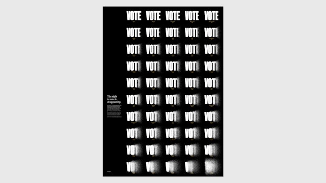
The color palette is intentionally stark—black and white, with a hint of neon yellow for data labels—to underscore the severity of the topic. Fifty buttons were designed, one for each state, representing 50 individual data points. The team also created a poster version, bringing the 50 individual “Vote” visualizations together. In the poster, one can clearly see the differences in disenfranchisement from state to state, with the word “Vote” becoming increasingly difficult to read from top to bottom.
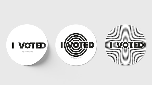
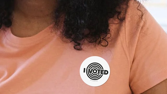
Giorgia and her team also worked on additional concepts to respond to the brief. One comically gestured to the relatable, banal, and even taboo reasons why people don’t vote—and make the case for why, no matter what, you should. Yet another concept was conceived to encourage repeat voting by visualizing the number of times the wearer has shown up to the polls in their lifetime.
Office
- New York
Partner
Project team
- Ting Fang Cheng
- Phillip Cox
- Madeleine Garner
- Nikki Makagiansar
- Talia Cotton
- Ed Ryan
- Gabrielle Merite
