

The goal was to deliver a solution that would be a true reflection of the brand and how its software and mission is to push mobility on a global scale; for a cleaner, smarter and more secure world on the move.


Pentagram has redesigned the visual identity for KPIT - an automotive mobility company and partner organisation, to create a more in-depth focus on software and technology after the company’s merger/demerger.
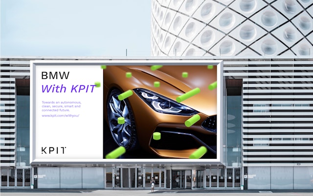
KPIT partners with leading automotive brands like BMW and Panasonic, where their combined technologies and software integration enable people and goods to move around more freely. The goal was to deliver a solution that would be a true reflection of the brand and how its software and mission is to push mobility on a global scale; for a cleaner, smarter and more secure world on the move.
Pentagram has designed the KPIT brand identity to be like KPIT itself; interconnected, responsive and generative. The visual identity has a graphics system at its core – tying together all constituent parts of the brand, its sub-brands and partners, which mirrors the company’s particular balance of technology, connectivity and innovation.
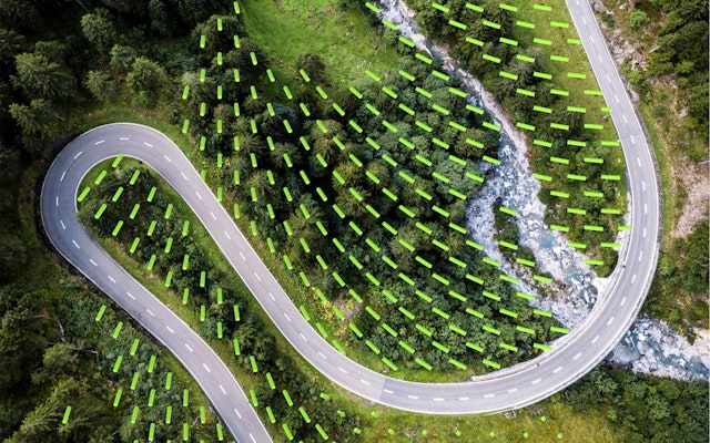
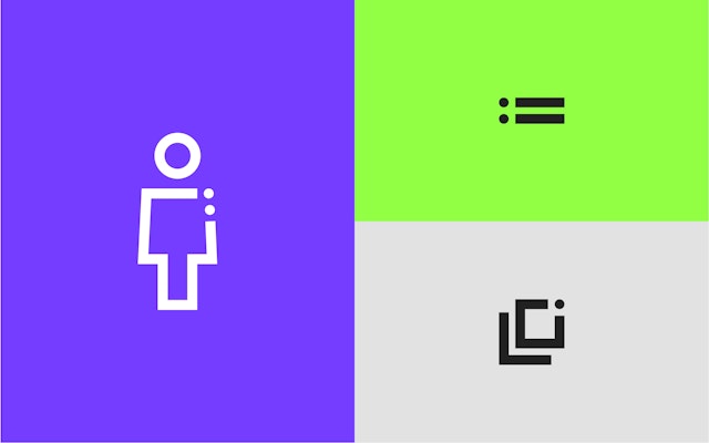
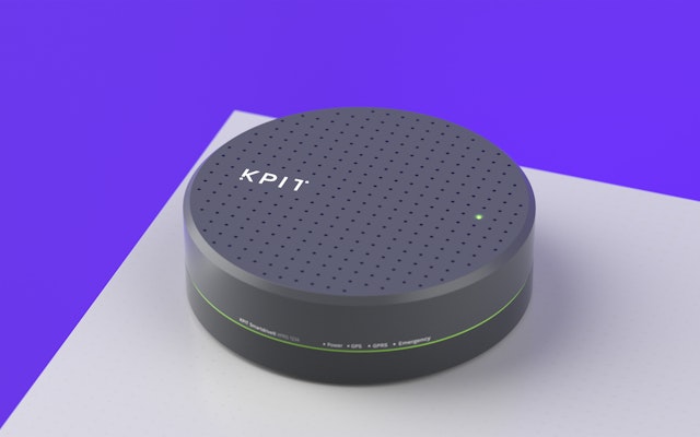
The new graphic system highlights KPIT’s advanced software as an invisible force; manifesting the idea that “It’s the things you can’t see that shape the world.” A grid ties all elements of the brand together; the visual language of the dots and lines can be seen in the wordmark, imagery and iconography, while the 3D spheres and rods, in photography, advertising and motion design.
Pentagram has also created a new design tool for the business, enabling KPIT’s in-house team to generate new dynamic brand assets easily. Activated grids and patterns reveal the immersive and responsive impact that the company’s software has in the real world. On a small scale, a 2D flat vector pattern has been applied to photography to add texture. Conversely, 3D renderings work on the macro-scale, combined with imagery that has perspective and a point of focus. This treatment is carried through to iconography, signage, social, advertising and campaign visuals.
The logo sits at the heart of the identity and is anchored within the new system, with the two dots positioned to fit within the grid. A vivid colour palette of green and purple form the primary brand hues, while neutrals act as complementary colours. Work Sans is the primary brand typeface; using medium and light cuts.
Office
Partners
Project team
- Laura Chan
- Ben Leonard
- Albert Sanjuán
- Michael Mason
- Stefano Falconi
- Gabriel Weichert