Stereolabs approached Pentagram to create a new brand story to better communicate to customers that it is both a software and hardware company that can function as both the eyes and brain wherever robots operate.


The opportunity was to create a single design system, one that dynamically connects all aspects of the business. A visual toolkit for machine perception and spatial compute, as well as brand identity. The Stereolabs symbol both appears on the camera hardware and represents the camera within the SDK. The intent is for design to become connective tissue between the digital and physical.


This design choice strategically positions the symbol as a connective element across the Stereolabs ecosystem, harmonising the digital and physical aspects of the business and showcasing how design can play a transformative role in tech companies.


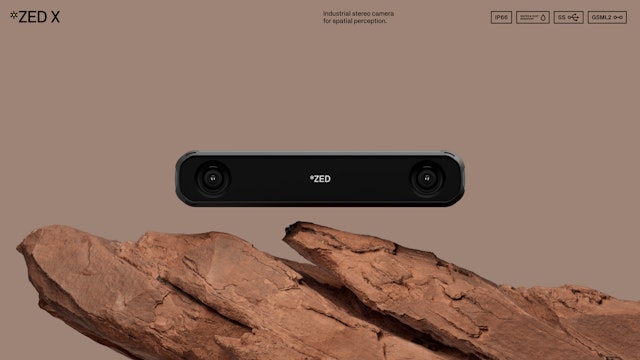
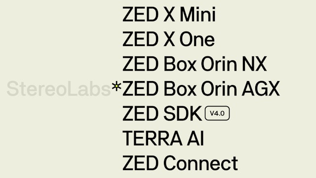
Stereolabs is a pioneering camera and software company renowned for its cutting-edge cameras that provide human-like vision for robots. Working together, its unique hardware and software ecosystem acts as the eyes and brain of the robots, unlocking a new level of insights in the field of spatial analytics. By turning 2D footage into a 3D understanding of the world, Stereolabs transforms these robots from basic navigational machines into highly skilled workers, carrying out complex tasks and making intelligent decisions.
Autonomous robots are already disrupting every industry. Their tasks might involve differentiating between varieties of crops and assessing their health for accurate picking and harvesting; identifying how to handle specific construction materials; detecting, sorting, and transporting goods, or tracking spaces to ensure people are safe. Regardless of where they operate, these robots must contend with unpredictable conditions including challenging lighting, weather and terrain.
To make all of this possible, robots need incredibly precise vision. Many engineers and developers tried to provide this using traditional LiDAR and radar systems. But soon realised that these systems not only can’t provide the detailed vision required, but are too expensive to scale. This is where Stereolabs comes in—using hardware to connect its stereo cameras to its AI cloud-based TERRA AI software, its ecosystem offers users ‘A new era of vision-driven precision’. The level of detailed information that it can process and evaluate can lead to huge benefits for these businesses.
Stereolabs has built up an impressive reputation for its ZED Cameras over the past ten years. It approached Pentagram to create a new brand story to better communicate to customers that it is both a software and hardware company that can function as both the eyes and brain wherever robots operate. The identity needed to convey that Stereolabs provides the most reliable, ready-to-deploy, scalable solution for unlocking autonomous robots’ full mission capabilities and elevating their spatial perception.
The identity is designed to work across Stereolabs’ outputs, from website, marketing, and trade shows through to the product itself. Crucially, the identity also integrates into Stereolab's software products, unifying the brand both in the field and digital environments. Zuki Sedgley and Dom O'Hare led and devised the brand strategy and wrote the verbal identity and copywriting for the website. Based around the idea of 'Dynamic Detail’ and ‘Precision Through Perception’ the strategy encompassed narrative themes, tone of voice and key messages.
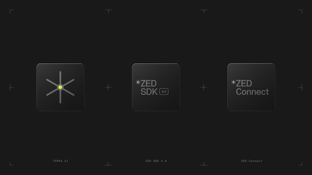
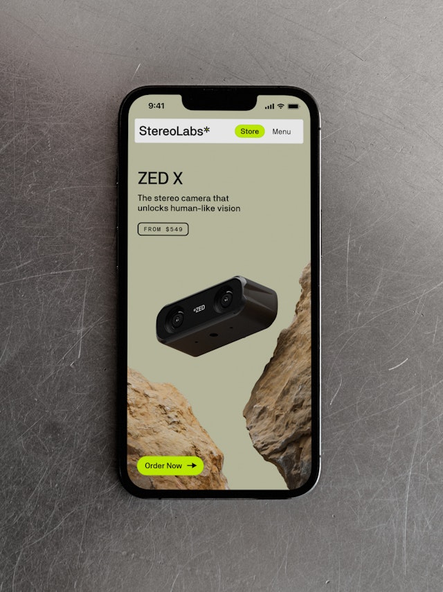
The identity includes a dynamic symbol, visual toolbox, modular diagram language, icons and data visualisation. With its new website designed by Pentagram and built by Commerce-UI, Stereolabs now has a compelling and easy-to-navigate brand platform to showcase both its hardware and software. They can now demonstrate to customers how they seamlessly integrate this ecosystem as an ‘eyes-and-brains’ upgrade for robots or contextual applications, with scalability at its core.
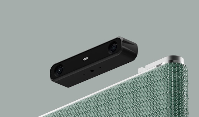
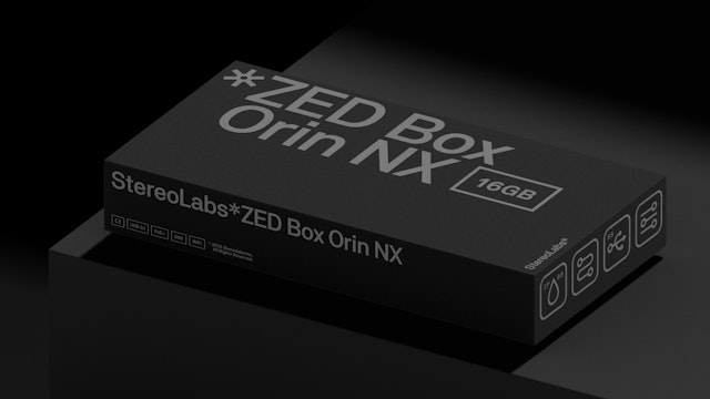
The readiness of the Stereolabs’ product is echoed in marketing renders that mix hardware and environmental contexts. The team also created a functional lockup system that ensures a clear product brand hierarchy, a colour scheme that feels native to the industry and an icon and labelling system that emphasises the plug-and-play mentality and scalability of the products.
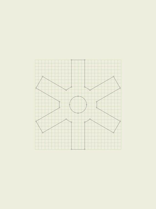
At the heart of the brand identity, the new Stereolabs symbol is a multidimensional spark capturing vision in a digital context. As an intelligent character, this dynamic star-shaped symbol seamlessly transforms across various applications. Developed to align seamlessly with both the brand’s identity and the demo process, the symbol appears across the identity as a standalone element, in logotypes, diagrams, and as a hero 3D version, providing a unified and integrated experience.
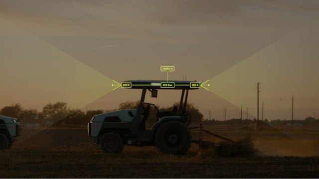
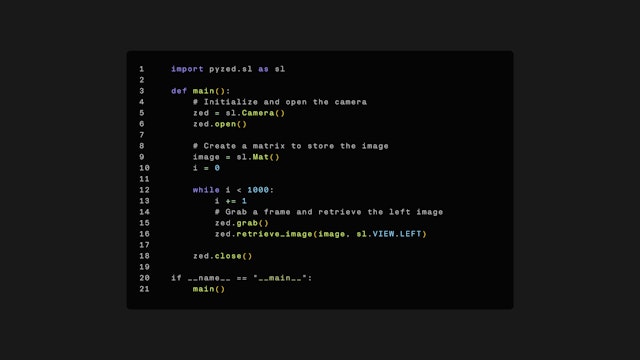
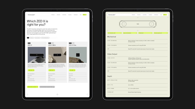
To help Stereolabs effectively communicate how their product family can be configured into tailored solutions for its customers, Pentagram’s design team crafted a comprehensive modular diagram language. The diagrams illustrate just how user-friendly the Stereolabs ecosystem is—all that’s needed to get human-like vision is to set up the camera and connect to its TERRA AI software.
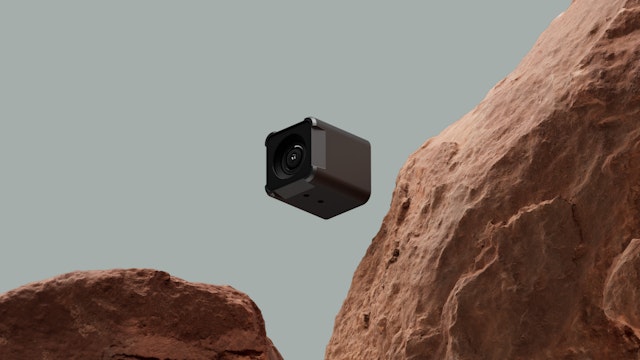
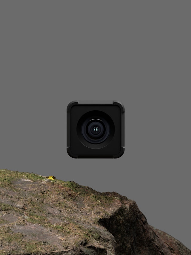
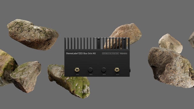
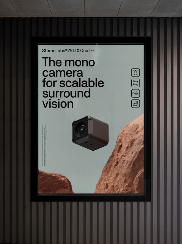
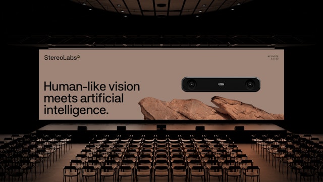
Using Unreal Engine, the team created a series of renders showing different environment material visualisations that the Stereolabs engineers can use to create brand assets. Focussed on communicating the TRL (technology readiness level) they feature natural elements such as rocks and foliage, as well as industrial features. They are designed to contextualise the use case of the technology.
‘Precision through perception’ is a theme that runs through everything Stereolabs does, and this is embedded in the design language. The simple, directness of the visual design is underpinned by a technical grid layer, emphasising accuracy, reliability and attention to detail. An exposed crossed-grid framework can be added to brand applications as a subtle graphic artefact, and is present as the underlying digital environment that software visualisations are built upon.
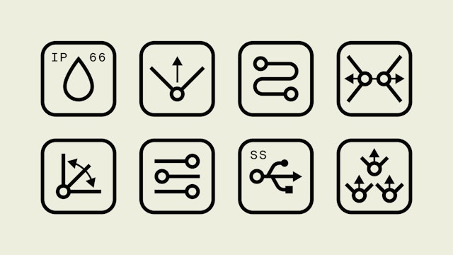
A set of technical icons distil key features, and serve as visual cues to convey the profound readiness and robustness of Stereolabs' technology.
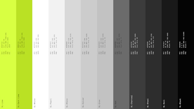
Each hue in the colour palette is chosen with the ‘eyes’ and ‘brains’ narrative in mind. White and lighter shades of grey accentuate the hardware narrative, while black and darker shades of grey contextualise the software story. A vibrant Signal Green (SL-Lime) is chosen to bind the intelligence narrative together—providing an ownable digital colour that forms the DNA of the Stereolabs brand.
The Pentagram team designed a type system using Neubau’s NB Akademie™, a grotesque style with a mechanical tone, owing to a strong sense of horizontality, found in the flatter stroke trajectories of ‘a’, ‘r’, ‘s’, combined with proportions and character features that hint at monospacing. The aesthetic is furthered by the use of the family’s specific monospaced cut in moments that require a more technical touch, ensuring precision and clarity in conveying complex information
Stereolabs demos highlight the capabilities of its products, which feature intricate hardware and software systems. The expanded symbol is developed in a way that feels native to the demos, creating a multidimensional tool that adapts to the different demands required to showcase the technology. Several months were spent working with Stereolabs’ R&D engineer, polishing details to optimise quality and ensure compatibility with customers’ software.
Stereolabs now has a single design system that not only serves as a visual toolkit for its advanced technology but also unifies all aspects of its business through the visual identity. This will enable the company to move to the next stage of its development, and push its pioneering work in the field of robot-led spatial analytics even further.
This design choice strategically positions the symbol as a connective element that appears across the Stereolabs ecosystem, harmonising the digital and physical aspects of the business and showcasing the way in which design can play a transformative role in tech companies.
Client
StereolabsSector
- Manufacturing & Industrials
- Technology
Discipline
- Brand Identity
- Digital Experiences
Office
- London
Partners
Project team
- Ceri Stock
- Stefan van Rijn
- Jonathan Quaade
- Harrie Yoo
- Luis Gutiérrez
- Jack Llewellyn
- Helena Postigo Matey
- Mariona Alegre
Collaborators
- Commerce -UI
- Dom O'Hare
- Zuleika Sedgley
