

The identity is based on the forms found within a specific "ensemble." The letters play with positive and negative space, gaining coherence through the act of reading across the ensemble.


There are no texts or labels on the walls of the galleries; visitors use a series of printed guides that correspond to the numbered galleries and identify the objects in each roomʼs ensembles.


The Barnes Foundation is one of the most important collections of Post-Impressionist and early Modernist art in the world, home to masterworks by Cezanne, Renoir, Matisse, Picasso, Van Gogh, and others. Established in 1922 by Dr. Albert C. Barnes, a scientist and entrepreneur who amassed paintings, decorative art, and African sculpture (before it was widely collected), the Foundation was conceived with a mission to educate the public about art and, more importantly, how artists see and interpret the world. Barnes was deeply influenced by the theories of his friend John Dewey, whose emphasis on the role of art in everyday life led Dr. Barnes to develop his collection as a resource for teaching. Barnes commissioned architect Paul Cret to design a gallery in Merion, Pennsylvania, to display his collection and hold classes in art theory.
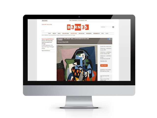
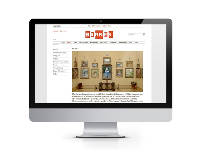
In 2013, the Barnes moved to a spectacular new home designed by Tod Williams Billie Tsien Architects in downtown Philadelphia. The building received the 2013 AIA Institute Honor Award for Architecture. The Foundation was conceived by Dr. Barnes as a wholly integrated environment in which the objects on display are presented in highly coordinated settings, which he called "ensembles" that create a visual dialogue among works. Pentagram has worked with the Foundation and the architects to capture the distinctive sensibility of the Barnes Foundation in its new identity, as well as in environmental graphics, publications and the museum's website.
The move of the Barnes from Merion to the Benjamin Franklin Parkway in downtown Philadelphia was controversial. A federal judge allowed the move on the condition that Dr. Barnes's "ensembles" would be preserved and replicated exactly, within galleries that matched the proportions of the original Cret-designed building. Conceived by Williams and Tsien as a “gallery in a garden and a garden in a gallery,” the building is set within public gardens inspired by the Merion grounds. (The landscape architecture is designed by OLIN.) The 93,000-square-foot building consists of three parts: the Collection Gallery, reproducing the 12,000-square-foot galleries; the Pavilion, a supporting administrative wing; and the Light Court, conceived as an enclosed courtyard space between the two volumes.
In developing a new identity for the Barnes, Pentagram wanted to establish a program that captured the specificity and originality of Dr. Barnes's vision. The designers conducted extensive research on Dr. Barnes, the ensembles, and the building. The identity is based on the forms found within a specific "ensemble." The letters play with positive and negative space, gaining coherence through the act of reading across the ensemble. The font used in the signature and in the wider graphic program is Milo, designed by Mike Abbink. The type within the ensemble is Monitor, designed by Fred Smeijers.
The designers developed several graphic elements to capture the unique character of the Barnes. Reflecting his belief that craft ennobles daily life and shares similar concerns of art, Barnes used ornamental and functional metalwork to punctuate his ensembles. Hinges, hasps, keyholes, braces, door pulls, keys, knobs, padlocks, trivets, ladles, forks, scissors, and other tools from various cultures and periods are hung to echo forms found within the paintings. The designers used metalwork to punctuate the website, as well as developed metalwork patterns on an umbrella, and in packaging for the museum shop. Cropped images of the ensembles are used within shopping bags and promotional graphics, using fragments and frame edges to convey the unique visual language of the Barnes installation.
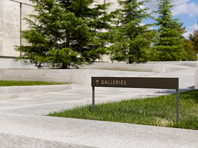
The team worked closely with the architects and project manager William McDowell on signage, and chief curator Judith Dolkart and publications director Johanna Halford-MacLeod on interpretive materials and books. Like many elements within the building, the signage uses a rich material palette of bronze and stainless steel. The lobby assiduously avoids LCD screens in favor of projected white letters on the cast concrete surface. From the parkway the Foundation is announced by a series of "processional" signs that are directed towards the flow of vehicular and pedestrian traffic. Throughout the building various elements recall the presence of Dr. Barnes: on a garden wall facing the museum café, a handwritten ensemble notation by Dr. Barnes is rendered in wrought iron; a quote from Dr. Barnes frames the edge of a fountain.
As at Merion, there are no texts or labels on the walls of the galleries; visitors use a series of printed guides that correspond to the numbered galleries and identify the objects in each roomʼs ensembles. The design of these guides, which now include every wall and every object, was a major component of the project. The designers developed a series of products for the Barnes shop, including a tote bag based on the pattern developed by the architects for the floor of the Light Court. A collection of six cups feature the silhouettes of Barnes paintings with color references in their titles.
Pentagram has also designed several publications for the institution. The Barnes Foundation: Masterworks (Skira Rizzoli) is the definitive guide to the Foundation, affordably priced at $40 to help make it accessible to the public. The cover pictures three objects—a Matisse painting, an African sculpture, and a key—suggesting the idiosyncratic nature of the collection, applied to a cloth cover that has the tactile quality of the galleries' cloth-covered walls. A deluxe edition of the book comes in slipcase featuring a debossed facsimile of a keyhole escutcheon. The Barnes is home to the worldʼs largest collection of paintings by Renoir, and Renoir in the Barnes Foundation (Yale University Press) is the first book to publish the museumʼs complete holdings by the artist. The front and back covers crop two paintings to show the edges of their frames, the motif used in other parts of the identity. The design uses typefaces and colors of the institutional palette. Pentagram also designed The Architecture of the Barnes Foundation (Skira Rizzoli), by Tod Williams and Billie Tsien, a behind-the-scenes look at the development of the new building.
Client
The Barnes FoundationSector
- Arts & Culture
Discipline
- Brand Identity
- Signage & Environmental Graphics
- Digital Experiences
Office
- New York
Partner
Project team
- Kristen Spilman
- Kim Walker
- Brian Raby
- Krista Reeder
