Embedded within the Tractable symbol is the fundamental relationship between the assessed object and the technology that surrounds, analyses and supports it.
Extending from the symbol and the visual components of circle and technological surround, the key relationship between object and insight was realised by Pentagram as the Damage Signature.


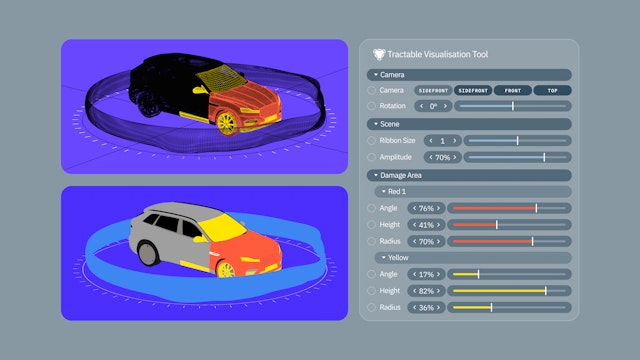
In order to facilitate Tractable’s brand team to use the Damage Signature visual, Pentagram created a bespoke tool that can output 3D rendered visuals for use within brand communications.

The team created a streamlined colour palette centered around a vibrant electric blue. To achieve parity between the digitally native colour and printed materials Pentagram also commissioned a bespoke Pantone ink mix titled Tractable Blue.

The Damage Signature and its representations of damage, segmentation and data input build a continuity across all of Tractable’s touchpoints and provide it with a clear means to talk to clients about the functionality and benefits of its product.


An illustration style as well as an initial set of illustrated visuals were developed that subtly point towards the object and boundary relationship found in the symbol and Damage Signature.


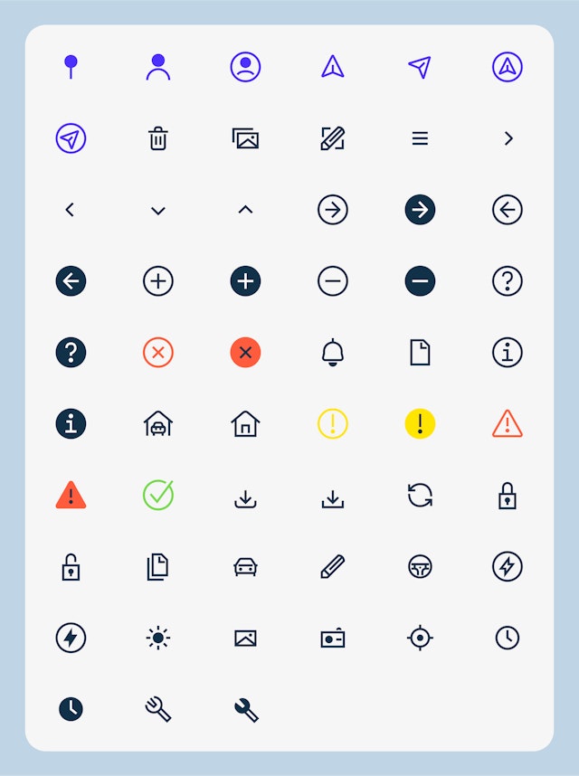
A suite of scalable icons were also designed that feature an offset break motif similar to the stylistic quality of the symbol.

Working in collaboration with the team at Tractable, a comprehensive set of brand guidelines were created that deliver a graphic system to build brand recognition, and help structure information and present complex narratives clearly.

Founded in 2014, Tractable is an Applied AI company that uses the speed and accuracy of artificial intelligence to visually assess damage to cars and homes. Its solutions aim to help people work faster and smarter, while reducing friction and waste, which is better for businesses and for the planet.
Trained on millions of data points, they process more than $2 billion in vehicle repairs and purchases annually, and connect everyone involved in insurance, repairs, and sales of cars and properties.
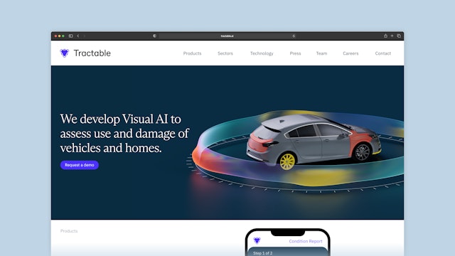
Tractable is the AI tool of choice for over 35 world-leading insurance and automotive companies, including over 10 of the Fortune Global 500. After a period of rapid growth and investment, Pentagram was approached to create a new brand identity to reflect the company’s vision for the future and its recently acquired Unicorn status. Delivered through an extensive set of brand guidelines, the identity features a newly created symbol, wordmark, graphic system, illustrations and icons, as well as the Damage Signature—a holistic narrative asset underpinned by a bespoke tool that produces an evolving suite of brand imagery.
Embedded within the Tractable symbol is the fundamental relationship between the assessed object and the technology that surrounds, analyses and supports it. This is visually manifested as a central circle and dynamic, encompassing ribbon that represents Tractable’s responsive capability to produce near real-time damage assessment and insight through computer vision—the key part of its offer. This dynamic nature of Tractable's protective ribbon is reinforced on digital platforms through the use of core logo animations that extend, contract and oscillate through wave patterns. An offset at the point where the inner circle and surrounding ribbon meet creates a distinctive visual feature as well as increasing legibility at small sizes. The accompanying wordmark is simple, reductive and with subtly squared curves providing a technical tone.
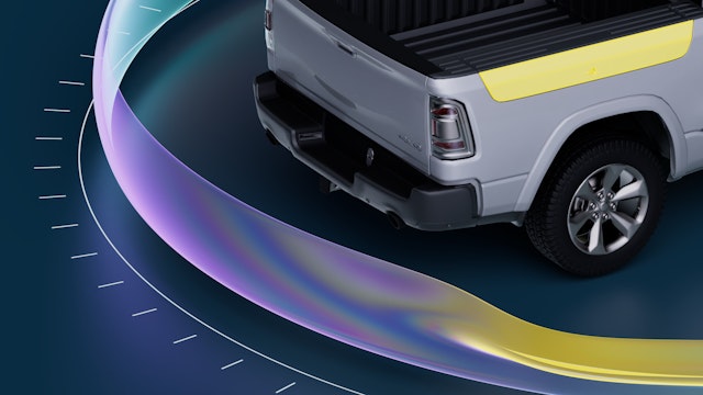
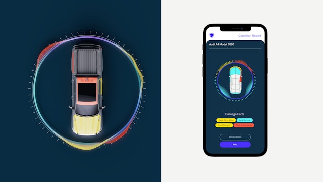
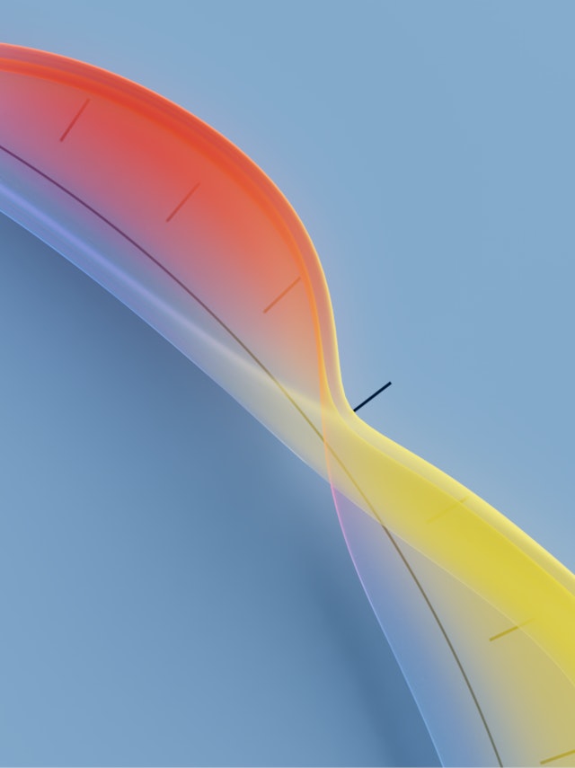
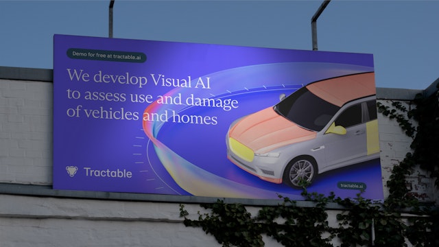
Extending from the symbol and the visual components of circle and technological surround, the key relationship between object and insight was realised by Pentagram as the Damage Signature. As a narrative motif the Damage Signature creates a holistic connection across all of Tractable’s brand communications: flexing its visual form to functional contexts—such as diagrammatic visualisations of damage assessments within Tractable’s app at the roadside after an accident—to hero brand visuals helping depict Tractable’s offer within marketing, to expressive abstract backgrounds for brand messaging.
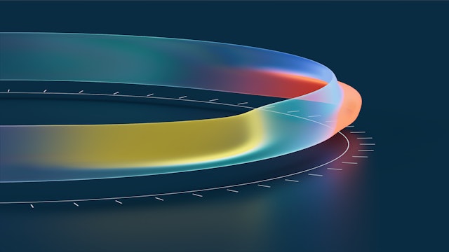
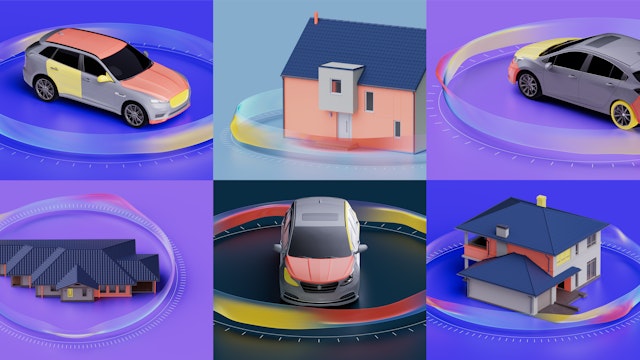
In order to facilitate Tractable’s brand team to use the Damage Signature visual, Pentagram created a bespoke tool that can output 3D rendered visuals for use within brand communications. The tool allows for any vehicle or house to be placed at the centre of the visual and surrounds it with a circular measurement boundary marking the area and positions from which data was captured. Depending on location and extent of damage, a translucent ribbon is rendered around the central object with variation of colour and amplitude of curve denoting the severity of damage. The visualisation on the surface of the damage ribbon relates directly to segmentation (where specific parts of the featured object are highlighted) of the object. The tool can also output abstracted, close crops of the Damage Signature for use as backgrounds or secondary visuals. In these images the variances and colour of the damage ribbon, offset by the technical lines of the measurement boundary, become more emotive of the dynamic and intelligent nature of Tractable’s technology.
The Damage Signature and its representations of damage, segmentation and data input build a continuity across all of Tractable’s touchpoints and provide it with clear visual cues that immediately unpack the functionality and benefits of its product.
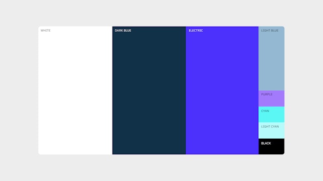
The team created a streamlined colour palette centered around a vibrant electric blue. To achieve parity between the digitally native colour and printed materials Pentagram also commissioned a bespoke Pantone ink mix titled Tractable Blue.
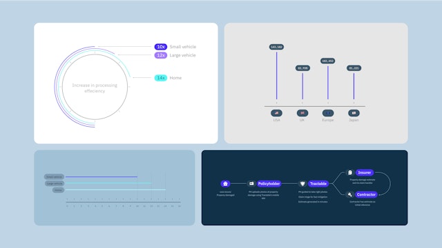
Pentagram selected three typefaces for use across brand, product and marketing applications to create a balance between technical proficiency, directness, and subtle human warmth: ABC Dinamo’s Arizona is used for headlines, with ABC Social used for subheadings and body copy. IBM Plex Sans and Mono are used at small sizes for labelling, diagrams and articulation of data, as well as across all text within Tractable’s digital product.
An illustration style as well as an initial set of illustrated visuals were developed that subtly point towards the object and boundary relationship found in the symbol and Damage Signature, alongside an art direction style for photography and video that focuses on real-world situations with simple perspectives and uncluttered framing. A suite of scalable icons were also designed that feature an offset break motif similar to the stylistic quality of the symbol.
Working in collaboration with the team at Tractable, a comprehensive set of brand guidelines were created that deliver a graphic system to build brand recognition, and help structure information and present complex narratives in a clear, direct manner. The guidelines give Tractable’s design team the tools to deliver and develop a consistent vision of Pentagram’s new brand identity across all applications and products.
Office
- London
Partners
Project team
- Nav Bhatia
- Jack Llewellyn
- Luis Gutiérrez
- João Miranda
- Yurii Khomovskyi
- Jonathan Quaade
- Anjela Freyja
- Jon Marsh
- Sky Kawano
Collaborators
- Suzanne Livingston
