
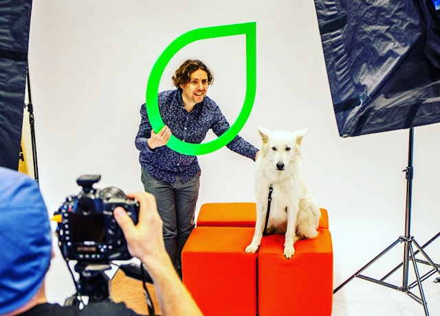
The new wordmark is held in a droplet shape that references the ‘ear’ form found in VRT’s logos between 1960-1991, acknowledging VRT’s historical legacy.

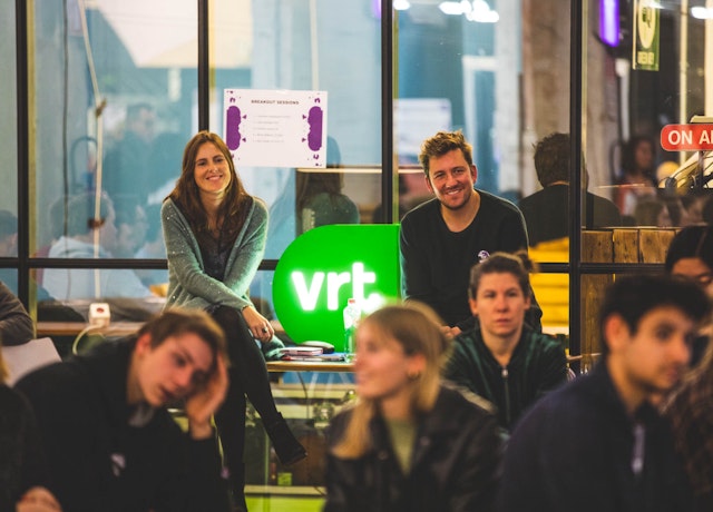
The new identity needed to provide VRT with a brand that reflected its ambitions; to increase the impact, relevance and user-friendliness of its established radio and TV brands in the digital space

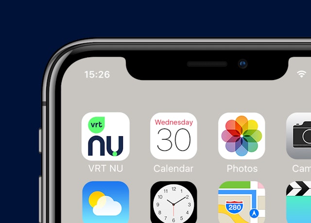
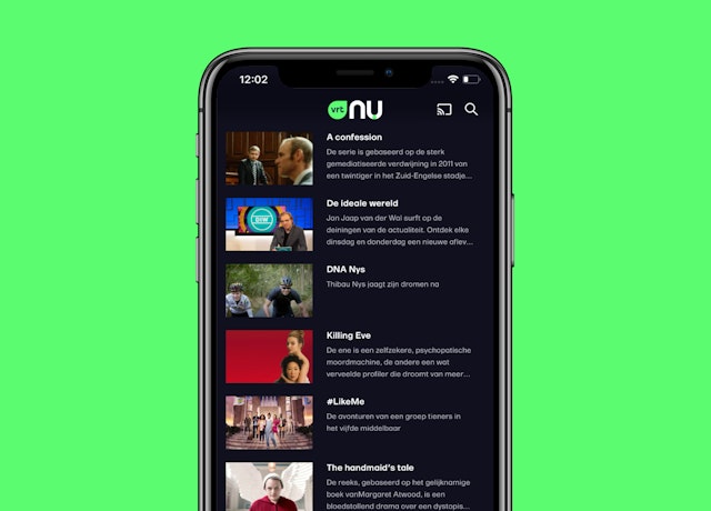
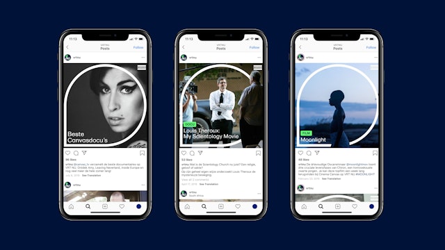
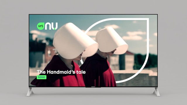
The iconic geometric shape forms the basis for the wider design language.
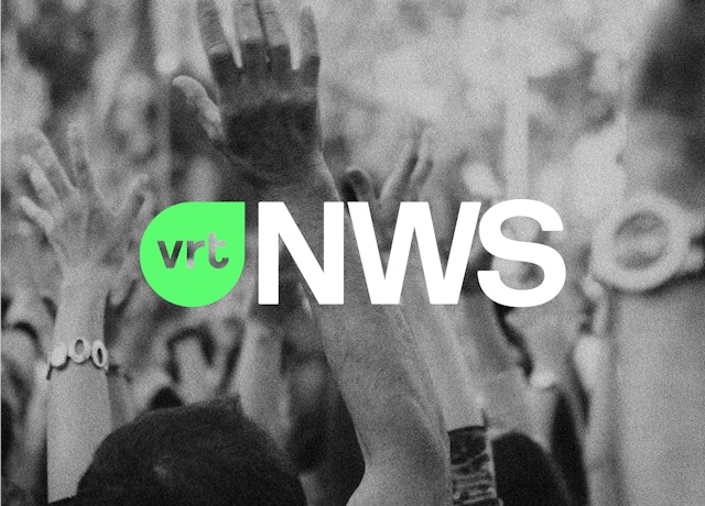
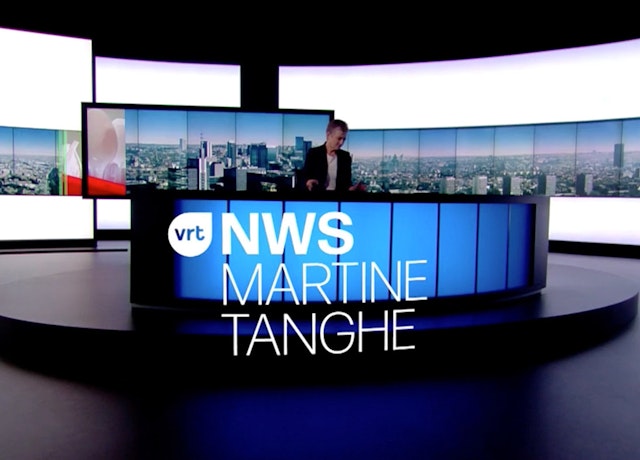
Pentagram has designed a brand identity for longstanding client VRT, the national public-service broadcaster for the Flemish region. With its 20-year legacy and diverse portfolio of popular channel brands, VRT is an important player in the broadcast market. It plays an influential role in shaping Flemish identity and society, similar to the BBC in the UK or PBS and NPR in the USA.
In recent years the nature of broadcasting has changed rapidly to adapt to multiplatform and on-demand viewing, as well as various mobile and social requirements. This paved the way for VRT to embrace these changes and evolve beyond a passive corporate-style brand to play a more active and digital-centric role.
The new identity needed to provide VRT with a brand that reflected its ambitions; to increase the impact, relevance and user-friendliness of its established radio and TV brands in the digital space, as well as incorporate products such as its new-generation video player VRT NU, and its hub for innovation VRT Start-Up.
Pentagram collaborated with strategic agency The Upside to deliver VRT’s digital transformation strategy. Together with the design team an identity that could be applied across a number of VRT’s different brands and platforms was created. The new brand comprises a flexible system across VRT’s brand architecture, ensuring a coherent logic between the sub brands and the mother brand.
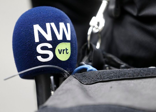
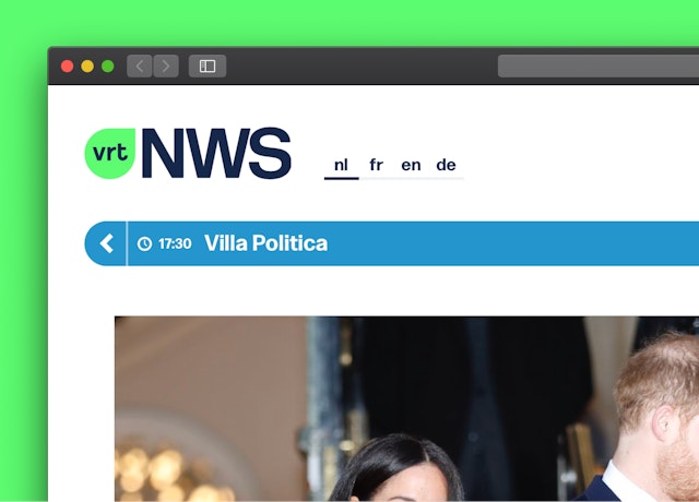
The brand architecture distinguishes the relationship and hierarchy between the main VRT brand and other services such as the NU video player and the trusted news platform NWS.
The identity operates as a smart, functional visual language that works as a toolkit for VRT to be inspired to create innovative onscreen assets. The new wordmark is held in a droplet shape that references the ‘ear’ form found in VRT’s logos between 1960-1991, acknowledging VRT’s historical legacy.
The iconic geometric shape forms the basis for the wider design language. This also includes other complementary shapes which work together to form a practical and playful visual language, which is instantly recognisable across all of the various VRT brands. The motion design team seamlessly translated this language into a suite of video player icons for NU’s play, stop, pause and fast-forward functions, using these motion graphics to convey the personality and energy of the brand.
The vibrant colour palette employed creates distinction among VRT’s competitors, with a primary green used throughout its channel brands. Careful attention was paid to ensure final colours were politically neutral, and secondary colours are used in conjunction with each of the sub brand personalities. A dark and sophisticated navy is used for NWS’s colour palette, which reassures viewers that the news platform is both trustworthy and authoritative.
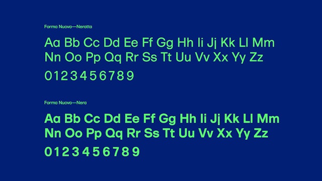
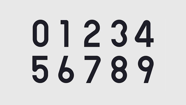
The bespoke typeface created for VRT is a custom version (including bolder weights and extra glyphs) of Forma Nuova, a recent interpretation by Marco Campardo and Lorenzo Mason (formerly Tankboys), of Forma, a sans-serif font originally designed by Aldo Novarese in 1968.
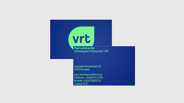
The design team developed a range of designs for the VRT brands’ assets across stationery, event materials, merchandise and the NU player interface.
Office
- London
Partners
Project team
- Stuart Gough
- Margherita Papini
- Sabrina Maerky
