
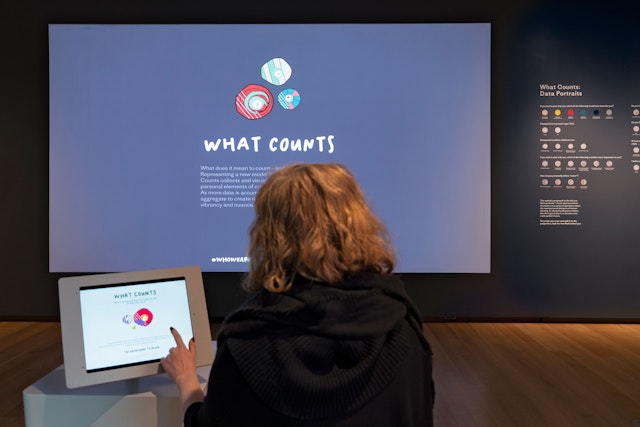
The installation reimagines how personal data can be gathered and communicated in more emotional, human ways.
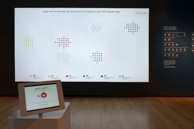
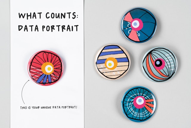
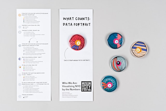
Each data portrait is redeemable as a wearable button that visitors can take with them as a personal memento of the experience.



Who We Are: Visualizing NYC By the Numbers is a new exhibition at the Museum of the City of New York that explores and highlights the importance of the upcoming 2020 Census. The exhibition focuses on the historical legacy of census taking and features contemporary artistic responses to concepts of counting, government appropriation, and individual versus collective identity.
Pentagram has conceptualized, designed and developed an interactive, multi-media installation for the exhibition that seeks to raise new questions about how individuals have been traditionally categorized by the United States census and reimagines how personal data can be gathered and communicated in more emotional, human ways. The installation, titled What Counts, was commissioned specially for the exhibition and is featured prominently at one end of the gallery.
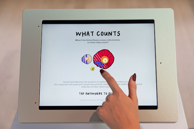
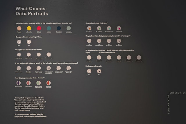
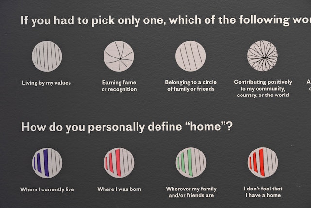
What Counts has two core components: a large projection on the gallery wall and an interactive interface installed on an iPad in the middle of the space. Exhibition visitors are encouraged to answer a short questionnaire on the iPad to contribute to the dynamic graphics projected on the gallery wall. Subverting the banal, utilitarian questions asked in the actual U.S. census, the survey instead poses more intimate questions, such as “How do you define home?”, “Compared to your actual age, do you feel young or old?”, and “Do you feel that what you currently have in life is ‘enough?’”
A unique visual symbol is generated on the iPad as one moves through the survey, resulting in a layered “data portrait” that represents the visitor’s answers. Pentagram purposefully designed the data portraits as hand-drawn and imperfect to deliberately contrast with the clinical bar charts and scatter plots that are typically used to visualize census data. Within each portrait, the multiplicity of discrete graphic elements—and the nearly exponential combinations possible—underscores the intersectional nature of human identity.
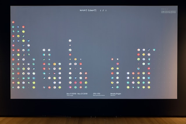
Once the survey is completed, visitors can “swipe” their unique data portrait to the gallery wall, where each portrait joins an animated projection of all data portraits collected to date. A queue of portraits at the top of the projection highlights the newest entries that will soon join the larger pool of unique data portraits. Over time, each element of the portrait is visually unpacked and explained, revealing the composite elements that make up each data portrait and illuminating the responses to each question.
Each data portrait is also redeemable as a wearable button (with a legend) that visitors can take with them as a personal memento of the experience. The installation will continue to collect data throughout the run of the exhibition, thereby creating an ongoing visual record of museum visitors.
What Counts illustrates a particular approach to data collection and visualization—dubbed “Data Humanism” by the team—that explores the potential to count people not with just numbers or statistics, but through more humanistic models that recognize (and even emphasize) individuals as complex, nuanced, and multi-layered beings.
Sector
- Arts & Culture
Discipline
- Digital Experiences
- Exhibitions
- Data Driven Experiences
Office
- New York
Partner
Project team
- Ting Fang Cheng
- Phillip Cox
- Sarah Kay Miller
Collaborators
- Accurat
