
Lupi wanted to help her friends process and communicate emotions: the range of feelings one experiences when coping with their illness, or that of a loved one.

The exercise of noting physical symptoms and clinical results from lab tests with softer data helped channel stress and anxiety into a semblance of control.




Two innovative artists responded to the overwhelming impact of a child’s illness by using their creative practices to make sense of the experience. Knowing that clinical records alone could not capture the full range of effects on the family, Pentagram partner Giorgia Lupi and experimental musician Kaki King used their art to understand and communicate the information that was missing.
One summer morning, King woke her nearly three-year-old daughter and saw that she had blood in her mouth. King asked her child to stick out her tongue, and on it was a lesion the size of a dime.
“Heart racing, panicking on the inside, I calmly packed her up and went straight to her pediatrician, who send us directly to the ER. After a blood test, she was diagnosed with a condition called Idiopathic Thrombocytopenic Purpura, or ITP, an auto-immune disease where her body attacks her platelets, a crucial component of blood clotting. She was getting spontaneous bruises and burst blood vessels called petechiae all over her body. The following weeks were a terrifying spree of platelet transfusions, courses of steroids, blood tests, and abject terror as we watched her platelet levels rise and fall.” — Kaki King
When Lupi learned what the child and her family were going through, she wanted to find a way to support, or at least help her friends make sense of what was happening. As a data visualization designer, researcher, and artist, Lupi uses data as a tool to understand human nature, and data visualization as a medium to express what she discovers. Through her work, she wanted to help her friends process and communicate emotions: the range of feelings one experiences when coping with their illness, or that of a loved one.
At the time, Lupi and King had been working together for a year on a project for Hennessy, where they blended their musical and visualization talents to create a brand identity for the 200th-anniversary limited edition of V.S.O.P cognac. The two artists had fallen in love with each other’s work and had continued to collaborate on new projects. When King’s child became ill, it became an unexpected opportunity to combine their practices and take a therapeutic sense of control over the frightening events.
ITP is an unusually visual disease: it presents with symptoms of abnormally large bruising and petechiae, and, as King explains:
“The doctor’s directive to us was to watch her skin for any significant changes. Since I had been working with Giorgia, I had learned to do personal data collection, so I began to write down what I was seeing on [my daughter’s] skin, what activities we did that day, what treatments she had, and what her readings were, as well as how I was feeling--my fear, stress, my hope. My thoughts and feelings.”
Having learned to gather different kinds of data by working with Lupi, King started making daily observations, juxtaposing physical symptoms and clinical results from lab tests with softer data: her emotional responses and individual activities over four months. The exercise of noting these details helped channel stress and anxiety into a semblance of control. Tracking data became a meditative action that helped King and her wife process what was happening to their family.
When Lupi read King’s records, she was overcome with emotion and asked herself: can a data visualization evoke empathy and activate people on an emotional level, not just a cognitive one? Can looking at a data visualization make a person feel part of a story of someone’s life? She decided to experiment with the combined scientific and incidental data as inspiration for a meaningful visualization.
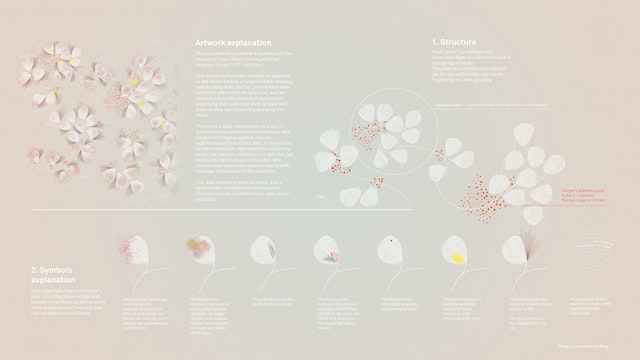
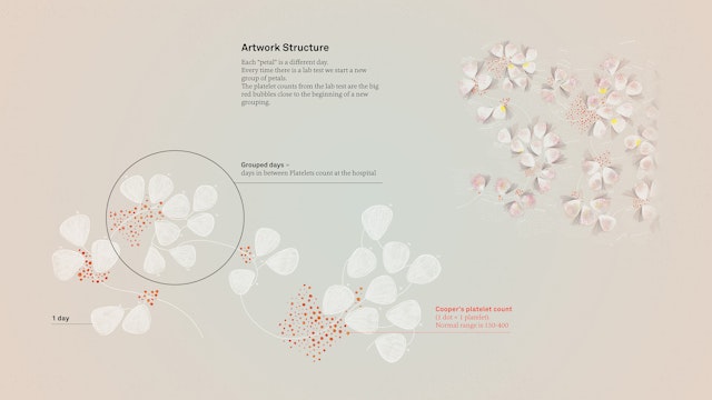
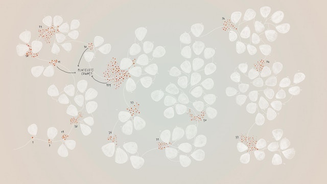
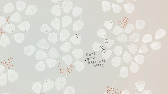
To begin this exploration, Lupi structured a non-linear timeline, where each one of the white petal-like elements indicates a new day. Days are grouped in sections: the moments between the child’s admissions to the hospital for blood tests, and the days that felt more monumental in King's family’s experience. Thus, in the visualization, a new group of days started with each a lab test.
Red dots at the beginning of the group represent the platelet counts from the test results. The normal range of platelets in the blood is 150–400. At the beginning of the recorded period, counts of 1, 7, and 30 appear; numbers that have powerful meaning and trigger deep emotions.
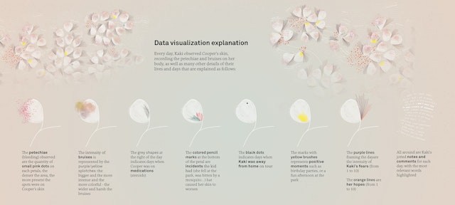
Lupi then incorporated King’s observations of her child’s skin, experimenting with ways to visually depict the symptoms of the disease through the use of different drawing materials. She used purple and green splotches to represent the intensity of bruises on the child's body: the bigger, more intense and more colorful the splotches, the broader and deeper the bruises.
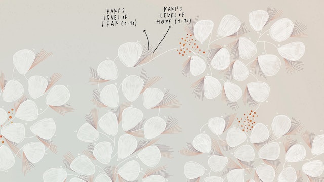
Tiny pink dots on each white "day" represent the number of petechiae. The denser the area, the more present the spots were on the child’s skin. When the child was taking steroids, Lupi added grey brush strokes on top of the day. If the child had some incidents that caused her skin to worsen, Lupi added colored pencil strokes.
As a performer, King tours often, and when she was away from home during this time, she was always feeling very stressed. In the visualization, a black dot appeared on days when King was on the road.
In these dark months, there were also positive times. Lupi represented these with bright yellow spots that cheer up the visual.
Lastly, King also kept track of her level of hope and fear each day on a scale on 1 to 10. Lupi visualized these as floating lines framing the day.
All around the graphic elements, Lupi hand-wrote King’s personal notes for each day and highlighted the most significant words.
The visualization is only half of the final artwork: King composed a musical score based on her data collection as well:
“The song has 120 measures in 3/4 time, covering the 120 days that I collected data. There are elements that you will hear that reference the amount of petechiae on her skin, my changing mood... And the main guitar part is a musical map of the bruises on her skin, changing, bleeding into each other.” — Kaki King
Through their experimental approach to data, music and design, Lupi and King made a cathartic sort of beauty out of a disturbing illness and its reverberations through a family. “Bruises: The Data We Don’t See,” has been featured in Fast Company, Eye on Design, the Italian Frizzi Frizzi, and in Nature—Cooper-Hewitt National Design Triennial at both the National Design Museum in New York and Cube design museum in the Netherlands.
Client
Self-initiated projectSector
- Arts & Culture
- Health
- Technology
Discipline
- Data Driven Experiences
