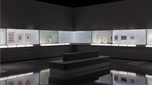
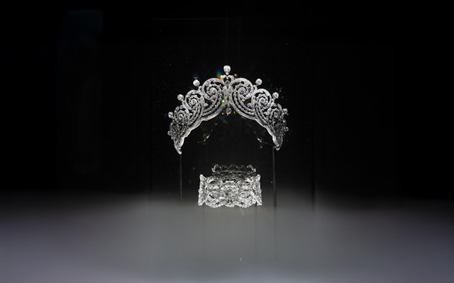
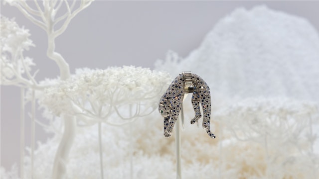
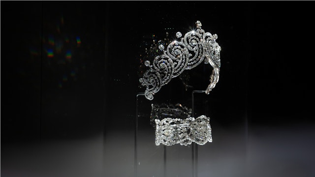
Featuring more than 350 pieces from the Cartier Collection, the exhibition tells the story of how Cartier became a defining force in the realm of fine jewellery and horology.
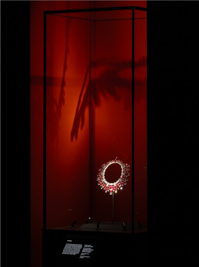
The spatial design invites visitors into a dreamlike journey—an immersive experience that unfolds from ‘reality’ to ‘dream’.
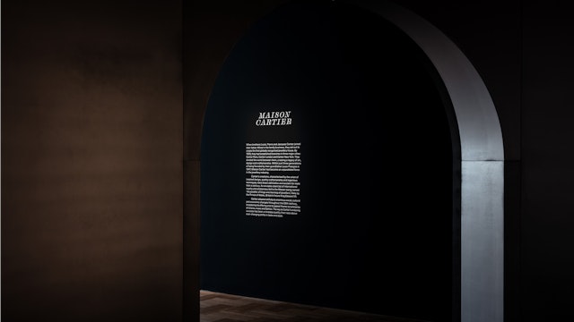
Reflecting the ‘dream’ to ‘reality’ narrative, the Cartier logo was cut into the wall, each meticulously hand-sanded with increasing bevel—a subtle shimmering optical illusion.


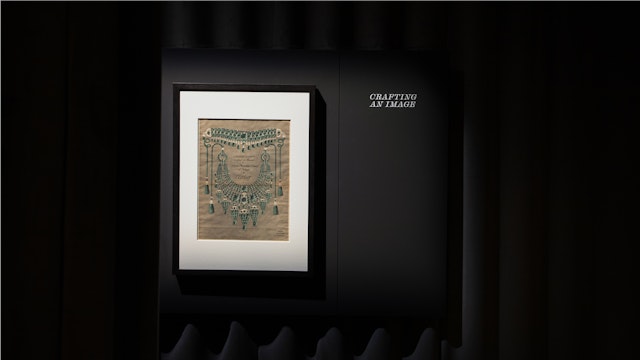
The Pentagram team visited the Cartier archive. The rich design history revealed an idiosyncratic graphic language in combination with Cartier’s customary elegance.


Pentagram’s typographic choices recreate the eclecticism found in the archive’s print artefacts and bring through their expressive texture, even in the simple, recessive setting of the exhibition text panels.


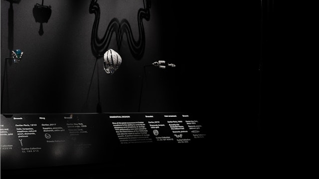
The exhibition graphics balance the expressive influence of the Cartier archive with the functional necessity of framing the often small scale objects in immersive focus. Highly visible but without distraction.
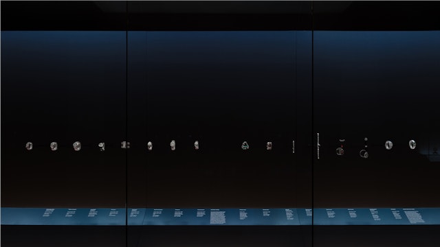
Key text was framed by discreet inlaid grooves that catch the light to subtly call out the text information to the visitor, at the same time as blending with each room’s ambience and materiality.


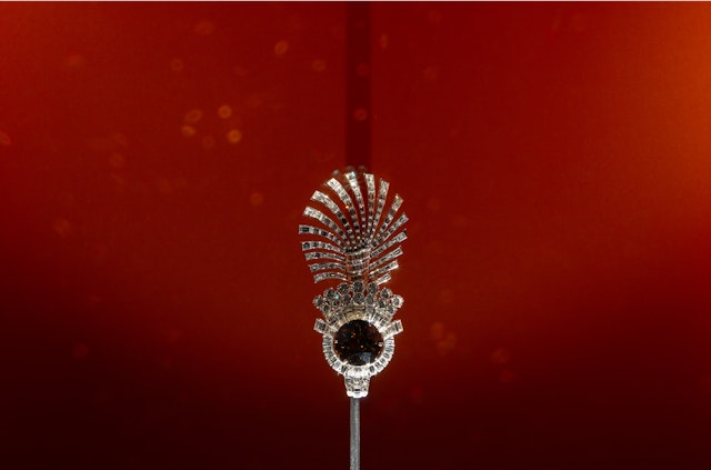
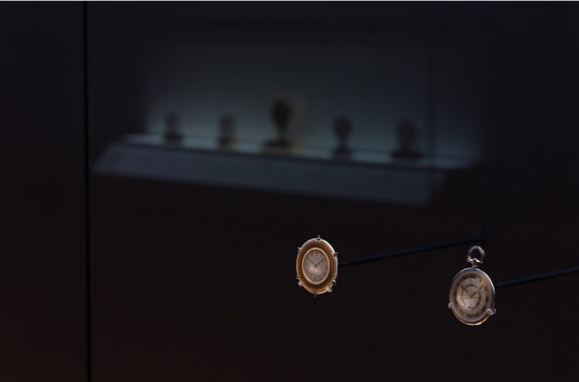
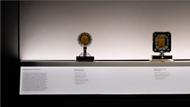
The landmark exhibition brings together dazzling jewels, extraordinary objects, historic gemstones, and signature timepieces from the V&A and Cartier’s own archives.
‘Cartier’, a major new exhibition at the V&A in London, traces the evolution of Cartier’s unique legacy of art, design and craftsmanship. Featuring more than 350 pieces from the Cartier Collection, the exhibition tells the story of how Cartier became a defining force in the worlds of fine jewellery, clocks and watches.
Founded in Paris in 1847, Cartier was swiftly embraced by royalty and aristocracy, its allure later captivating icons of cinema, music, and fashion. This landmark exhibition brings together dazzling jewels, extraordinary objects, historic gemstones, and signature timepieces from the V&A and Cartier’s own archives, alongside previously unseen drawings and works lent by His Majesty The King, together with treasures from international museums and private collections.
The exhibition was designed by British architect and longstanding Pentagram collaborator Asif Khan MBE, who asked Pentagram to create the exhibition identity and graphics. Asif’s design invites visitors into a dreamlike journey—an immersive experience that unfolds across three distinct spaces. Each area evokes different feelings, rhythms, and intensities, a progression of immersive ‘dream stages’ that culminates in a hypnotic waltz of tiaras.
To start the project, the Pentagram team visited the Cartier archive and workshop at their London Maison in New Bond Street. The rich design history found in early print marketing and brand ephemera revealed a more idiosyncratic graphic language in combination with Cartier’s customary elegance. Eclectic juxtaposition of typeface styles in asymmetric, often unstructured-feeling layouts, alongside variations of the famous script logotype became the basis of the team’s inspiration.
The exhibition graphics balance the expressive influence of the Cartier archive with the functional necessity of framing (not distracting from) the often small scale objects. Scott Vander Zee’s Scotch Genovese Display Italic was selected as the lead typeface for its avant-garde manifestation of the Scotch Roman style, a dream-haze recollection of Cartier’s logotype calligraphy. It is paired with the highly contrasting styles of Schick Toikka’s SCTO Grotesk A’s functional minimalism and the industrial geometry of Lewis McGuffie’s engraving-like Stndrd. The choices recreate the eclecticism found in the archive’s print artefacts and bring through their expressive texture, even in the simple, recessive setting of the exhibition text panels. The Pentagram team built a layout system that focused on smaller-than-usual column widths, uniform text sizing and variation of tracking to subtly hint at the turn-of-the-century aesthetic of Cartier’s early graphic material.
Whilst the use of typography itself stands-out, the form-language of the exhibition graphics allow both immersion into the dreamlike environments, and consistent wayfinding through the exhibition narrative. Key text was framed by discreet inlaid grooves that catch the light to subtly call out the text information to the visitor, at the same time as blending with each room’s ambience and materiality. Highly visible but without distraction, the team’s solution provided an elegant and practical way to make the graphics work within the highly-designed space.
The entryway to the exhibition greets visitors with a striking, large-scale typographic installation, setting the scene for the graphic motifs in the show itself. The Cartier exhibition logo was cut into the wall, each letter in relief, and meticulously hand-sanded so that each letter is increasingly bevelled. The C remains sharp, whereas the final R’s smooth curves almost melt into the wall—a gradient of blur that reflects the exhibition’s narrative of reality to dream. The result is a subtle optical illusion that shimmers with Cartier’s undeniable magic and mystique.
Photography by Luke Hayes.
Client
V&ASector
- Fashion & Beauty
- Arts & Culture
Discipline
- Signage & Environmental Graphics
- Exhibitions
- Typefaces
Office
- London
Partners
Project team
- Nav Bhatia
- Jack Llewellyn
- Hazal Ozkaya
- Emma Caamaño
Collaborators
- Asif Khan Studio
