These projects cover critical pieces of public policy that are especially relevant to a post-pandemic society and synthesize data in a clear and creative manner.
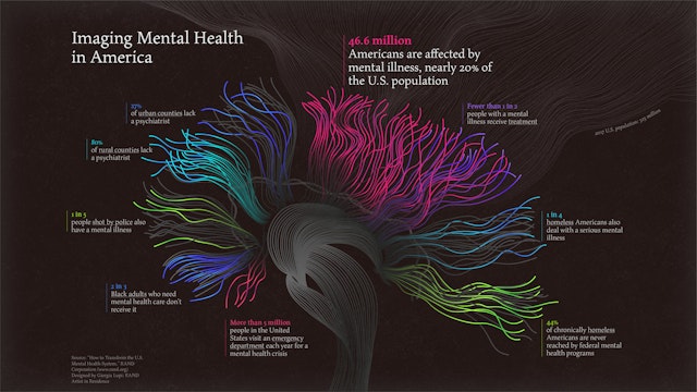
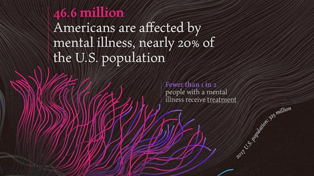
Giorgia and team researched data from RAND’s report on mental health, then conducted a series of design explorations that organized the information around different regions of the brain.
Based on new research from RAND, the large-scale data sculpture gives physical shape to the persistent inequalities that are embedded in our economic system.


Spanning three distinct projects, Pentagram partner Giorgia Lupi has created visualizations on mental health, income inequality, and the human body, in partnership with the RAND Corporation. Each using vastly different media, research, and approaches to data storytelling, these projects cover critical pieces of public policy that are especially relevant to a post-pandemic society and synthesize data in a clear and creative manner.
In 2021, Giorgia Lupi was named the inaugural artist in the RAND Art + Data Residency, a program of the RAND Corporation that merges the worlds of art and data to help people better understand public policy issues. RAND is a nonprofit, nonpartisan research organization that uses rigorous analysis to transform research into fact-based, actionable solutions that empower communities.
The program is part of the NextGen Initiative, a series of ongoing projects focused on introducing RAND’s cutting-edge capabilities and extensive public policy research to younger generations. Each quarter, a different artist will use RAND’s public policy research to create a series of monthly visualizations aimed at building awareness around pressing issues such as healthcare, education, international affairs, energy and the environment. This goal to make data more approachable and engaging complements Giorgia’s work in “data humanism”—using data to uncover the human stories behind the numbers and statistics, and to challenge the idea of data as something that is impersonal and intimidating.
The first RAND Art + Data visualization focused on mental health, a serious issue facing millions of Americans today, especially as the country emerges from a collective trauma like the pandemic. The visualization featured a striking image inspired by an MRI brain scan, to reinforce the connection between mental health and science. The infographic employed a visually expressive and poetic approach that helps humanize the data.
Giorgia and team researched data from RAND’s report on mental health, then conducted a series of design explorations that organized the information around different regions of the brain. In the final visualization, the data was abstractly represented by colorful “waves” emanating from the brain. The infographic highlighted data that conveyed a sense of urgency around the issue, like the fact that 46.6 million Americans, or nearly 20 percent of the population, are affected by mental illness, but fewer than 1 in 2 of these people receive treatment.
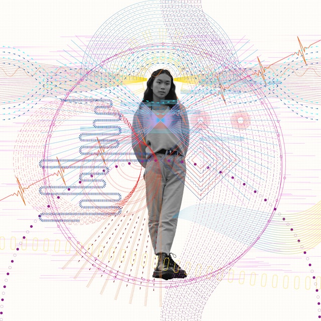
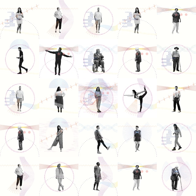
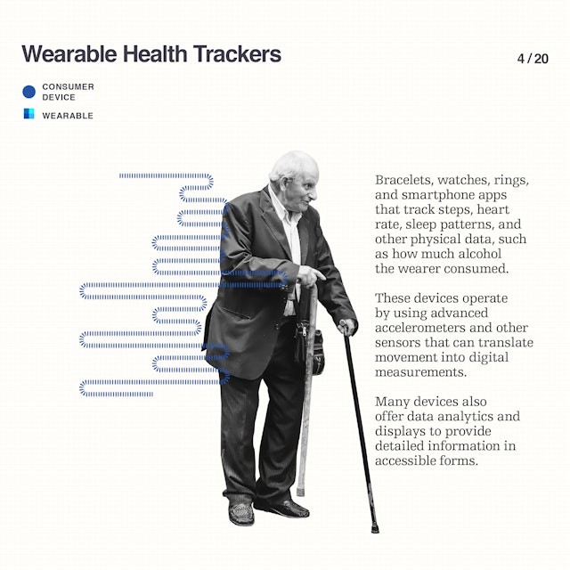
The second project, titled “Internet of Bodies,” was an emerging ecosystem of internet-connected “smart” devices that monitored the human body and collected personal biometric data. These diverse devices, such as implantable microchips, clothing with sensors, and wearable health trackers, represented a new frontier in personal technology. Presented as an animation, the visualization illustrated the devices on both the micro and macro level and raised provocative questions about the future impacts of IoB technology on intelligence, health, and privacy at scale.
Giorgia and team conferred closely with the subject matter experts at RAND on the topic as they sought to creatively illustrate the report’s themes for a mass audience. Many of the devices of the IoB centered on tracking and collecting personal data––an activity Giorgia explored in a more analog way in her “Dear Data” collaboration––and then employing this data to enhance and empower one’s life.
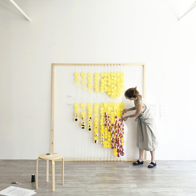
The third project was “Connecting the Dots on Income Inequality,” a three-dimensional installation that visualized how Americans’ income has transformed over the past four decades. Based on new research from RAND, the large-scale data sculpture gives physical shape to the persistent inequalities that are embedded in our economic system.
This was the first time Giorgia had conceived a data visualization as a sculptural installation. The sculpture manifested the idea of wealth and the accumulation of things with the cloud of coin-like dots that filled the six-foot-square frame. The paper discs were cut from handmade assemblages of found objects including personal checks, receipts, bank statements and other documents, and hung on three layers of string to give the piece a sense of depth and perceived mass. A legend accompanying the installation explained the concept and how to interpret the color and placement of the data. The full data visualization for all three projects can be viewed on RAND’s website.
